If you want to boost your sales this year, take a look at your brochure design. It might need an update from the last time that you created it.
Improving the design of your brochure can transform it into a powerful marketing tool that’ll encourage customers to buy more of your products. You can check out the multiple brochure design templates available online to give you ideas about what to change.
In this article, we’ll share with you 15 brochure design ideas that you can use to improve your marketing efforts and boost your sales this year.
Why a Creative Brochure Design Is Crucial This Year?
A brochure is an excellent tool to ignite the visual interest of your customers. With the combined number of offline and online businesses, catching customers’ attention is harder. You have to ensure your brand will always stand out amidst the competition.
Your brochure design can make that happen.
You don’t have to impress them with modern brochure designs if that’s not fitting for your brand image. But you have to ensure that you know of enough trends so customers know you’re always on the lookout for new trends that can improve your operations.
This shouldn’t be too hard because there are several sources of inspiration online. You can look for an excellent example in digital brochures. Check out your competition and see how their brochure designs have evolved.
Combine different brochure design ideas and let them unlock your creativity. Use it to create an impressive brochure for your brand.
15 Brochure Design Ideas to Improve Sales Significantly
Creating brochures isn’t rocket science. You have to remember two things. First, your brochure should be consistent with your brand. Second, you have to meet your customer’s expectations.
Just like a product catalog or a pamphlet, a brochure is meant to provide information. It targets a specific area of your brand and includes information about it. The goal is to give customers adequate details to make informed decisions about it.
Keep that in mind as you search for brochure templates.
To help you get started, here are some brochure design tips that can help boost your sales this year.
1. Choose Simplicity
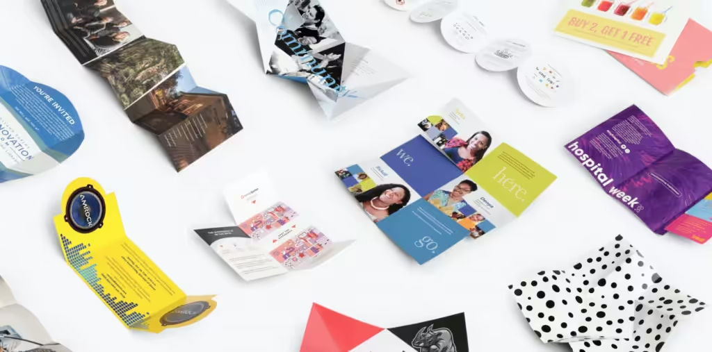
Your brochure design ideas don’t have to be extravagant to be noticed. Believe it or not, a minimalist design can stand out just fine.
Think about a brochure stand with a lot of colorful designs. Then you have your own, with clean lines and fonts amidst a white background.
Which one will stand out? It’s the one that looks clean.
And if you use high-quality images against a plain, light-colored background, that’ll also make your images pop up.
That’s a great technique to use when designing your next brochure.
2. Create Impact Through Shapes
Using geometric shapes is also a great way to make your brochure stand out. There are two ways to implement this.
The first is using bold shapes as the actual design of the brochure. Use brochure design templates to put text and images on specific geometric shapes. That’ll leave you with color blocks of different shapes and sizes.
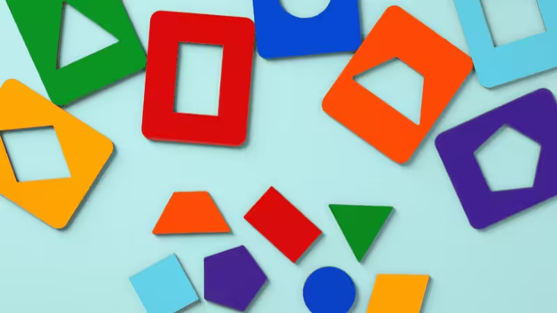
The second option is to deviate from the usual rectangular shape of brochures. Opt for triangles, circles, and even hearts as the shape of your brochure.
This is one of the brochure ideas you should try because the shape alone would make it stand out.
3. Include a Surprise
Setting up a small surprise for the brochure readers is one way to make it effective as a marketing tool. Imagine showing them a straightforward cover, only for it to open to a full pattern of photos and text when they open it.
Or you can add brochure design elements that you rarely use but are still aligned with your brand story. You can also include a small giveaway in your brochure as a gift for the reader.
These are simple yet powerful ways to make a brochure memorable. If it leaves an impact, customers will remember your brand.
4. Go for Linear
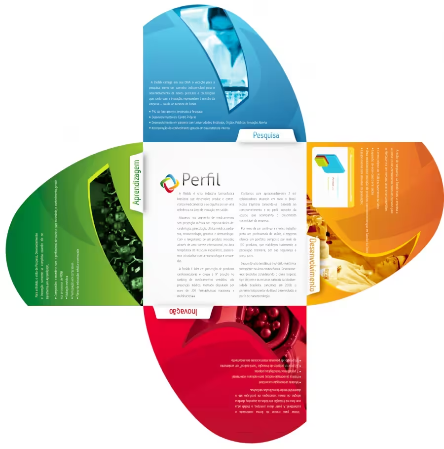
Instead of just going for tri-fold brochures, why not make the linear fold longer? Instead of the usual booklet-type brochure design that people are used to seeing, you’ll have a seemingly smaller brochure that stretches out to multiple pages.
Customers can view the whole thing immediately instead of flipping and turning pages as it unfolds. It becomes easier to read and could give you much more space to provide relevant information to your customers.
5. Do Creative Folds and Graphics
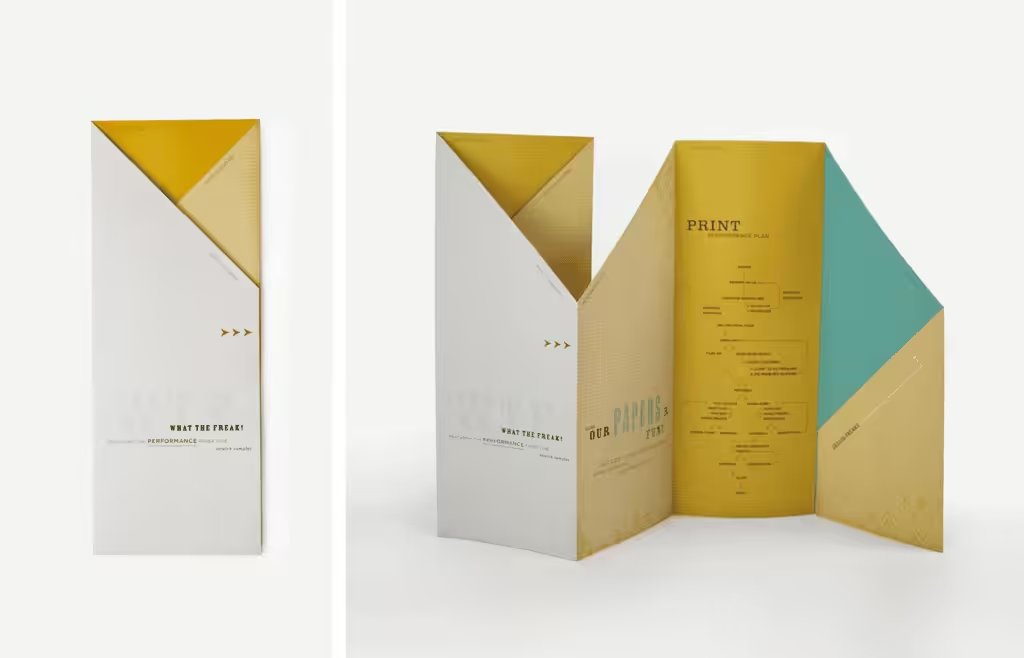
If you like the linear idea of a fold brochure, let’s take it one step further. Have a creative brochure that folds into different shapes.
Imagine a square brochure that has the front flap folded to look like a triangle. When people see that, they’ll immediately focus on what’s different. They’ll get curious enough to unfold that triangle and see what’s inside. Make sure you blow them away with incredible graphics—just like a surprise.
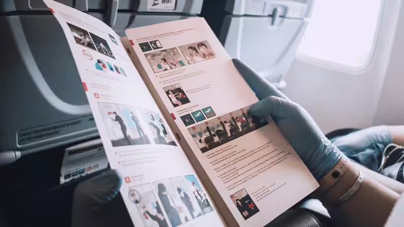
That’s how you use visual elements to attract the attention of your target market. They don’t have to look the same. But they should work together to leave an impact on those who handle them.
6. Add Inserts
Brochures are incredible marketing materials on their own. But that doesn’t mean they can’t work together with other tools that you use to market your product.
Feel free to insert a pamphlet about another product that you offer. Or you can have something pop out of the brochure when it’s opened. It could be a CD that contains more information about your brand.
Or it could be a sample product that’s small enough to fit in your brochure.
7. Make It Interactive
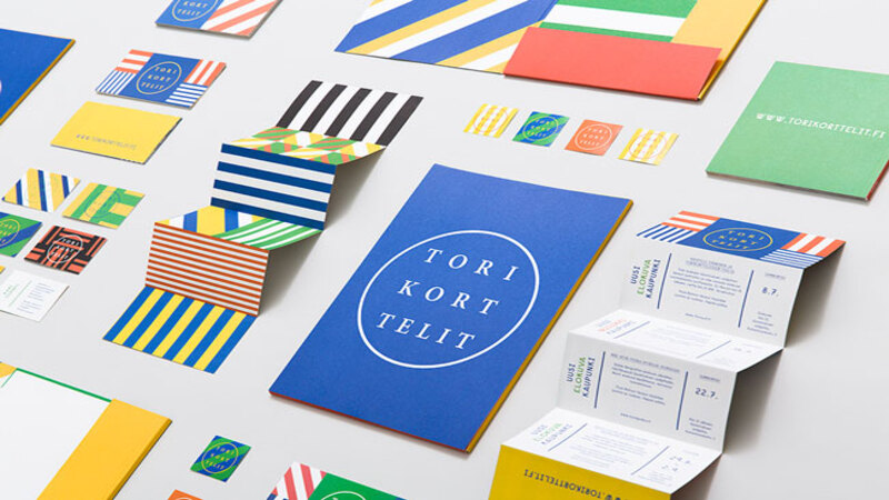
How can you make a brochure interactive?
Think about how children’s books are interactive. An illustration of a farmhouse has small flaps over the windows that children can open to reveal an animal inside.
That’s something that you can use in your brochure design. Create a unique layout where customers can open flaps inside your brochure to reveal something.
For instance, you can cut out a cutout of a fabric or material that you use to create your product. That way, the customer may not have the actual product, but they can touch the fabric and imagine what the real thing will look like.
Another idea is to design a fold brochure creatively, like a three-dimensional shape.
8. Opt for Sustainability
One of the design trends nowadays is sustainability. This is one of the best ideas that you can use.
It’s not just about including trees or environmental elements in your design. You need to learn to create an environmentally friendly brochure.
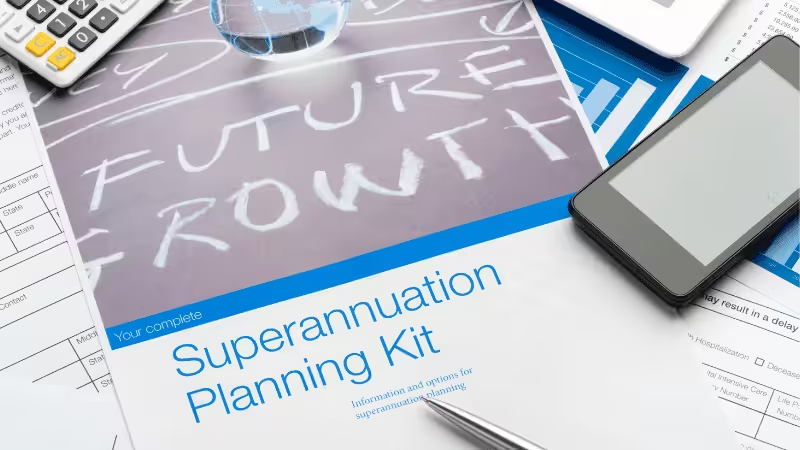
It’s about using brochure materials that are sourced responsibly. That means the paper for your brochure is taken from well-managed forests and is free from exploitation and illegal environmental practices. You can also choose to use recycled paper to show your support for eco-friendly materials.
If you notice, many corporate brochures use sustainability as part of their marketing strategy. It’s a great way to attract eco-conscious customers.
9. Give It Texture
Adding texture to flat brochure designs is one way to make them interactive. Emboss the design on the page to stimulate the sense of touch in your customers. Or you can use glitter.
This will add dimension to your brochure. How multiple senses are stimulated as the customer reads the brochure will surely make it memorable.
This is a great way to leave a lasting impression on them. Even if they don’t buy immediately, they’ll at least remember your brand once they need your offer.
10. Be Fun and Playful
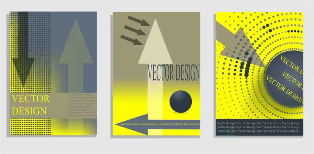
Adding fun and colorful visual elements is sure to make your brochure stand out. Use bold colors as long as they fit your brand, the product line, or the service you’re trying to promote.
These will help give life to your brochure and excite your customers about its contents.
Use artistic and colorful images, artwork, and illustrations. Choose photos that represent fun and playful times.
Remember, everyone wants to be happy. So making your brochure design exude happiness is one way to generate interest.
11. Stay Small
Fantastic brochures are those that don’t follow the traditional look. If you want your brochure to be considered cool, why not make it small?

After all, you don’t have to create a big brochure to impress the customer with the value of your brand. Sometimes, going small is the best way to go.
Of course, you must consider the content you’ll be sharing with them. If you can make it short, clear, and concise, you might be able to make your brochure design smaller. Maybe you can make it small enough to fit in a pocket.
12. Take Design Risks
From using unique shapes to using bold colors, there’s something about risky designs that can make your brochure the talk of the town.
So if you have unique ideas and want to add them to your brochure, go ahead. Of course, you want your brochure design elements to reflect your brand. But that doesn’t mean you can’t deviate from the usual and go crazy sometimes.
As long as your customers can still recognize your brand, being risky can pay off. It’ll show your creativity and prove to customers that you’re brave enough to go against stereotypes.
Create a mockup of this and test it out with your customers. See how they react to your risky designs.

13. Play With Perspective
You can play with perspective, even with a flat brochure design.
With the proper illustrations laid out in exciting angles, you can give your customers an eyeful of design creativity.
You can use a combination of typography and color angles to make customers turn the brochure around to get the whole message.
This is one of the creative brochure design ideas that might need a professional graphic designer. Make sure you do a mock-up first to guarantee you get the right perspective on your designs.
14. Try Die-Cuts
Using die-cuts isn’t one of the new design trends. You’ll notice this in a lot of brochure template designs available today.
This technique will create windows, allowing the customers to look at the brochure design elements behind the page.
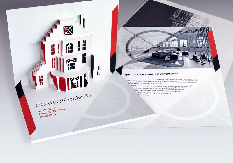
Here’s an example. If you have real estate brochures, you can do a gatefold. Then, implement the die-cut design on the front flaps of the brochure. It’ll give customers a peek inside the brochure, just like how a person looks through a house gate to see inside.
It’s a clever way to showcase your creativity and stay true to the nature of the business.
15. Design Multiple Versions
How do you create multiple versions of your brochure?
You can print the same brochure template with different color schemes.
Or you can choose brochure design templates that allow you to switch relevant images that you’ll use on the front cover.
These multiple versions should have their own personalities but be distinct as well. It’s an effective way to target a diverse market. It’ll make the brochure feel personalized.
3 Tips for Brainstorming Brochure Ideas
Before you look for brochure templates that you can use, you should consider a couple of tips. It’ll help you create a brochure design that represents your brand well. Also, the brochure template you’ll use will resonate with your customers.
Take a look at these three tips.
1. Check New Customer Preferences
Before designing your brochure, take a look at your target audience and their preferences. While you may have enough data on your ideal customer, you still have to consider how they have changed over the years.
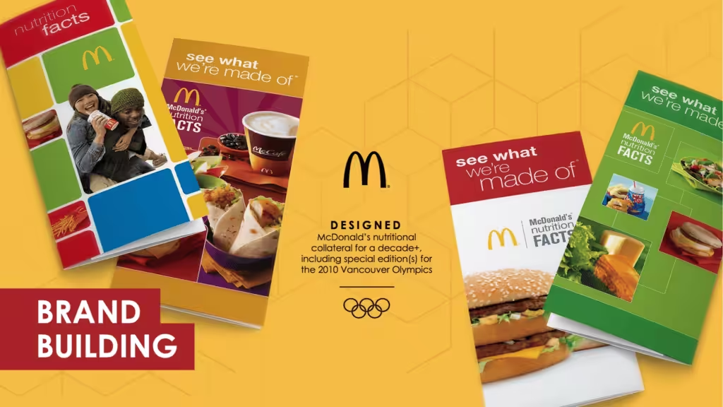
Think about McDonald’s. They have been the epitome of unhealthy living. But now, with people opting for a healthier lifestyle, they’ve made changes to keep up. They released healthier items on their menu.
If you’re looking for a new brochure template, ensure it matches your customers’ preferences.
2. Small Changes Are Acceptable
You don’t have to go overboard when changing your brochure design. You can make a few changes here and there.
Maybe have it printed on a different type of paper. Or you can change some of the images.
The small changes are acceptable. You don’t have to revamp the whole brochure template.
3. Mind Your Photos and Images
Choose brochure templates that’ll allow you to highlight other visual elements that you know will resonate with your customers.
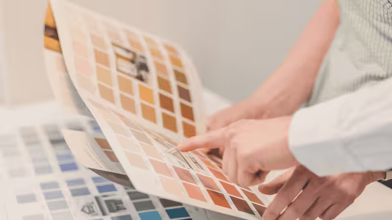
While your brochure is meant to provide information, providing enough images will break the monotony of text. It’ll help make your brochure look more creative and attractive.
When choosing photos, focus on what your customers want to see and relate to. Make sure the images support the content of your brochure.
Conclusion
An effective brochure design can significantly impact your sales and marketing efforts. By incorporating creative elements, interactive features, and modern trends, you can make your brochure stand out and engage your audience.
Whether you opt for simplicity, bold shapes, unique folds, or sustainable materials, the key is to align your design with your brand identity and customer preferences. Small tweaks or complete redesigns can refresh your brochure and enhance its effectiveness.
Discover Unique Brochure with Packoi
Choosing among several brochure designs can be challenging with all the online options. But the choice will be easier if you’re clear on your purpose for changing the brochure template.
At Packoi Printing, we’ll give you several brochure templates. If you think none of them reflects your brand, that’s okay. We have a team of designers ready to help you create a unique brochure.
Contact us today so we can talk about your ideas. We’ll send you a fair quotation as soon as possible.


