A study revealed that fonts affect readability differently. Using Times New Roman would read differently compared to the Verdana typeface.
This is important proof that you should pay attention to the font that your brochure text will use. It’s not just about giving information about your product or brand. It’s also about making the content visually appealing so the reader can read the whole thing.
In this article, you’ll discover more about typefaces and what it means to use the right font for marketing and corporate brochures.
Why Using the Right Font Matters
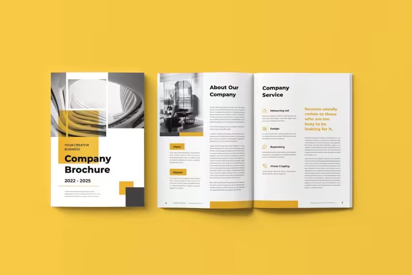
Brochure fonts give your marketing material personality. This is why it’s a crucial part of the content creation process.
It allows you to reflect the brand image that you want to promote. Whether you want to appear luxurious, professional, fun, or creative, there’s a specific font selection that can do that very well.
Choosing the best fonts will also allow you to present the body text with flair. Legibility and readability are both important in delivering your message to the reader. Different styles will allow you to emphasize specific areas in the brochure.
The typeface will also affect the size of the brochure. You need to leave enough space so the text won’t appear jumbled together.
If you can put together the right typefaces for your brochure, it’ll improve the typography and make your design more visually appealing.
Choosing Fonts Based on Purpose
It’s easy to choose a popular font style for your brochure designs. But if you want to get the right reaction from your target audience, you need to choose a font that’ll resonate with them. Not only that, but you also want to ensure they’ll react to your marketing efforts correctly.
Planning the typography of your brochure design requires you to fully understand the purpose of the marketing material. Focusing on this will give clues to the typeface you can choose.
For Classic Elegance: Serif Font
If you want to portray your brand with classic elegance, then you should focus on serif fonts. These are typefaces characterized by having small lines at the ends of the letters.
Think about Times New Roman, Georgia, etc. These fonts would be a great option for the body of the text or the title of the brochure.
These have a classic and timeless vibe that can give your brand a credible and trustworthy image. It’s the same font that Rolex and Mercedes-Benz use. It’s a great font option for those in the finance, luxury, and legal sectors.
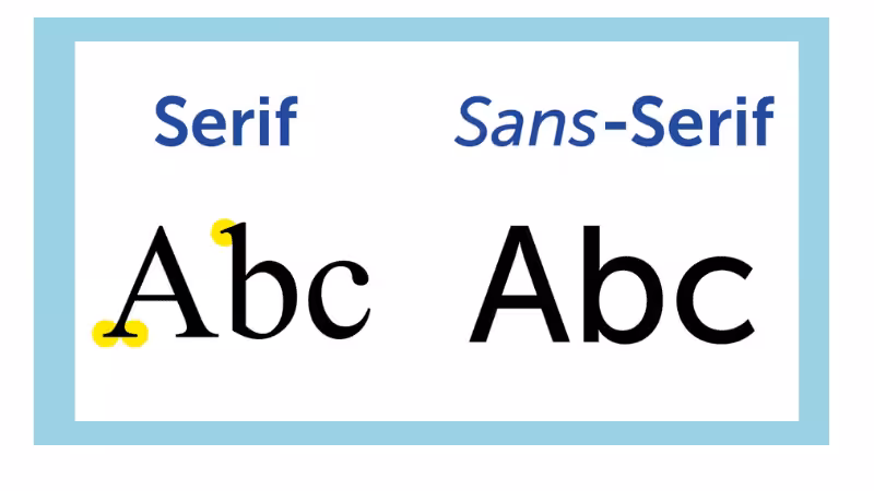
For Simplicity: Sans-Serif Font
If you want your brand to be portrayed with an image of simplicity and clarity, you should use a sans-serif font. This is characterized by a clean look without the “line” at the end of the letters.
Among the typefaces that you can use are Arial, Calibri, and Helvetica. These are clean enough to look at so they’re perfect for the main content of the brochure.
Famous brands that use sans-serif fonts include Netflix and Google. Based on these examples, you can assume that tech companies would look great using these typefaces. The healthcare industry would also benefit from the clean look of these styles.
For Personalization: Script Font
Unlike sans-serif fonts, script fonts bring a combination of personalization and a bit of elegance to them. It can also exude a sense of luxury, making it ideal for beauty and fashion brands. Examples of cursive fonts include Brush Script, Mr. Dafoe, Parisienne, etc.
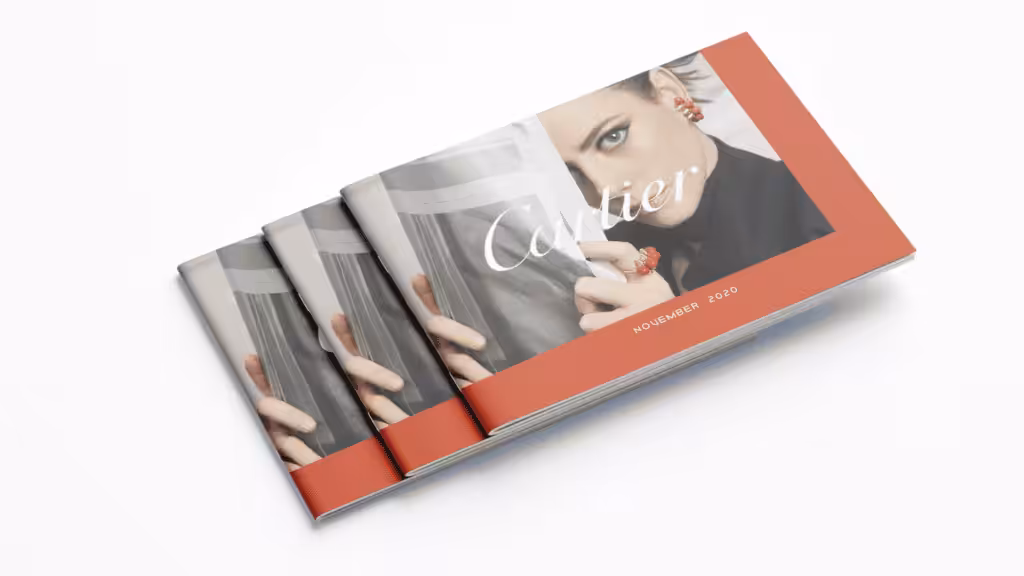
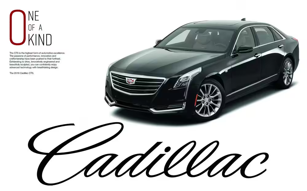
There are two ways that brands use cursive typefaces. The first is the more formal script used by brands like Cartier or Cadillac. Then, you also have the more casual script that looks more like handwriting, like on Instagram, Pinterest, and Ray-Ban.
You can use the script typeface for headings or anything that needs to be highlighted.
For Uniqueness: Display Font
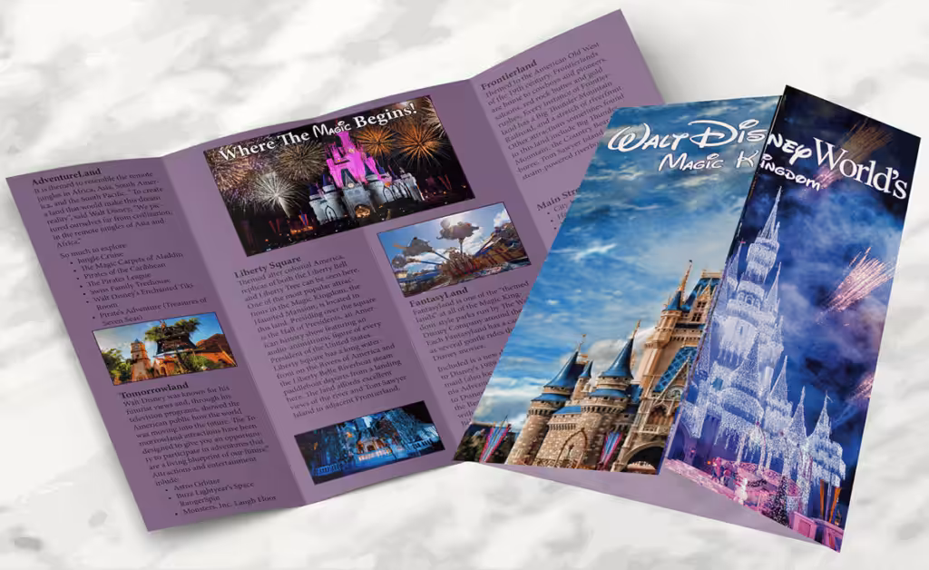
If you want a unique brochure design, opt for display fonts. There’s no rule when it comes to this typeface. These are created with a specific brand in mind, making them incredibly unique. The most popular example of this typeface is the one used by Disney.
Using this font will give your brochure a distinct personality, making it stand out as it showcases the artistry of your business. Examples of these fonts include Impact, Pacifico, Lobster, Bungee, etc.
This group is called display because it’s meant to be used for headings and titles. They’re large and meant to highlight important details in the brochure.
For Contemporary Appeal: Modern Font
To give your brochure a more traditional and contemporary style, you’re better off using modern typefaces. These are characterized by their fresh and updated appearance, making them very easy to read.
The modern look makes them ideal for the main body text of the brochure. Among the examples of these fonts are Futura, Bodoni, Avenir, etc. Some categorize Helvetica in the same group.
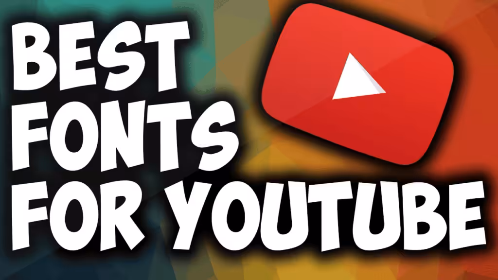
The brands that use modern fonts include YouTube, Adobe, and Tesla.
For Saving Space: Condensed Font
Some businesses might consider this the best font for brochures. As the name suggests, condensed fonts won’t take up a lot of space. It’s often a narrow version of an existing font, like Arial Narrow or Roboto Condensed.
Some fonts are created to be narrow, like Oswald and Orinoco. The brands that use this typeface include Bobbi Brown and GAP.
If you want to pack your brochure with a lot of information but don’t want it to be too big, you’re better off using this font.
6 Tips to Choose the Ideal Typeface for Your Brochure

Now that you know how to match the best font with the purpose of your brochure, it’s time to take the steps to identify the right one to use. Although you’ve decided on a modern or sans-serif font, you still have a lot of options to choose from.
To know which typeface to use for your brochure, here are six tips that you can implement.
Make It Reflect Your Brand
Since your brochure is meant to market your business, you must choose the best font to represent your brand. If you notice, the typefaces used by the brands mentioned earlier in this article fit their personalities. Can you imagine Google using the same font as Cadillac?
No, it won’t fit because the font used by Cadillac looks luxurious – and Google is anything but that. Google needs a clean and modern-looking font like sans serif.
Think about how you want your brand to be represented. Choose the typeface that has the features that can show that.
Plan Your Typographic Hierarchy
Your brochure should also have a specific typographic hierarchy. Start by identifying the font size for the title or heading, subheading, and body. The brochure headings would have the biggest size. The subheading would follow, and the body would have the smallest size.
Once this is clear, you want to choose the typeface that will fit the purpose of each section of the brochure. This has to be consistent so the reader can easily identify what the heading, subheading, and main text are.
Prioritize Readability
As you choose the typeface for your brochure, make readability your priority. Choose a font that will allow users to read with ease and understanding. You don’t want your readers to feel confused or end up with eye strain because you chose a font that’s hard to read.
If you’re choosing a typeface for the headings, you want it to be eye-catching. For the body text, you want it to look clear and simple so the information doesn’t feel overwhelming. Consider the upper and lowercase characters and use them to make readers focus on the right words in your brochure.
Limit Font Styles to Three
Having too many fonts could make your brochure look confusing and overwhelming. The different typefaces would be fighting for attention, so it’s best to limit your choices to two or three fonts.
Maybe you can choose one typeface each for the heading, subheading, and body text. You can even choose similar fonts for the heading and subheading; just make the font weights different (e.g., one is bolder or in italics).
Combine Fonts with Distinct and Different Features
When you pick the fonts for the heading, subheading, and body text, choose the ones with distinct characteristics. You want the readers to be able to differentiate one from the other. But at the same time, you also want them to work together in harmony.
For instance, you can combine a display and a serif typeface. Mix and match different styles to choose complementary fonts for brochures.
Be Conscious of Licensing Terms
Some typefaces come with licensing terms that define how they should be used. Some of them give you broad rights even if you use them for commercial purposes. Some can be strict, while others are limiting.
For example, Adobe offers thousands of fonts, and it has specific font terms of use that you can carefully understand before using. These licensing terms vary, and you should be aware of how they affect the period of use and the scope of how you can use them.
Be clear on this, especially if you plan to use a similar font for your branding. In case the terms come with an expiration date, take note of the date so you can reapply to get the right to keep using the typeface.
10 Common Font Styles Used in Brochures
To move along with your brochure design, let’s talk about the versatile font options that you can use to put together effective marketing material.
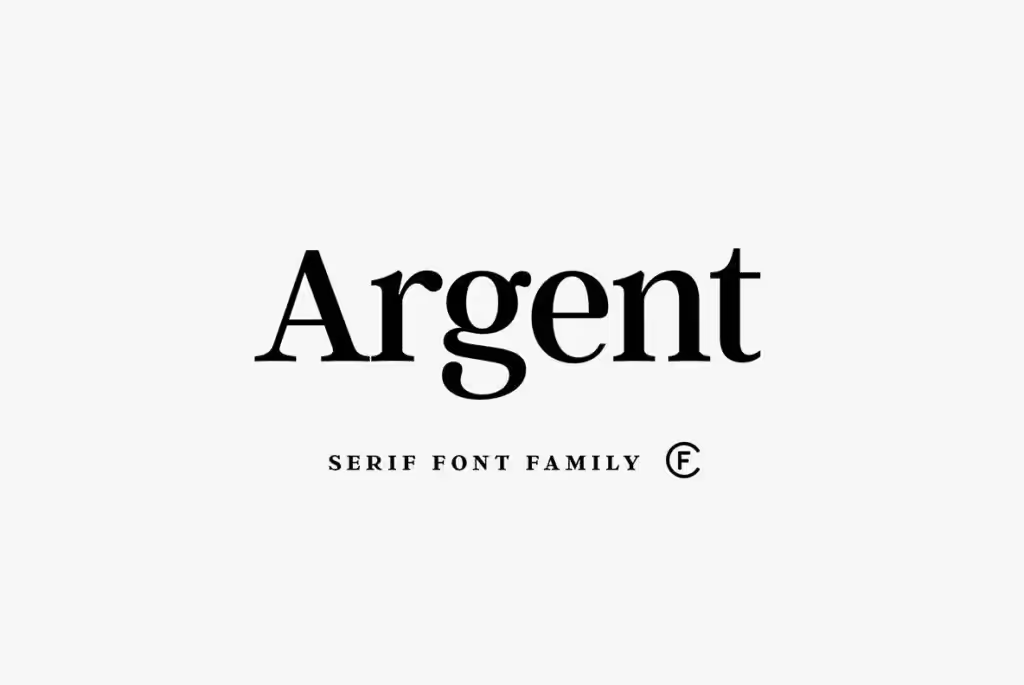
Argent
This is a serif font that looks both classic and modern at the same time. It can be used for branding, headlines, and logos. You can use an italicized, bolded, or superbolded version.
Coccina
This is another type of serif font that combines simplicity and elegance. It can be used for both headlines and body text. It has great-looking upper and lowercase characters with smooth curves that make it look elegant and professional.
Helvetica
This is one of the most versatile sans-serif font options that you can use. It has a neutrality that allows it to be used regardless of the industry or product line. This makes it a safe font to use, so if you’re not sure about your options, choose this one.
Impact
This is another popular option among sans-serif fonts. It has a classic look that can also exude a powerful vibe if placed in the right place. It’s great for headings because it can capture the attention of readers easily. It’s not ideal for body text because the spacing of the typeface makes readability difficult.
Macaria
If you’re looking for a modern sans-serif font, Macaria is the right one for you. This looks very smooth, with a bit of a curve that can pass off as playful. This is a great blend of simplicity and creativity in your brochure design.
Pacifico
This is one of the script fonts that are fun to look at. This looks like handwriting that can make your brochure feel personalized. The handwritten-like strokes for uppercase and lowercase letters can easily make the text stand out, so it might be best to reserve this for highlighted text or headings.
Pontiac
The rounded style of this sans-serif font has a certain geometric feel to it. This is great as a display font for headlines and brand logos. It can look playful from certain angles with a retro vibe. This also blends well with various typefaces.
Raleway
This is a great option if you want a modern sans-serif typeface. This elegant font has a clean and simple form. When used the right way, these can work well with traditional fonts to give your brochure a modern look.
Trajan
This looks like a Roman serif font with the way the thickness of the lines alternates with each other. This is best for large texts like headings or branding. The unique look can make your brochure stand out, and it’s also very easy to read.
Verdana
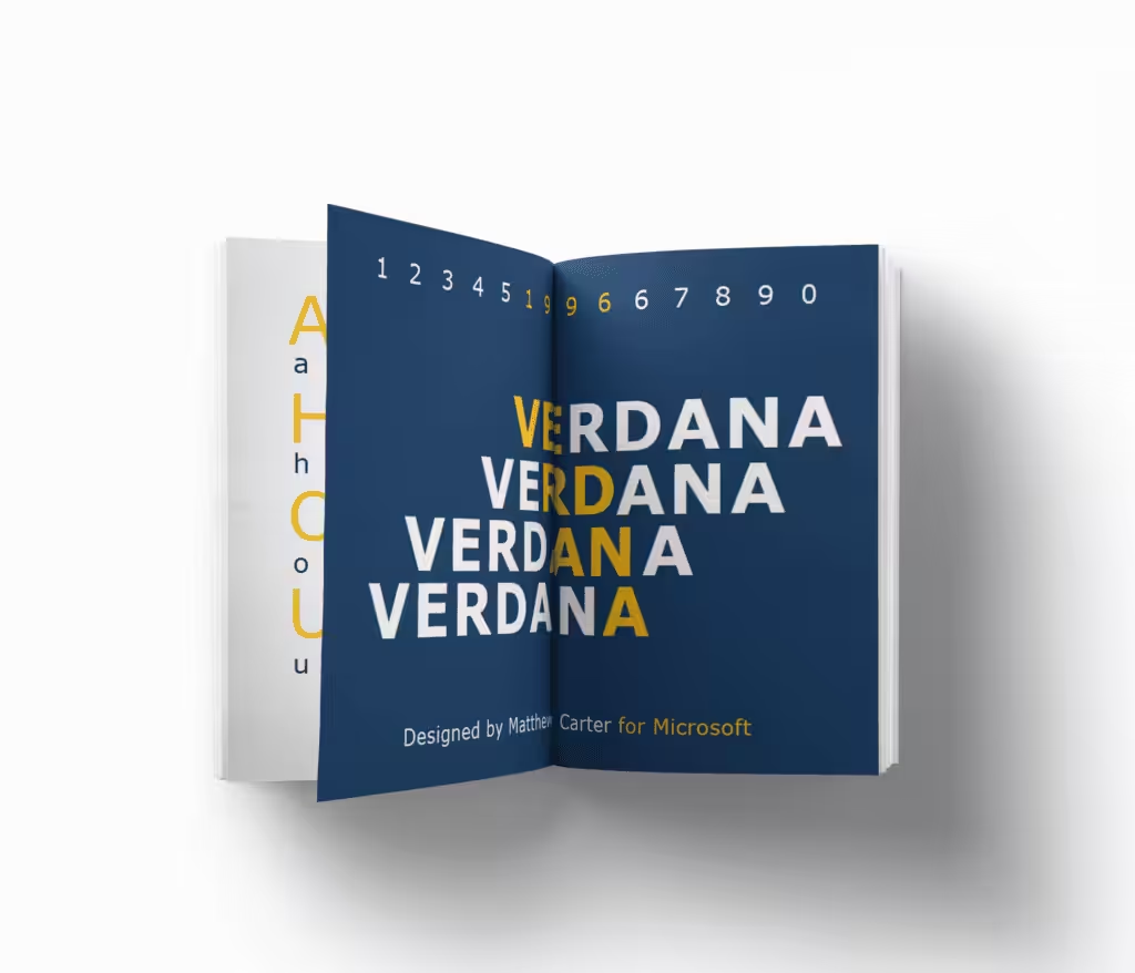
This rounded sans-serif font is very legible and easy to read, but it requires a bit of space in your brochure. So if you’re not planning on adding a lot of text, this is a great typeface to use. At the same time, the thin lines of the typeface increase readability despite being in large blocks of text.
Conclusion
Choosing the right font for your brochure is more than just a design choice—it directly influences readability, brand perception, and overall impact.
Whether you aim for elegance, simplicity, or uniqueness, selecting the appropriate typeface ensures your message is delivered effectively.
By considering factors like purpose, readability, and typographic hierarchy, you can craft visually appealing brochures that capture your audience’s attention.
Let’s Plan a Brochure with the Best-Looking Fonts. Packoi Printing Can Help with Professional-Looking Brochures.
Finding the perfect font becomes easy as long as you know what you want your brochure to look like. Start by identifying the purpose of the marketing material so you can search for the right characteristics that your typeface should have.
If you need help identifying the right fonts to use, get in touch with Packoi Printing. We have a design team who can guide you in choosing the options that will make your brochure stand out.
Contact us today so we can discuss your plans. We’ll get back to you with a quote soon.