According to one study published on Techsling.com, brochures delivered at home usually stay in the house for approximately 38 days. What’s more, 23% of them get circulated among family members.
This is why the printed version is the more effective brochure design compared to other marketing strategies, specifically digital brochures. It can gain momentum over time. It’s not like digital brochures, which only have a fleeting influence on customers.
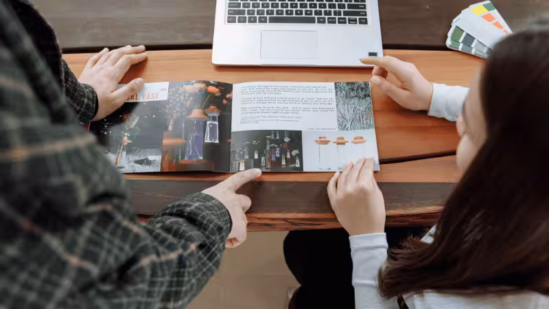
In this article, you’ll learn about the essential characteristics of an effective brochure. This will be helpful while creating content for your brochure so it can increase sales and grow your brand’s reputation.
5 Tasks of Brochure Marketing
Before getting into the characteristics of effective brochures, it’s crucial to understand the purpose of this marketing tool.
What should your brochure’s design and content accomplish? Create a list to identify what these are. This will guide you in choosing the right content that should be included in your brochure.
Remember, this marketing material won’t have as much space and page count as a catalog. You have to choose the right elements that can push your market to buy from you.
Whatever design you choose for your brochure, make sure it fulfills the following tasks:
1. To Inform
What is the vital information that your target audience needs so they’ll decide to buy from your brand?
There’s no need to give complete details about your brand. You only want to include relevant information to get potential customers interested in your brand and product. Focus on how they can benefit from your offer.
Use the limited space of the brochure to explain how you’ve created the perfect solution to their pain points. If you sell food products like dried fruits, your brochure can provide information about their nutritional benefits. Or you can give instructions on how to add it to salads.
Providing ideas on how customers can use the product will help convince them to buy it.
2. To Introduce
If you have a new product, service, or event that you want to announce, a brochure is one of the perfect marketing materials that you can use. Your loyal customers can rely on these to inform them of the new additions to your brand’s offer.
Product brochures can also attract potential customers and get them to buy from you for the first time. This is why you have to be careful with what you choose to put in your content.
Don’t overload the customers with information. It has to give a clear message, and the information presented should be on the first few pages.
That way, the customer will immediately know that the brochure should be read from cover to cover.
3. To Persuade
Don’t forget that brochures are promotional materials. They’re meant to entice readers to buy your offer. This is why your brochure design should be poised to persuade customers to respond to your call to action.
Whether it’s to give you a call, buy the product, or avail of your service, it doesn’t matter. Your content should convince the reader that they need you.
Whatever pain point or issue they may be suffering from, you can provide the relief they need to get rid of it.
This is why your brochure shouldn’t just focus on the product details. It has to emphasize the benefits that your customers will get. It has to make your offer a necessity so they won’t have doubts about their buying decisions.

4. To Highlight
How do you get the reader’s attention with your brochure? Highlight the right words and phrases that address their pain. For instance, your product is laundry detergent. Your brochure can highlight how stains are a huge headache for parents with overly active kids.
Use an image of a parent looking stressed because their kids are wearing dirty clothing. If that’s what you highlight, it’ll catch the attention of people who go through the same frustration.
Once you’ve captured their interest, that’s when you can discuss the important elements of your product or service that the customer won’t find anywhere else.
It doesn’t have to be all the relevant information. Just give them enough proof that you can help solve their problems.
5. To Represent
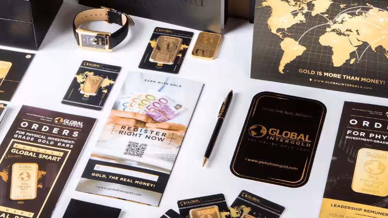
An effective brochure design should represent the brand properly. The first step is to put your branding elements in it. That includes your brand name, logo, and even the company behind your brand.
But apart from that, the content should reflect the overall message of your brand. For example, Shell released a series of marketing materials that discussed typical car issues. They focused on how people could solve these issues.
Although the material didn’t directly advertise products, it helped Shell build a reputation as a trustworthy source of information for vehicle owners.
That’s a great strategy for your brochure. Use it to build the right perception of your brand. Position yourself in a way that’ll make people respect what your brand represents.
7 Must-Have Characteristics of a Powerful Brochure Design
Now that you understand what a successful brochure should look like, it’s time to break down how you can do it. When you’re creating your own best brochure design, it’s important to realize that you don’t need to cram a lot of information into it.
That won’t be possible because brochures have limited space. Not only that, you don’t want customers to give up reading the material because they feel overloaded with information.
So to ensure that you’re providing the right kind of content, here are the must-have characteristics that your brochure should have:
1. Customer-Centric Approach
Start by thinking about your target audience. They are the ones that you have to impress with your brochure design. What do you think is the message that’ll resonate with your ideal market?
Earlier, it was mentioned that an effective way to capture the readers’ attention is to discuss their pain points. The only way you can identify that is if you know what goes on in the minds of your target market.
What is it that they struggle with? This pain should be something that they want to solve as soon as possible.
Tailor your content to show that you understand what the customer is struggling with and that you have a solution to it. This won’t just help them make a buying decision in your favor.
It’ll also convince them that you’re an expert and they can trust you to help them. Make sure your tone and style reflect the language that they communicate with.
- Quick Example: A fitness center’s brochure that says “Get Fit Fast!” vs. “Finally, a workout plan that fits your busy schedule.” The second approach directly addresses the target audience’s main struggle—lack of time—making it immediately more relatable.
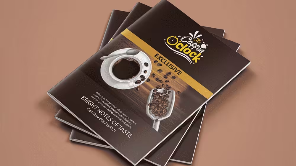
2. Craft an Eye-Catching Cover Design
Your cover design is your single most important opportunity to make a first impression. It must instantly hook both potential and existing customers, compelling them to open the brochure. An effective cover strategically combines three essential design elements:
- Your Brand Logo: For instant recognition and to reinforce your brand identity.
- A Compelling Headline: Use bold typography to clearly state the brochure’s purpose or main value proposition.
- One Striking Image: This single visual sets the tone for the entire brochure. It’s the hook that piques curiosity and promises value inside.
Real-World Comparison:
- Weak Cover: Generic stock photo + “Our Services” headline
- Strong Cover: High-quality product photography showing your actual work + “Transform Your Space in 7 Days” headline + prominent logo placement
This approach ensures brand consistency from the very first glance.
3. Compelling Headlines
This doesn’t just refer to the headline on the cover. It also includes all the headlines and subheadings in the brochure design.
A well-designed brochure should convince readers to go from cover to cover. The headings in the material will give customers a reason to keep turning to the next page. It’ll guide the readers and give them clues to what they’ll see if they read the brochure.
The headings will also prove useful for readers who are in a hurry. With a glance, the headings should inform your audience if the printed material contains the information they want to know.
Headline Contrast:
- Weak: “Our Features”
- Strong: “3 Ways We Save You Time & Money”
The second version promises specific value and gives readers a clear reason to keep reading, especially effective in tri fold templates where each panel needs to pull readers forward.
4. Brief Yet Clear Messaging
Although your brochure design requires artistic skills, it’s also important to realize that the primary purpose of this marketing tool is to convey a business message.
It could be to announce a new product, service, or event. It could even be to educate customers about issues that you can solve.
All these should point to one clear message: you are the solution to the problems of your target audience. Find a way to convey this simple message.
It has to be clear and to the point. Don’t use language that only you can understand. If you confuse your readers, they might not get your message. That could lead them to lose interest in your brand.
- Message Clarity Example: Instead of “We provide comprehensive solutions,” try “We handle your bookkeeping so you can focus on growing your business.” The second version is specific, benefit-focused, and immediately clear—essential whether you’re using simple bi-fold or complex creative brochure examples.
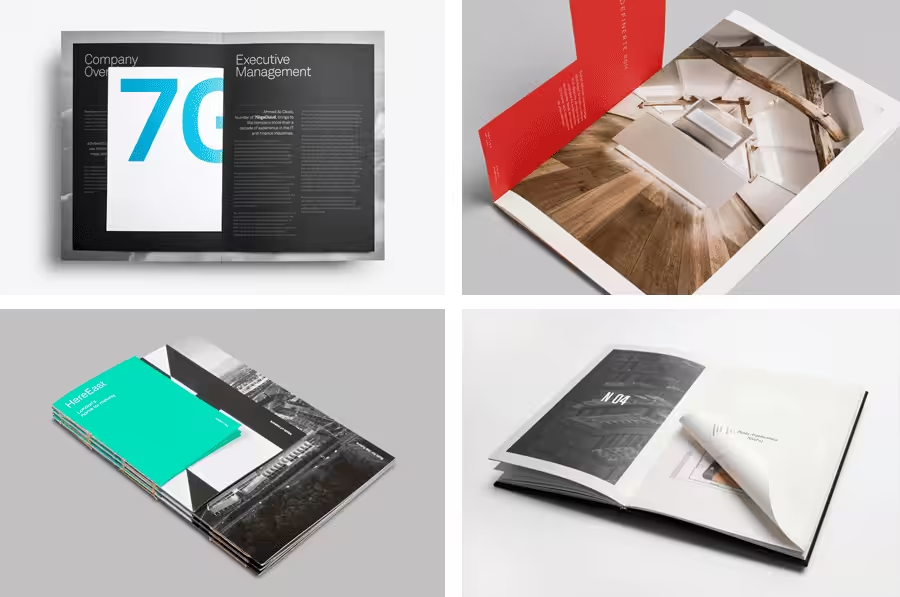
5. Build a Cohesive Visual Style with Imagery and Layout
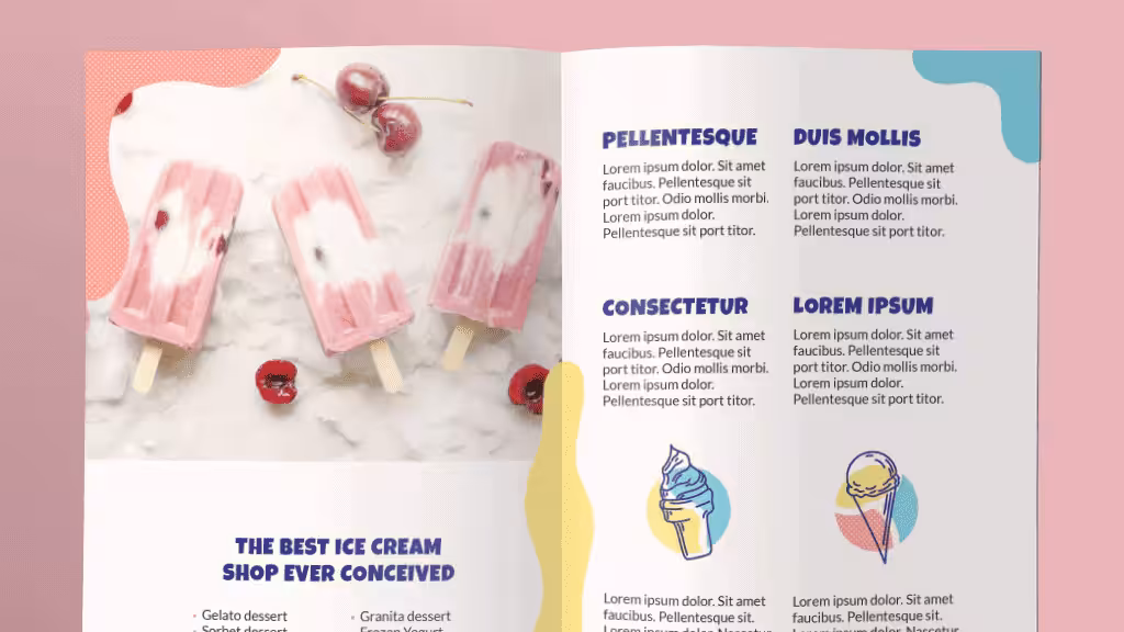
While the cover gets them to pick it up, the internal design determines if they keep reading. Your goal is to add visual interest throughout the entire brochure, creating a seamless experience that reinforces your key messages.
This is where you must use high-quality images. Pixelated or generic photos suggest a lack of professionalism. In contrast, crisp, vivid imagery does more than just fill space—it helps show customers what type of brand you are: premium, reliable, and attentive to detail.
Beyond the images, a truly professional layout harmonizes several key design elements:
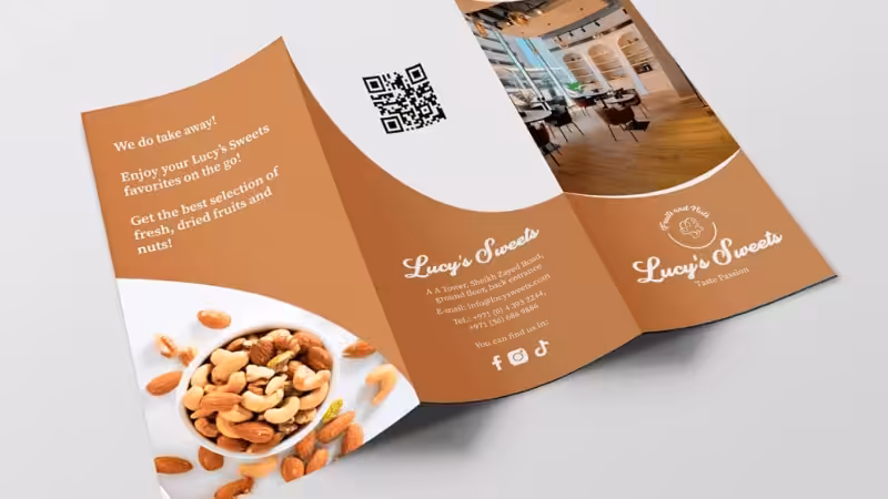
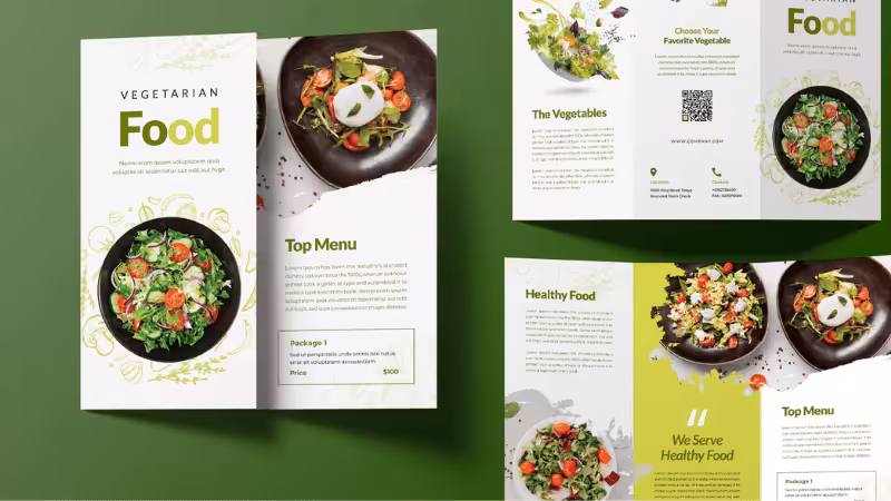
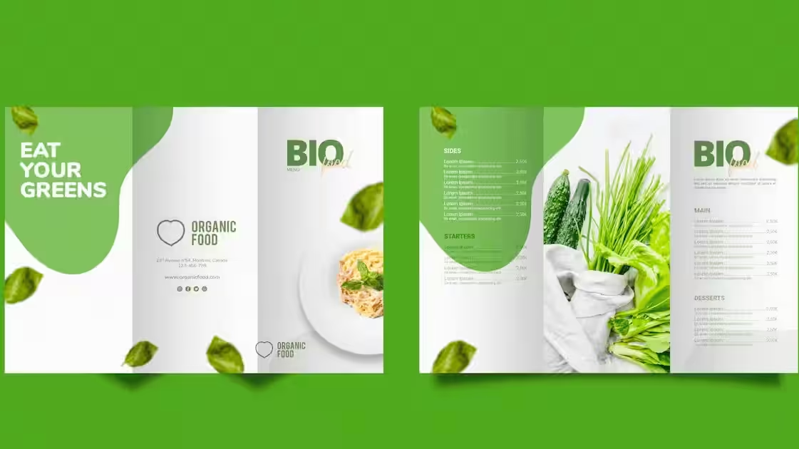
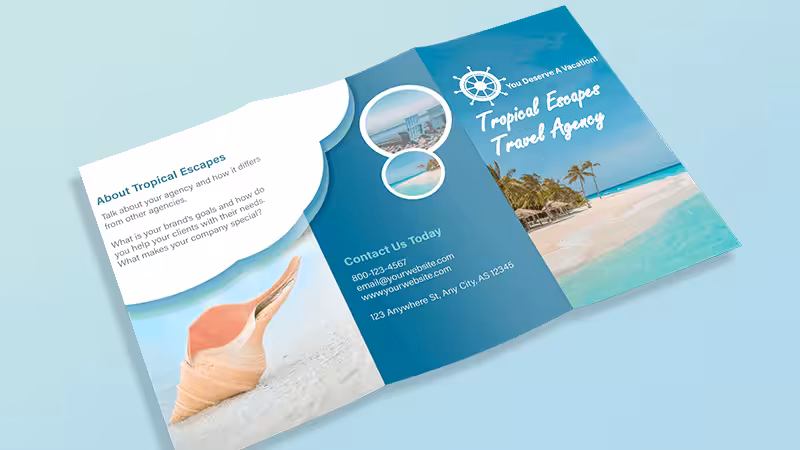
How to choose between bi-fold, tri-fold, and Z-fold brochures?
- Bi-fold: Best for simple messages and large visuals
- Tri-fold: Ideal for step-by-step information or storytelling
- Z-fold: Perfect for dramatic reveals or before/after comparisons
The way the paper is folded dictates how you organize information and guide the reader’s journey. Maintain brand consistency by using the same visual style across all panels for a unified look.
Layout and Space:
- Whether you choose a complex or a simple layout, always prioritize providing ample space (white space). It gives the reader’s eyes a rest and makes it easier for them to scan the content and avoid information overload. A balanced layout feels professional and can strategically highlight your key messages.
Strategic Color Scheme:
- Colors are powerful enough to influence 90% of a customer’s impression. Research basic color psychology to pick a color scheme that matches your brand’s emotion. Use bright colors to highlight calls-to-action, ensuring the overall visual style is cohesive. For more inspiration, you can also research current trends in brochure printing to see what resonates with modern audiences.
Readable and Evocative Typography:
The right font affects the visual appeal and sets the mood. Rounded fonts feel friendly and approachable, while serif fonts like Times New Roman feel serious and professional. Using the perfect font helps stir the right emotions, making it easier for customers to respond to your call to action.
6. Strong Call-To-Action
Don’t forget that the ultimate purpose of your brochure design is to persuade your customers to buy from you.
Whether the content provides direct information about your offer or an educational piece about the customer’s problems, the whole idea is to convince them to patronize your brand.
Give them a clear and simple-to-follow CTA to make this happen. Your call to action should allow them to immediately act, so they don’t postpone the urge to buy from you.
If you can make your customers act on the CTA, that’ll make your brochure a very powerful marketing tool.
CTA Examples:
- Weak: “Contact us for more information”
- Strong: “Schedule your free 15-minute consultation today”
Position your CTA where it naturally fits the paper folded flow—often the final panel or back cover works best for maximum impact.
7. Complete Contact Details
Apart from the call-to-action, your brochure design should also include your contact details. Sometimes, readers want to know more about the information that they got from your brochure. They won’t take the next step until their questions have been answered.
Make it easy for them to find the answers they need. Give your contact data, which includes your website, address, email, and phone number. A link to your FAQ section is also advised.
If you provide your phone number, ensure that someone is on standby to provide answers. Or you should instruct the readers that the number is ideal to use during specific times of the day. That way, customers will know when it’s the right time to call.
- Contact Section Best Practice: Create a dedicated “Get In Touch” section with contrasting colors to make it easily scannable. Include multiple contact methods since different customers prefer different communication channels—some want to call immediately, others prefer to visit your website first.
Final Steps: Preparing Your Design for Brochure Printing
Once your design is complete, the next phase is brochure printing. This is a critical stage where technical details determine whether your digital file translates flawlessly into a high-quality final product. Here are the essential pre-press checks:
- Set the Correct Color Mode (CMYK): Screens display color in RGB, but professional printers use CMYK. Convert your design file to CMYK to ensure the printed colors match what you see on screen as closely as possible.
- Use High-Resolution Images (300 DPI): For crisp, clear printing, all your relevant images must have a resolution of at least 300 DPI (Dots Per Inch) at their final print size. Anything lower will appear pixelated and unprofessional.
- Include Bleed and Trim Marks: “Bleed” prevents ugly white borders if the cutting machine is slightly off. Your printer will also need trim marks to know exactly where to cut.
- Choose the Right Paper: The feel of the paper is part of the experience. A glossy finish makes bright colors pop. A matte finish feels more sophisticated. The paper’s weight also signals quality. Discuss options with your printer to match your brand identity.
Budget Considerations: Investing in Perception
While your end-customer won’t see the price tag, your budget decisions directly shape their perception of your brand. A well-planned budget is an investment in quality and trust. This table shows how different cost factors translate into the final customer experience.
| Item | Key Factors | Impact on Customer Perception |
|---|---|---|
| Design | Professional Designer vs. Template | Professionalism & Uniqueness vs. A generic, low-budget feel. |
| Copywriting | Professional Copywriter vs. In-House | Persuasive Power & Brand Voice vs. Potentially flat or unprofessional messaging. |
| Imagery | Custom Photography vs. Stock Photos | Authenticity & Exclusivity vs. May look generic or be seen on a competitor's site. |
| Printing | Quantity, Paper Quality, Size | Perceived Quality & Credibility. (e.g., heavy paper stock feels more substantial and trustworthy). |
| Finishing | UV Coating, Foil Stamping, Embossing | A Premium Feel & Memorability. (Special finishes make the brochure stand out and feel valuable). |
FAQs
Q1: How many words should I include in my brochure?
Keep it concise—aim for 150-300 words total for a tri-fold brochure. Use short paragraphs, bullet points, and focus on key benefits rather than telling your complete story. Remember, your brochure should spark interest and drive action, not overwhelm readers.
Q2: What is the most common mistake when designing brochures?
The biggest mistake is cramming too much information into limited space, creating cluttered designs that overwhelm readers. Many businesses also use low-quality images or too many different fonts. Focus on one clear message and ensure every element guides readers toward your main goal.
Q3: What should I write in my brochure copy to get customers to take action?
Start with a headline that addresses your customer’s main problem, then use 3-5 bullet points highlighting benefits (not features). Include specific numbers like “Save 30% in 60 days” rather than vague promises. End with urgent, action-oriented language like “Call today for your free consultation.”
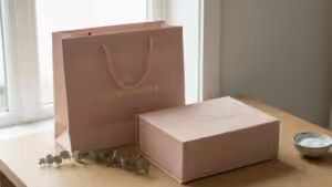
Q4: Can I create custom brochure packaging to make my marketing materials stand out?
Yes—custom packaging like branded envelopes, sleeves, or presentation folders can significantly boost your brochure’s perceived value. These coordinated materials create a premium first impression before recipients even read your content. Professional packaging services can design complete marketing systems that reinforce your brand identity.
Conclusion
An effective brochure design is a strategic marketing tool that builds brand awareness and customer trust.
By mastering the entire design process, from the first glance and body text to the final brochure feel, you can create brochures that leave a lasting impression. Use these principles to spark your own brochure design ideas and achieve powerful results.
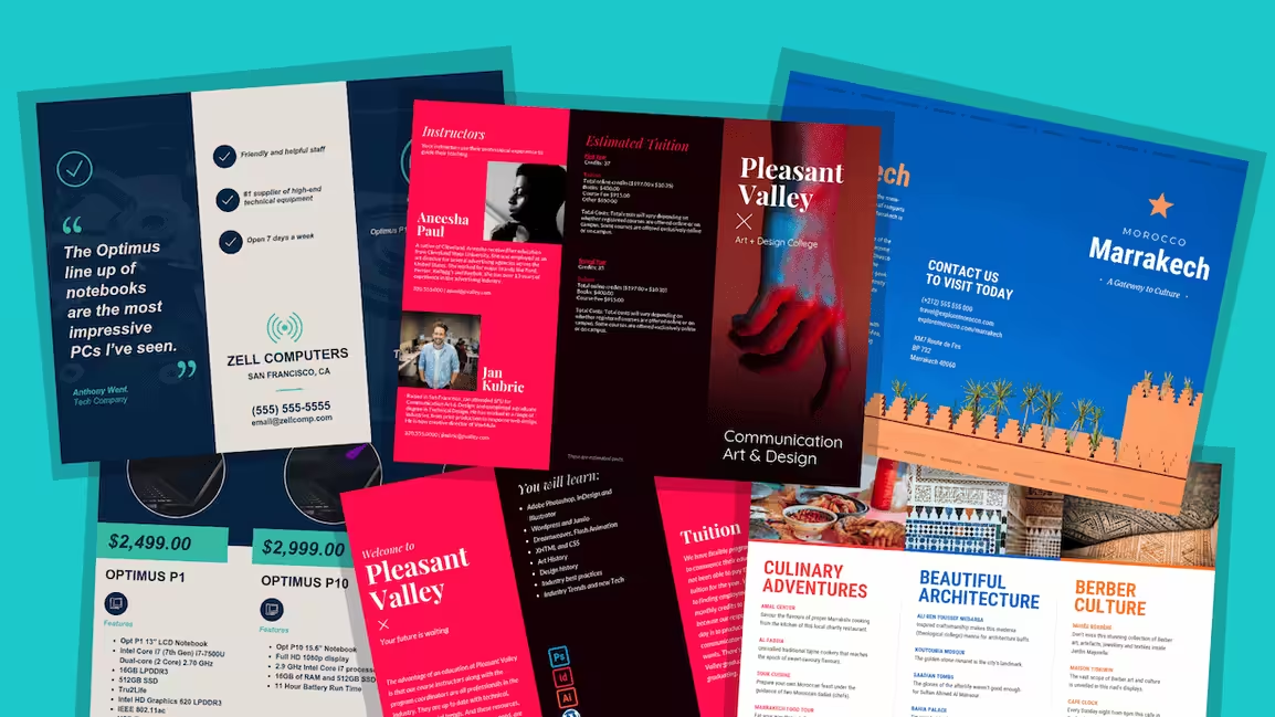
Packoi Printing Has Several Brochure Examples You Can Choose From.
Are you ready to create an effective brochure? Make sure it has the right content so it can help pass along the right message to your customers. The content will set the level of interest that your target market will have in your brand.
If you want to know more about brochures, Packoi Printing is here to help. We have a lot of brochure examples that you can access and take inspiration from.
Contact us today so we can talk about your ideas. We’ll get back to you with a fair quote as soon as we can.