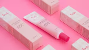
In the beauty and skincare industry, brochure design is more than creating simple flyers—they are your silent salespeople. Cosmetic products are very personal. Even the texture of your paper can affect whether a customer trusts your formula on their skin.A great brochure design is both a visual and tactile experience.
Use premium materials and a thoughtful layout. It instantly elevates your brand, showcases your product’s quality, and gives customers a real reason to buy.
If done correctly, this can create a great opportunity for you to increase your sales. A well-designed brochure allows you to communicate the features of your products and brand – specifically the ones that make you stand out.
In this article, you’ll learn effective design tips for creating an effective cosmetic brochure that won’t just drive sales but will build brand awareness as well.
The Role of Printed Marketing Materials in the Beauty Industry
Product brochures provide a tangible and visual communication medium that customers can use to conveniently browse cosmetic products. It provides relevant information that the target audience can use to make a buying decision.
The more information is provided, the more confident potential clients are in making a satisfactory decision about cosmetic products.
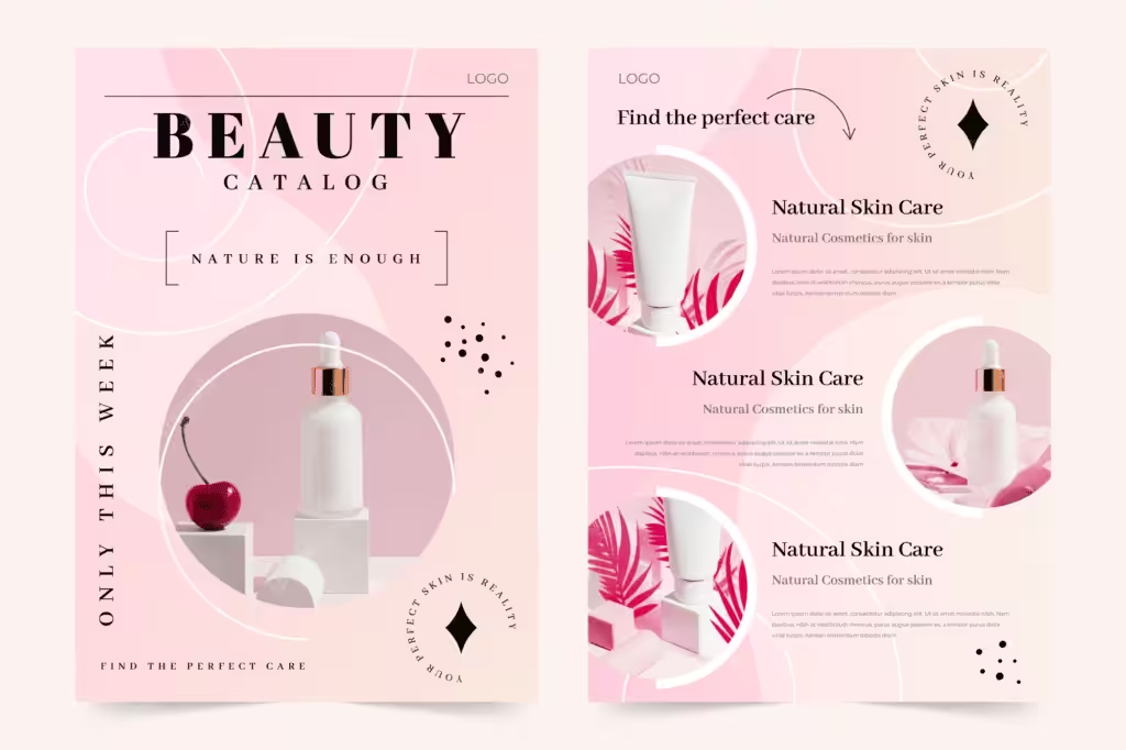
Although there are other marketing materials that you can create to promote your beauty products, brochures continue to display efficiency in improving product recall, specifically when comparing their visual communication capabilities to digital marketing tools.
A marketing test published on Postcardmania.com revealed that participants showed 70% higher recall for direct mail printed materials (including brochures) compared to digital ads. Not only that, printed materials like brochures can hold the customer’s attention 118% longer.
In another study by Marketing Sherpa, it was revealed that more than 8 out of 10 respondents put more trust in printed materials rather than digital ads.
This proves the power of a great brochure design. It can help build your brand identity while creating new business for your beauty products.
10 Must-Have Elements in Cosmetic Brochures
Incorporating the right elements in your brochure design is crucial to making it an effective marketing tool. It’s the key to catching the reader’s attention and conveying the brand message that you want to deliver.
There are 10 must-have elements that you should consider as you make plans to design your beauty products brochures.
1. Vivid Product Images
One of the most important elements in your brochure design is the product images. Remember, customers are visual buyers. If they can’t see the actual beauty products, you need to give them the next best thing: photos.
This is why you have to invest in great images of your cosmetics. Using stock images isn’t advised. It’s okay to use stock photos for the lifestyle shots of your brochure. It’ll save you from having to pay for actual models. But it won’t work for your products.
For an effective brochure design, your customer has to see the actual product for themselves. So you should give them a photo worth looking at.
The product should be photographed with the right lighting to ensure that the colors in the photo are as accurate as the real thing. Edit it to make it look more vivid and enticing.
Once you have these images ready, you can start creating your brochure. If the target market likes what they see, you’re one step closer to convincing them to buy the product.
2. Product Benefits and Special Features
If the product visuals impress your customers, the next thing that they’ll look at will be the features. The brochure design should articulate both the benefits of using the products and the special features that make them unique.
If you use natural or organic ingredients, mention them. If there are long-lasting formulas unique to your brand, make sure you indicate this in your product description.
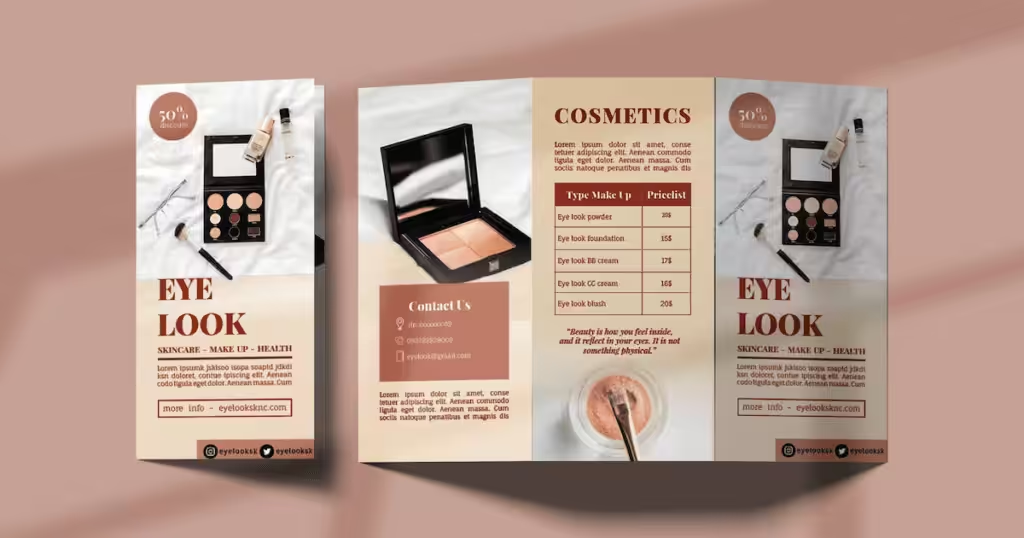
You should also include the benefits that the customer will enjoy if they use your product. Whether it’s protection from the Sun, better skin complexion, or removal of blemishes, all these should be highlighted in the brochure design.
These are unique selling points that should be included in your product brochures. This information will help your brand stand out. If the customer likes the information about your product, they’ll decide to buy it.
Move beyond basic descriptions. To make your beauty brochure truly convert, focus on these four key elements that build trust and drive action:
Hero Ingredients & Science – Today’s consumers know their ingredients. Highlight the key activities and briefly explain how they work to show your expertise.
Visual Persuasion – Proof matters. Use authentic Before & After photos for skincare and real-skin swatches for color cosmetics to show results and true colors.
The Ritual (How to Use) – Turn your product into an experience. Provide clear, step-by-step instructions to guide use and encourage complementary purchases.
Trust Badges – Use icons like “Cruelty-Free,” “Vegan,” or “Dermatologist Tested.” They quickly reassure customers. They boost confidence.
3. Before and After Photos
How can you prove to your potential customers that your cosmetic products will work? Give them before and after photos. This is ideal for skincare and makeup products.
If your product is skincare, you can include before-and-after photos showing the improvement in your model’s skin.
Or, if it’s for acne removal, make your brochure design show photos to prove that your claims are valid.
For makeup products, put a beauty shot of a model showing a clean face and one that has makeup on. Seeing the improvement in their looks will give customers an idea of what they can expect once they use the product.
4. Color Samples or Swatches
Showing the color variants of your products is also another piece of information that should be added to your brochure design.
For example, makeup products usually come in different variants for different skin colors. Show how the makeup product will look when applied to various skin colors. This is true for concealers, eye shadow palettes, lipstick, etc.
Even nail polish should indicate the color swatches. That way, your customers can choose the best color that they’ll purchase.
5. Complete List of Ingredients
This is an important part of your brochure design. The list of ingredients isn’t just to impress the customers with your product.
It’s also to ensure that your product is safe for customers to use. Being clear with the ingredients will help people avoid any products that could cause allergic reactions. In most countries, authorities require companies to be upfront with any ingredients that usually cause allergies.
This includes nuts, berries, fruity fragrances, and preservatives. There are also ingredients like parabens, phenoxyethanol, and formaldehyde that are linked to causing skin allergies.
Apart from allergies, some customers prefer organic and all-natural ingredients. By being transparent with the ingredients and components used in your cosmetic products, you give customers the ability to protect themselves from harm.
6. Clear Instructions to Use
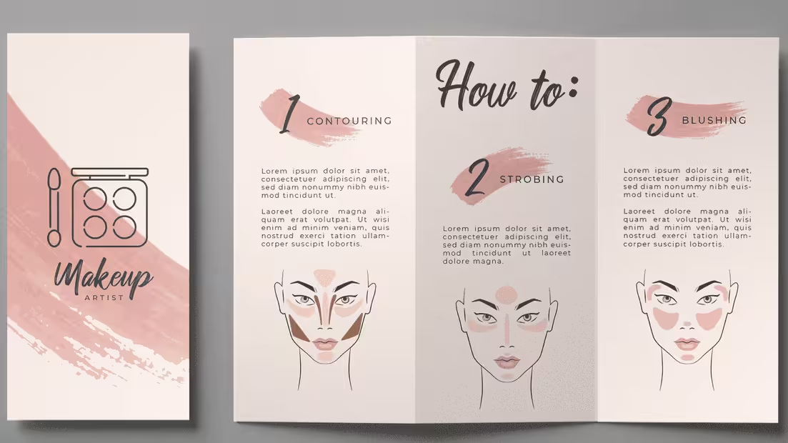
Providing clear instructions to use products is also something you can add. While this is typically found in the beauty product’s packaging, you can also include this in your brochure design.
Why? Because no matter how effective your products are, if the customer doesn’t use them correctly, they won’t get the full benefits. This will lead to disappointment. It’ll also make them think that your claims aren’t true. It could ruin your brand’s reputation – all because there was a miscommunication in the product’s usage instructions.
But that’s not all. This will help customers decide if they can follow through with the instructions. If something takes too long to apply or use, some customers might decide not to use it.
Be upfront and transparent with how your product should be applied or used. Give clear step-by-step guidelines. Storage instructions should also be included.
7. Industry Certifications
This may not apply to all products. But if your product uses color additives or uses ingredients that cause allergic reactions, you have to check if you need to get industry certifications.
This is sometimes a strict requirement by authorities. If you fail to comply, it might cause problems for your business in the future.
But that isn’t the only reason why you should include this in your brochure design. It’s also a way to establish trust with potential customers.
Once they see that you are industry certified, they’ll know that you comply with industry standards. They’ll trust the quality of your product. This is a great way to increase customer loyalty while improving your brand reputation.
8. Product Packaging Design
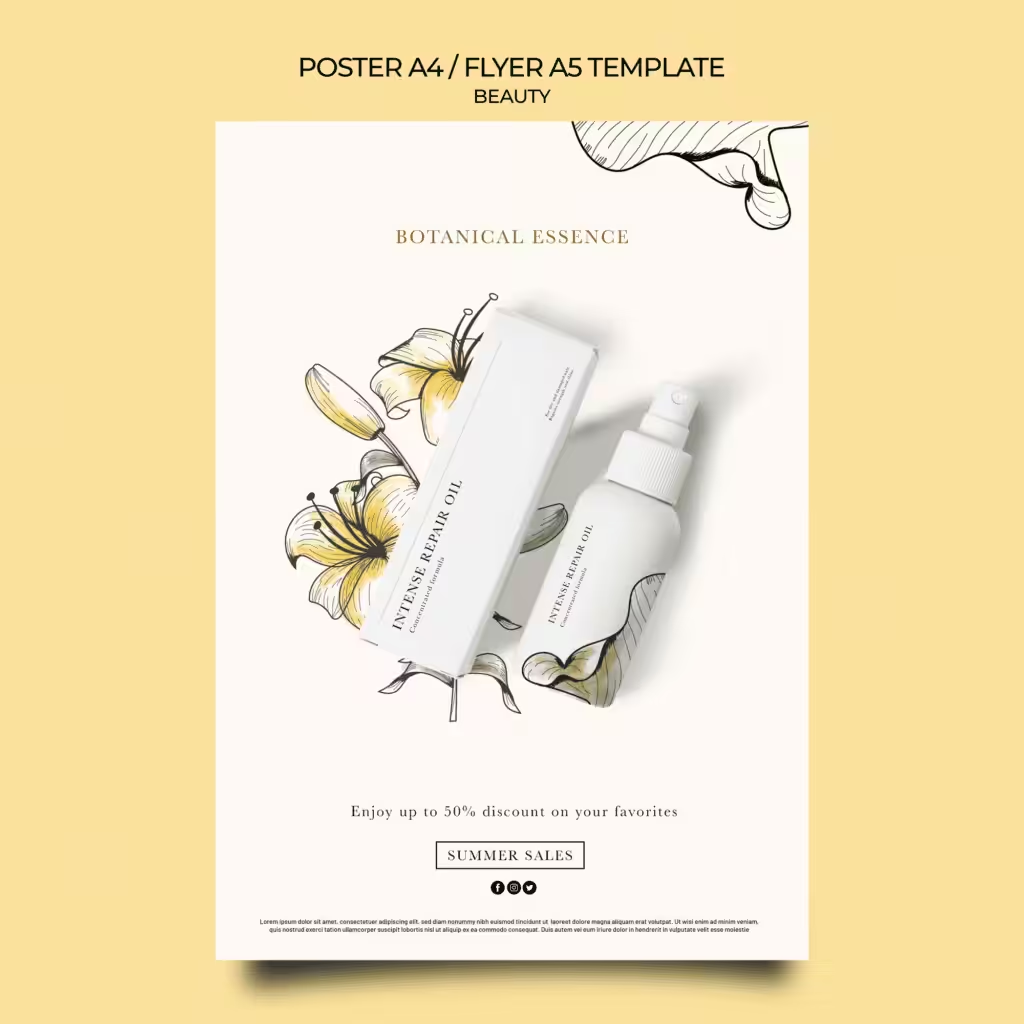
If your cosmetic packaging is unique and well-designed, flaunt it in your brochure. When you take product shots, include the box packaging behind it. Or you can feature it separately.
Showing the innovative packaging of your products can add to the excitement that customers will see when they look at your brochure. This is especially true if you’re releasing limited-edition packaging.
Highlight it in your brochure design so it encourages customers to buy the product just so they can get their hands on your packaging.
This is a great marketing strategy that can increase your sales. It’ll make customers curious enough to want to acquire both the product and packaging.
Not only that, but this will also help customers identify your product when they go to retail stores. There will be familiarity when they see it displayed.
9. Customer Reviews and Testimonials
Do you know what’s powerful enough to convert potential customers into paying ones? Reviews and testimonials from past customers. Specifically, those who were satisfied with your product.
Usually, customers look at reviews before they decide to buy a product. They want to know about actual experiences that people have after using your product.
By adding this to your brochure design, you’re making it easy for customers to make a buying decision in your favor. Instead of having to research, they can look at the brochure to get the answers that they seek.
When choosing the reviews and testimonials that you’ll add, make sure you pick the realistic ones. While you want to focus on positive reviews, you don’t want customers to feel like you’re manipulating them.
This doesn’t have to take up a huge part of your brochure design. You only need a page or even half a page in your brochure. Or you can include a text bubble beside selected products that you think need a push to sell more.
Adding the feedback would make readers feel more confident about making a purchase.
10. Contact Details and Online Presence
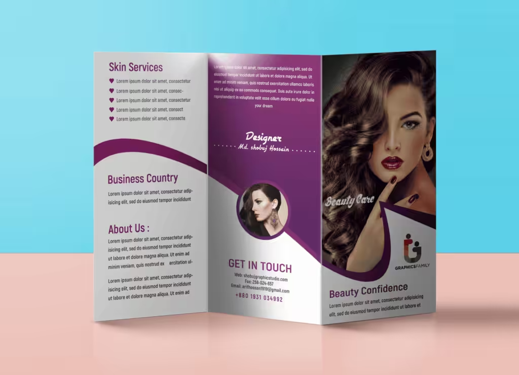
Finally, your brochure design should have your contact details, like your phone, email address, website, and even social media accounts.
These will give customers a platform where they can raise their questions and concerns. Sometimes, unanswered questions stop customers from taking that final step to buy your products.
Don’t let that happen by providing customers with a chance to interact with you. These platforms that you’ll include in the brochure design should encourage customers to engage with your brand even after they’ve purchased your product.
It’s a great way to open more doors of communication.
Step-by-Step Guide: Creating a Cosmetic Product Brochure
When designing product brochures, the goal is to grab attention and prevent them from being discarded. Create a front cover that entices customers to open it. Inside, use engaging product images and clear information to keep readers interested until the end. A well-designed brochure encourages customers to keep it for future reference.
Follow these 9 steps to customize your brochure template and create an effective cosmetic product brochure
Step 1: Define the Purpose and Objectives
What is the purpose of your new brochure design?
One purpose would be to promote a new line of products. Or it could be to highlight the products that fit the next season (e.g., spring, summer, autumn, winter). It could even be a generic list of all your products.
The answer to the question will give you direction. The objectives will define the brochure type that you’ll create for your brand. It’ll guide your design and content choices.
Step 2: Know Your Target Market
The next step is to understand who your target audience is. If you know your target market, you can easily identify their wants and needs. You can anticipate what they want to see in your brochure design.
Do they want a serious brochure? Or a fun one?
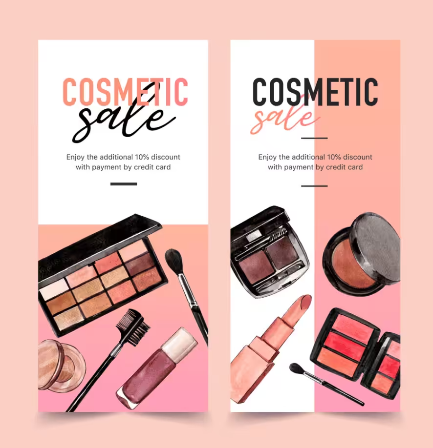
It’ll also help you choose the images that your potential customers can relate to. When they look at the images, they should be able to imagine that it’s them in the photos.
That’s a great technique to use in your brochure to encourage people to buy.
Step 3: Identify Your Unique Selling Point
Before you proceed with choosing the elements to put in your brochure design, think about your unique selling point first. You want to highlight this so you can make your brochure stand out.
Among the examples of a USP are an all-organic cosmetic product line or being against animal testing. Using innovative technology and following sustainable practices are among the USPs that you can use.
Highlight these throughout the brochure – specifically on the front cover. That way, people will know what makes your brand stand out against your competitors.
Step 4: Choose an Engaging Design
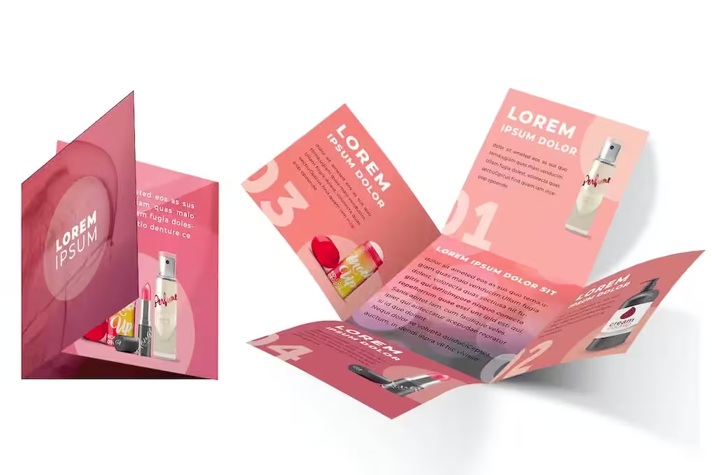
So far, the steps you’ve gone through will give you guidelines on how your brochure design should look. Now, it’s time to decide on what type of design you’ll use.
Don’t feel intimidated by the task just because you’re not artistic or creative. A well-designed brochure isn’t just visually appealing. It has to be engaging as well.
This means if you have a firm grasp of your brand identity, the target market’s preferences, and marketing objectives, you’ll have an idea of what to use to design your brochure. You can choose the colors, images, typography, and layout that’ll create the look that you want to be associated with your brand.
Step 5: Write an Informative Yet Concise Content
Cosmetic brochures are meant to convince people to buy your product. You can’t just do that by putting eye-catching photos. You also have to give customers enough information about the product. Not only that, but it should also reflect your brand message.
The challenge is figuring out how much content should be included in your brochure design. Find the balance between the text and the images.
For sure, the information should be enough to give the necessary details (especially those in compliance with industry standards like the ingredients, benefits, and usage instructions). But you have to keep it short. Use the right headings, bullet points, and be factual when it comes to descriptions.
Step 6: Categorize Your Product Line
Categorize the products in your brochure design so readers won’t have a hard time looking at what they want to see. If you sell makeup products, categorize the products into what can be used on the face, eyes, lips, etc.
Use images to serve as the breaker between categories. For instance, show a beauty shot of a model’s face, then list products that customers can use on their face, like foundation, blush, primer, face powder, concealer, bronzer, etc. Then, use a photo of heavily made-up eyes. This would introduce products like eye shadow, eyeliner, mascara, etc. Use a photo of luscious lips for lipstick, lip balm, lip tint, etc.
Step 7: Write an Easy-To-Follow CTA
The CTA or call-to-action is a must in all your marketing materials. Don’t make your customers feel so excited going through your brochure, only to find out that they don’t know how to follow through with their buying decision.
Your brochure design should end with a clear and easy-to-follow CTA. Keep it simple. Putting too many steps might make people change their minds about buying.
Make it easy for people to take action. Put a QR code instead of a link so readers can just scan it to visit your website. Or you can give the address and contact details of your retail store so they’ll be encouraged to drop by to buy your products.
Step 8: Partner with a Reputable Printing Company
All your amazing plans to create a brochure design would be for nothing if you partnered with the wrong printing company.
When you’re looking for a printing partner, ask about the printing techniques that they use. Ask them to show you samples of what they have done in the past. Inquire about the paper products they use. Where are these sourced? Is there a way to use recycled paper for your brochures?
Read through reviews and make sure the company is trustworthy before you sign with them.
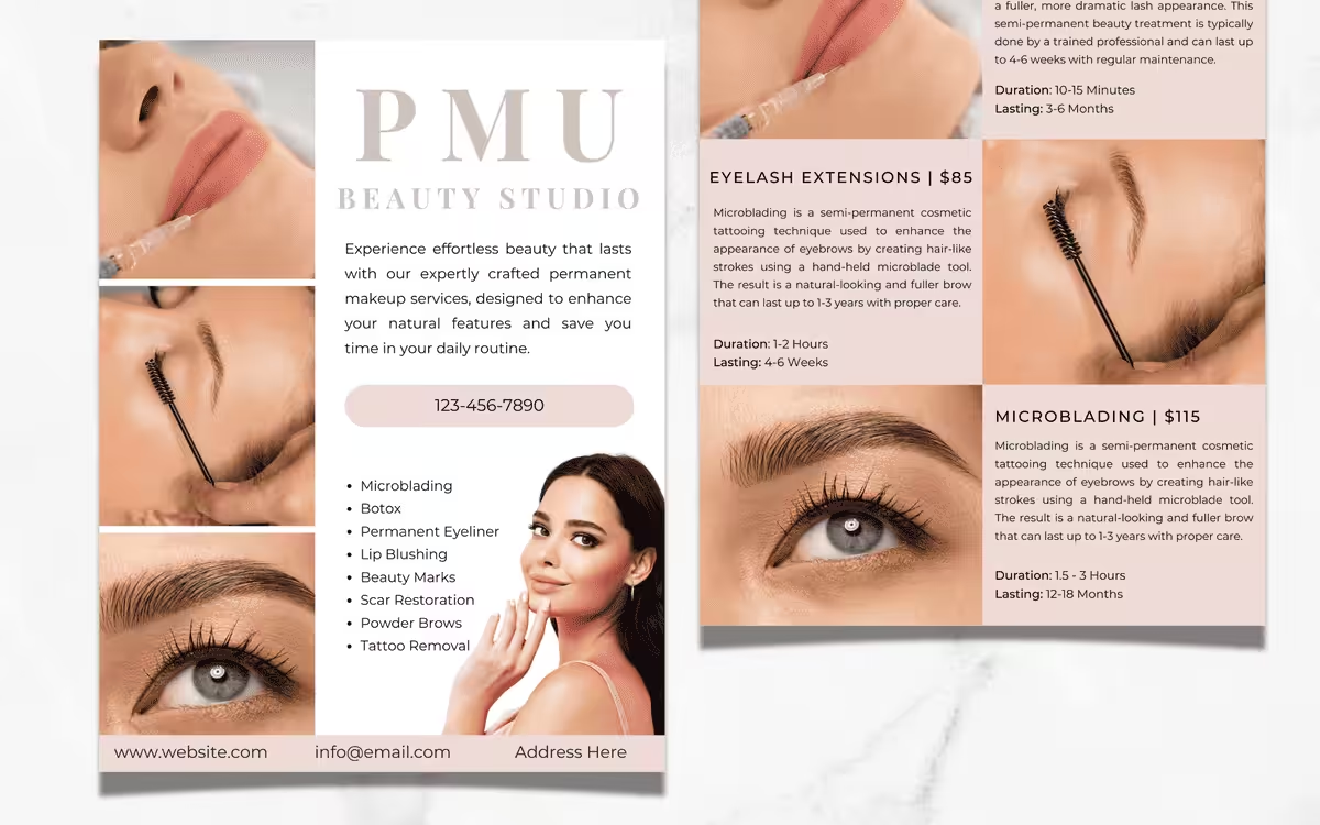
Step 9: Test the Brochure and Revise
Before you finalize the printing of the brochure, request a sample and test it with a select audience. Or you can create a mockup and show it to your colleagues.
Get feedback about the brochure design in terms of color, layout, images, content, typography, etc. If you can show samples from the printing company, ask people to comment on the paper finish, thickness, and size.
Check if the brochure can communicate your message effectively. Don’t hesitate to make changes if they are necessary.
Skincare vs. Color Cosmetics: Material Strategy Comparison
| Dimension | Skincare | Color Cosmetics (Make-up) |
|---|---|---|
| Core Visual Vibe | Minimalist with lots of white space and cool tones. Uses natural elements like plants and water for a healing feel. | (Typically vibrant, bold, and energetic.) |
| Paper / Printing Ideas | Use Uncoated Paper for a natural touch, or Matte / Soft-touch finishes for a premium feel. | Use Glossy Coated Paper to make colors pop and shine bright. |
| Brand Feel Conveyed | Feels natural, pure, and safe. Conveys a high-end, professional, clinical vibe. | Emphasizes vibrant colors and high pigmentation. Feels trendy, fashionable, and visually striking. |
| Key Content Focus | Highlight ingredient origins and close-ups of the texture. Show Before & After results and promise safety. | Display the full shade variety. Must include real Color Swatches showing pigment on skin, and close-ups of final looks. |
3 Popular Brochure Templates for the Beauty Industry
Brochure Template 1: Clean Beauty – Organic Skincare Brochure
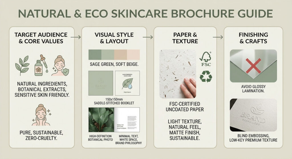
For skincare brands emphasizing natural ingredients, plant-based products, and sensitive skin. Use a modern square saddle-stitched booklet (e.g., 150x150mm). Cover: brand logo and a close-up of a plant or water droplet.
Inside: full-bleed nature images with minimal text on brand philosophy, “no-additives” promise, and key ingredients. Paper: FSC-certified uncoated textured or kraft paper for a natural, eco-friendly feel. Finish: blind embossing on the logo for a subtle, premium touch.
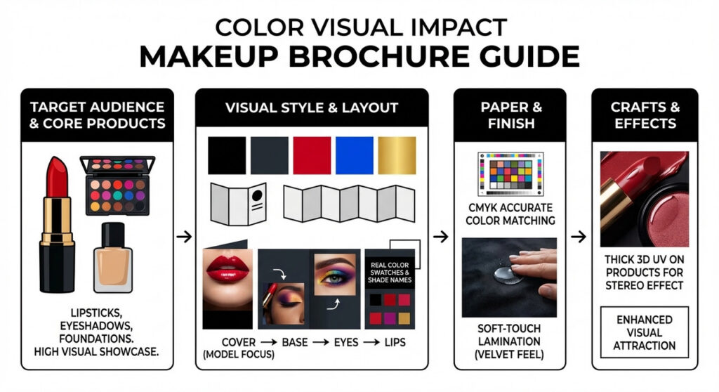
Brochure Template 2: “Visual Impact” Makeup Catalog
Targeting color-intensive products like lipsticks, eyeshadow palettes, and foundations.
Bold, high-contrast visuals with dark backgrounds highlight product colors. Use a tri-fold or Z-fold layout: cover features the season’s look, inner pages follow “Face → Eyes → Lips.” Include pages for realistic swatches with labeled shades.
Soft-touch lamination gives a velvet feel, and localized 3D UV enhances product images. Ensure colors match products with precise CMYK reproduction.
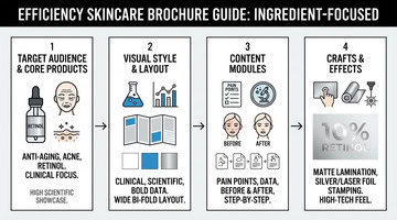
Brochure Template 3: “Ingredient-Focused” Skincare Brochure
Targeting skincare or cosmeceutical brands with anti-aging, acne, or patented ingredients like retinol and peptides. Visuals are clinical and data-driven (lab white, tech blue, silver).
Use a wide bi-fold layout for charts, ingredient diagrams, before-and-after images, and step-by-step guides. Large areas get matte lamination; logos or key ingredients (e.g., “10% Niacinamide”) can use silver or holographic foil to convey a high-tech, professional look.
FAQs
How do I choose the right printing materials and techniques for cosmetic brochures?
A: Choose paper based on your product type—glossy for makeup, matte or recycled for skincare. Add special touches like holographic foil or soft-touch finishes if it fits your brand. Work with a trusted printer, request samples, and test them with your target audience to finalize the best materials and techniques.
What types of cosmetic products are brochures best suited for?
Brochures work best for skincare and makeup products. Skincare items like serums, acne treatments, and peels benefit from clear usage instructions and ingredient details. Makeup collections, including foundations, lipsticks, and eyeshadows, are ideal for printed booklets to neatly display all shades and formulas.
How can I reduce MOQ (Minimum Order Quantity) risks when printing?
For new brands or test products, large print runs can be risky. To minimize risk:
Ask your printer about short-run digital printing for your first launch.
Keep your design timeless—avoid printing prices, temporary promotions, or expiration dates.
Use the same printed batch for an extended period.
Should brochure design change by product type?
Yes, the design should match the product category. Skincare brochures should be clean and informative, focusing on ingredients and usage. Makeup brochures need high-quality visuals with minimal text, while perfume brochures benefit from elegant layouts and lifestyle imagery to convey emotion.
Digital or physical brochures?
Most brands use both. Physical brochures enhance the in-store experience and build trust, while digital PDFs are cost-effective and easy to share online. A single design can usually serve both purposes with minor adjustments.
Ready to Create Cosmetic Brochures? Packoi Printing Can Help.
Start creating an effective cosmetic product brochure that can increase your sales and improve your brand image. The goal of your brochure design should go beyond making people buy. Aim to create an impression that’ll lead to a long-lasting relationship with your customers.
This is something that Packoi Printing can help you accomplish. We have been in the industry of printing brochures for various niches. We use eco-friendly paper to help you create sustainable brochures.
Get in touch with us so we can discuss your plans. We’ll send you a fair quotation after the call.


