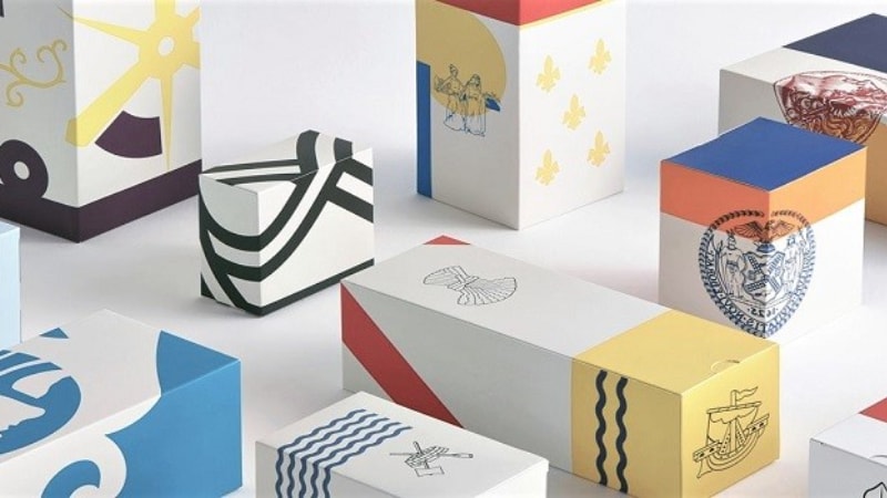
Color psychology is transforming the way brands compete, connect, and convert. It can drive trust, signal quality, and even influence perceived taste or effectiveness. In short, color makes or breaks the emotional contract between product and buyer.
In this article, we’ll explore how the strategic use of color in packaging design can elevate brand identity and shape consumer behavior. You’ll learn how different colors affect perception, why cultural context matters, and how brands are leveraging color to stand out in saturated markets.
What Is Color Psychology in Packaging?

In packaging design, color is not just an aesthetic choice, but a strategic one. Below, we explain it in detail.
Color psychology refers to the study of how colors influence human emotions and behaviors, especially in a buying context. When applied thoughtfully, color becomes a silent storyteller.
It can trigger a feeling, signal a promise, or align with the deeper values of your target audience. And in today’s hyper-competitive landscape, that kind of resonance matters.

Packaging colour psychology plays a crucial role in packaging design, influencing consumer behavior and perceptions. Research reveals that adding color to packaging and branding can increase brand recognition by up to 80%. It’s essential to understand how different colors affect consumer engagement and brand loyalty.
Consider Hermès’s iconic orange packaging. This distinctive shade wasn’t planned—it was born from post-World War II shortages when only orange cardboard remained. Today, it’s synonymous with luxury, instantly signaling sophistication without a word.
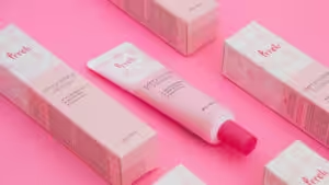
The right use of color in packaging design can evoke specific emotions, convey a brand’s message clearly, and reinforce identity at a glance. Whether it’s the soothing calm of pastels or the bold confidence of black, the packaging color meaning can steer consumers toward a purchase or away from it.
Understanding how color affects consumer behavior empowers brands to create packaging that connects on a psychological level. This connection can lead to increased sales and longer-lasting customer relationships.
In essence, color theoretical concepts marketing isn’t just a tool. Companies can use it to differentiate themselves, build immediate trust, and enhance recognition.
4 Ways Packaging Color Influences Consumer Behavior
Color isn’t just decoration. It’s communication. It’s the first layer of meaning your customer sees, often before they even register what your product is. In the blink of an eye, color creates a connection or causes confusion.
Let’s explore how this works and why it matters.
1. The Role of Color in First Impressions
Consumers form opinions fast. And here’s the kicker: up to 90% of that first impression is based on color alone. That’s how powerful color psychology can be.
When done right, packaging color becomes a tool of trust. It can instantly signal quality, set the emotional tone of the product, reflect your brand’s voice and purpose, and make your product recognizable across shelves and screens.
Let’s say you’re launching a luxury skincare line. A sleek black or deep emerald design instantly conveys sophistication and exclusivity. But try that same color scheme on a toddler’s cereal, and the message feels confusing, even off-putting.
Color helps set expectations. If those expectations feel aligned with what the customer wants or values, they’re more likely to take action. That action might be picking the product up, scanning the label, or clicking “add to cart.”
2. Color as a Shortcut to Product Function
Consumers are busy. Their attention is limited. Color becomes a shortcut; a fast way to interpret what your product does and who it’s for.
Here’s how that plays out in real-world packaging:
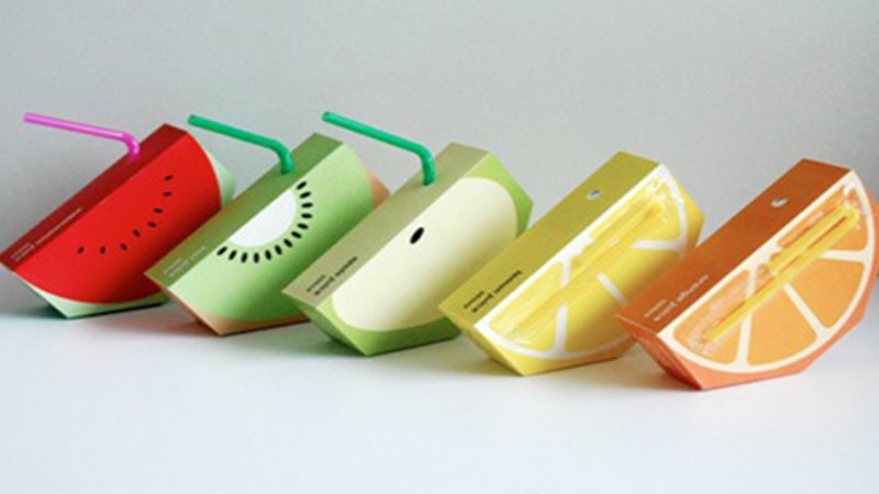
- Bright or Neon: Think hot pink, lime green, electric blue. These colors signal fun and energy. You’ll often see these on snacks, soft drinks, or toys. These colors speak loudly and fast, making them ideal for impulse buys and youth-focused brands.
- Muted Tones: Earthy browns, soft greens, and grays suggest simplicity, authenticity, and sustainability. These are often found in natural or artisanal products—think handmade soaps, organic teas, or eco-packaged foods.
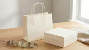
- White or Minimalist Designs: They suggest purity, innovation, or a forward-thinking approach. These are common in tech, wellness, and premium beauty products. Apple’s packaging is a great example—clean, elegant, and modern.
The meaning of packaging color varies slightly by culture, but the emotional impact stays constant. Colors trigger feelings. Those feelings shape perception. And perception drives behavior.
3. Influence on Perceived Value
Color doesn’t just shape feelings. It shapes expectations around price and quality. Without reading a single word, a consumer can sense whether a product is luxurious, affordable, or somewhere in between. The brain makes instant judgments based on visual cues, and color is at the top of that list.
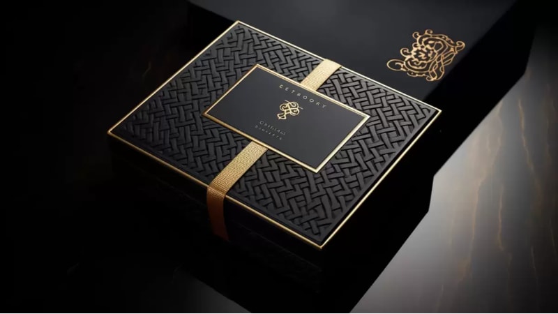
Luxury brands often rely on deep tones like black, gold, navy, or rich burgundy. These colors feel elegant, timeless, and exclusive. They suggest premium pricing, expert craftsmanship, and high status. Think of a sleek black perfume bottle with a gold-foiled logo. It doesn’t need to scream quality. It shows it.
Meanwhile, budget-friendly products lean toward cheerful and bright colours. These shades feel accessible and upbeat. They suggest simplicity, fun, or everyday use. Red, yellow, and bright blue are often used on discount items or value packs because they signal affordability and approachability.
Even white space can impact perceived value. Minimalist designs often suggest purity, sophistication, or innovation. But if not executed well, they can also appear generic.
4. Shelf Impact and Brand Recognition
Walk down any supermarket aisle and you’ll see hundreds of products competing for attention. Most will blend into the background. A few will pop. Color is usually the reason why.
A well-chosen color palette helps your product stand out. That’s called shelf impact, and it’s one of the most overlooked yet powerful tools in packaging design. A distinct color or combination can stop someone mid-scroll or mid-step and make them take a second look.
Distinctive colors help break the pattern of sameness. Think of the iconic red of Coca-Cola, or the matte black of a high-end tech product. These colors cut through the visual noise.
Color also reinforces brand memory. The moment you see Tiffany blue or Cadbury purple packaging, you already know the brand, long before you see the logo. That’s the magic of consistency. Over time, color becomes a brand shortcut.
Packaging color directly influences product recall and brand loyalty. When consumers remember how a product looked and felt, they’re more likely to buy it again. It creates a visual anchor that sticks in the mind.
Key Considerations for Choosing Packaging Colors
1. Gender and Age-Based Color Preferences
If color is communication, then your audience determines the language. Understanding how colors influence buying decisions means looking beyond aesthetics. It requires brands to align color choices with the preferences of their target demographic, including gender and age.
- Men: They prefer bold, saturated colors like blue, black, and gray. These tones are perceived as strong, stable, and modern—ideal for tools, tech, or men’s grooming products.
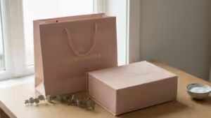
- Women: They tend to favor softer shades, such as lavender, teal, or rose. These hues feel refined and emotionally expressive, making them a strong fit for beauty, wellness, and lifestyle brands.
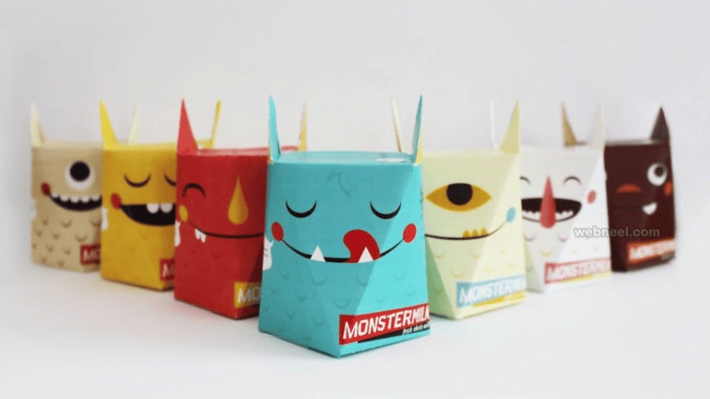
- Children: They respond best to bright, high-energy colors like red, yellow, and green. These grab attention quickly and convey playfulness. That’s why many of the best packaging colors for food products aimed at kids include saturated primaries.
- Older Adults: They need high contrast and clear readability. Low-contrast combinations (such as combining pink with white) can be hard to process, especially in low lighting. Brands targeting senior consumers should prioritize clarity, legibility, and subtle elegance in their color palette.
In branding, it’s not just what each color means; it’s who it means it to. Aligning packaging color with gender and age preferences creates deeper resonance and stronger product appeal.
2. Cultural Factors in Color Response
Color speaks differently around the world. A color that inspires joy in one culture can trigger discomfort in another. For global brands, understanding these regional nuances is essential to creating packaging that connects, not confuses.
Red is a prime example. In China, red symbolizes luck, prosperity, and celebration. It’s widely used in weddings and holidays. But in many Western markets, red can suggest aggression, danger, or urgency. It’s often used in clearance sales or to prompt fast action.
Similarly, white signals purity, peace, and simplicity in the United States. It is common in tech, bridal, and wellness packaging. However, in some Asian cultures, white is associated with mourning and loss. That same clean design could unintentionally convey sadness.
Multinational brands must design with cultural intelligence. Adapting color strategy for regional market success means testing, researching, and often customizing packaging for different audiences. A one-size-fits-all approach may dilute a brand’s message or even alienate potential buyers.
When brands understand what each color means in branding across cultures, they gain the ability to build trust, respect local values, and truly globalize their impact.
Using the Color Wheel to Master Packaging Color Psychology
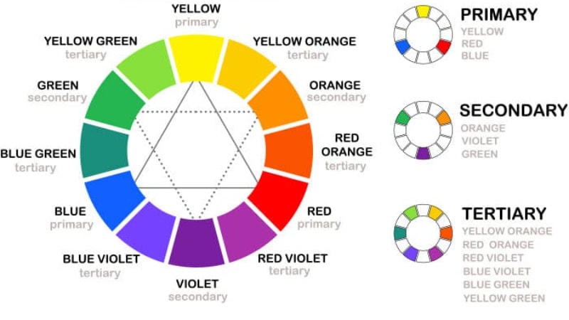
The color wheel is a powerful tool in packaging design. It helps brands create color combinations that feel balanced, intentional, and emotionally resonant. By understanding how colors relate, designers can craft packaging that stands out while aligning with the product’s message.
Want to suggest eco-friendliness? Pair soft greens with neutrals.
Aiming for luxury? Deep purples or golds do the trick.
The wheel alsohelps avoid clashing or chaotic color schemes that confuse shoppers. For brands looking to influence buying decisions through color, mastering the color wheel is a smart and strategic move.
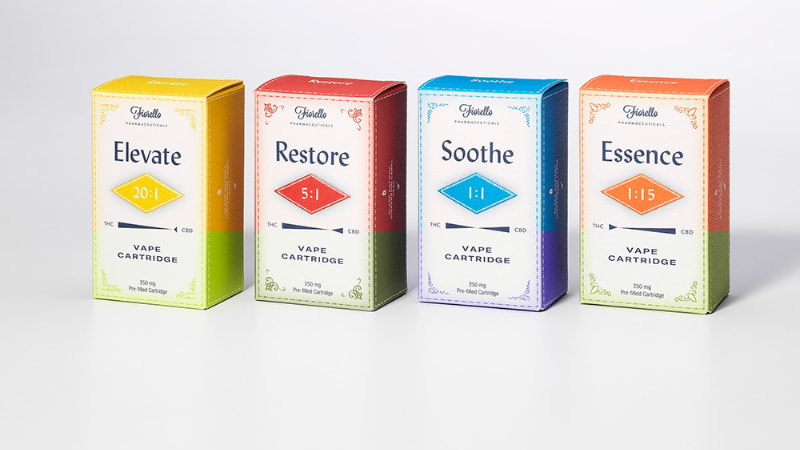
Color Meanings in Packaging: What Each Hue Communicates
The following table shows what each color means in packaging.
| Color | Emotional Associations | Use Cases | Packaging Insights |
|---|---|---|---|
| Red | Urgency, passion, and appetite | Food products, promotions | Stimulates appetite, sparks impulse buying |
| Blue | Trust, calm, professionalism | Tech, healthcare, finance | Conveys reliability, luxury with silver, serenity with light tones |
| Green | Health, sustainability, freshness | Organic goods, eco brands | Suggests wellness, eco-consciousness, and natural appeal |
| Yellow | Optimism, youthfulness, and caution | Snacks, beverages, kids’ products | Captures attention, evokes joy, use with moderation |
| Black | Luxury, elegance, mystery | Premium goods, fashion, electronics | Signals exclusivity, pairs with gold for drama, minimalist chic |
| White | Purity, simplicity, cleanliness | Skincare, pharma, wellness | Highlights simplicity, enhances legibility, and has a clean design |
| Orange | Excitement, energy, playfulness | Sports drinks, toys, and casual brands | Creates bold shelf presence, energetic tone, warmth with naturals |
Use Color to Boost Perceived Product Value
When it comes to packaging color psychology, the power lies not in single colors, but in strategic color combinations.
Well-chosen pairings can evoke emotions, establish the right tone, and shape consumer behavior. Brands leverage color contrast to capture attention and color harmony to build trust with their audience.
Below is a targeted guide to color application for four core product categories, tailored to international market preferences:
1. High-End & Luxury Products
For premium goods, the right color palette instantly conveys exclusivity, refinement, and scarcity, the key markers of high perceived value.
- Core Color Combinations: Deep blue + light gray + matte gold; forest green + off-white + silver trim; burgundy + dark brown + matte black.
- Application Tips: Minimize the use of bright, high-saturation colors. Prioritize matte textures to add a subtle, sophisticated feel, and use metallic accents or thin trim for delicate detailing. Avoid flashy designs to maintain an air of understated luxury.
2. Everyday Essentials:
Affordable daily essentials rely on bold colors to capture attention quickly and highlight practicality and cost-effectiveness, driving fast purchase decisions.
- Core Color Combinations: Bright red + white; vivid yellow + black; bright orange + blue.
- Application Tips: Use eye-catching, high-contrast color pairs to stand out on shelves or digital platforms. Emphasize themes of necessity, value for money, and instant gratification through vibrant hues, and keep designs simple for easy consumer recognition.
3. Health & Natural Products:
This category focuses on building trust and conveying safety, so color palettes should evoke a sense of nature, gentleness, and non-irritation.
- Core Color Combinations: Light green + off-white; pale yellow + light brown; blush pink + white.
- Application Tips: Steer clear of harsh, high-saturation colors. Opt for soft, nature-derived tones paired with matte or frosted textures to reduce emotional distance with consumers and reinforce a “safe and natural” brand image.
4. Tech & Professional Products:
Cool and metallic color schemes communicate professionalism, reliability, and cutting-edge innovation—critical for tech and industrial products that require consumer trust.
- Core Color Combinations: Space gray + silver; Klein blue + white; tech green + black.
- Application Tips: Stick to cool-toned palettes to project expertise and dependability. Incorporate metallic accents to enhance a high-tech feel, and avoid warm tones like red and orange, which can make products appear unprofessional and inconsistent with technical positioning.
Case Studies: Brands That Use Color Effectively
The following brands do a stellar job of using color psychology in packaging, be it softer shades, cool colors, or more.
Coca-Cola (Red and White
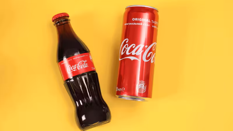
Coca-Cola’s iconic red packaging instantly grabs attention. The color combination of red and white creates a powerful contrast, evoking excitement, passion, and energy.
The use of vibrant hues in Coca-Cola’s design has made it a timeless brand, with warm colors that signal fun and thirst-quenching refreshment. This packaging choice speaks to the brand’s energetic, consumer-focused identity, creating a lasting emotional connection with its audience.
Tiffany & Co. (Tiffany Blue)
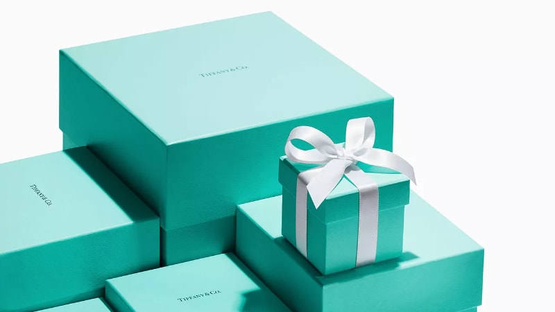
Tiffany & Co. uses a distinctive dark green-tinged blue packaging—known as Tiffany Blue—which has become synonymous with luxury, exclusivity, and sophistication.
This color combination conveys elegance and high status, making it instantly recognizable in the world of jewelry and high-end gifts. The unique blue packaging builds trust and refinement, ensuring that the brand remains a symbol of premium quality.
Apple (Minimalist White and Silver Printing)
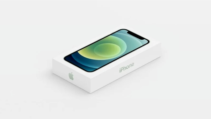
Apple’s use of white packaging with silver accents has become the epitome of sleek, minimalist design. This combination conveys simplicity, purity, and cutting-edge technology.
White packaging with silver details creates a sense of modern luxury and sophistication, reinforcing Apple’s reputation for premium, high-performance products. The choice of this color combination enhances the brand’s clean, innovative identity while attracting customers seeking both functionality and elegance.
How to Choose and Test Your Packaging Color
Here’s a brief explanation of how to choose and test packaging colors.
How to Choose
Choosing the right color for your packaging begins with understanding your brand. Start by defining your brand personality and values. Is it fun and playful, or sleek and sophisticated? Next, match the color to your product type and audience.
Different colors evoke different emotions, so make sure your packaging aligns with what resonates with your target market. But choosing the right color isn’t just about psychology—it. It’s also about strategy. Consider industry norms and competitors: Some industries may have established color trends that influence consumer expectations.
Competitive Color Analysis and Differentiation
- Analyze the dominant colors in your product category
- Identify opportunities for differentiation while maintaining relevance
- Consider whether following or breaking category color conventions serves your goals
- Test consumer responses to both conforming and differentiating color choices
Finally, factor in printing techniques and materials, as colors may appear differently on various surfaces or with different printing methods.
How to Test
Testing your packaging design is crucial to understanding its impact. A/B testing for packaging design allows you to compare two versions of packaging to see which performs better.
Conduct focus groups and surveys to gather direct feedback from consumers about their emotional responses and preferences. You can also use eye-tracking and heatmap tools to analyze how consumers interact with your packaging on store shelves, helping to refine your design for maximum engagement and effectiveness.
FAQs
1. Common Color Psychology Packaging Mistakes to Avoid
Prioritizing trends over brand alignment confuses consumers and weakens brand identity; ignoring industry color conventions that consumers link to specific product traits; and overcomplicating color schemes overwhelms audiences and reduces the psychological impact of packaging. Simple, strategic color choices are always more effective than complex or trend-driven designs.
2. Can packaging colors affect perceived value?
Yes. Darker or metallic tones often signal luxury, while bright colors suggest affordability. Rich hues like black, gold, and burgundy convey premium quality and exclusivity, whereas bold, vibrant shades communicate accessibility and value for money to shoppers.
3. How can I choose the best packaging color for my brand?
Start with your brand’s personality and audience preferences. Then use color psychology to match the emotions you want to evoke. A/B testing, customer feedback, and competitor analysis can also help confirm the right color choices.
Conclusion
Color plays a vital role in shaping consumer perception and behavior, influencing everything from first impressions to emotional connections. Strategic color selection is crucial for resonating with your target market.
Remember, testing and validating your packaging colors through methods like A/B testing and focus groups ensures your design aligns with consumer preferences and maximizes its impact.
Ace Color Psychology With Reliable Packaging Solutions
Looking for a supplier that can provide packaging in the colors of your choice? Packoi fits the criteria with its exceptional quality packaging and design support from experts. Contact us today for a quote.