Many brands believe that “simple” packaging means “cheap.” Nothing could be further from the truth. A perfect minimalist packaging design is often harder to create than a complex one because there is nowhere to hide. Every line, font, and texture must be intentional.
Minimalist packaging proves that simplicity can be powerful, premium, and profitable. In this guide, we break down what this design approach really means, why brands are embracing it in 2026, and how you can use materials like Kraft and textured paper to create luxury without the visual clutter.
What is Minimalist Packaging?
Minimalist packaging design works by omitting needless stuff from the packaging, like the graphics, bold colors, and excessive text. The fundamental concept behind minimalist packaging is that package design should represent both the company and the product using minimum design elements.
Minimalist packaging focuses on the “less is more” strategy by reducing the eye-catching things on the package so the consumer only focuses on the important information.
Negative space is the empty space in anything. Minimalist design uses the negative space to its advantage by drawing your focus to the required area without compromising on quality.
Traditional packaging confuses customers with a lot of things demanding attention at once. Unlike this, while looking at a sample packaging design, you would know exactly what the product is for because the first thing you read on the package will be the only readable thing present.
This way, the packaging manufacturer portrays confidence in their product by letting it do the extra talking, making the decision-making process quick and easy for the consumer.
Traditional vs. Minimalist Packaging: What’s the Difference?
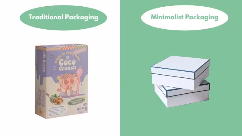
To visualize why you might want to switch, let’s look at the key differences in how these packaging styles communicate.
| Comparison Factor | Traditional Packaging (Maximalist) | Minimalist Packaging (Packoi Style) |
|---|---|---|
| Design Philosophy | "More is More": Fills every space with colors, claims, and graphics to grab attention. | "Less is More": Uses negative space strategically to highlight the brand logo and essential info. |
| Material Focus | The material is often hidden behind full-coverage printing. The texture of the paper is less important. | The material IS the design. The texture of Kraft paper or corrugated board is visible and tactile. |
| Ink & Printing | High usage. Often uses 4-color process (CMYK) + heavy coatings. Higher production cost. | Low usage. Often uses 1 or 2 spot colors (Pantone). Lower production cost and eco-friendlier. |
| Typography | Uses multiple fonts and sizes to shout information. Can feel cluttered and sales-heavy. | Uses one or two bold, clean fonts. Text is sparse, legible, and confident. |
| Consumer Perception | Often perceived as "Mass Market" or "Commercial." Can feel overwhelming. | Often perceived as "Premium," "Honest," and "Sophisticated." Feels calm and high-end. |
| Eco-Friendliness | Heavy ink load makes recycling harder. Often uses plastic laminates for shine. | Minimal ink load makes recycling easy. Often uses raw, unbleached, or uncoated paper. |
| Unboxing Experience | Functional but often forgettable. The focus is on getting to the product quickly. | Ritualistic and "Instagrammable." The clean aesthetic creates a moment of pause and appreciation. |
Why Top Brands are Switching to Minimalist Packaging?
Minimalist packaging is more than an aesthetic choice; it’s a smart business decision. It solves several key brand challenges at once.
Reduce Costs Without Sacrificing Quality
Minimalist design saves you money. A design using one or two ink colors costs much less to print than a CMYK full-color design. Simpler designs can also use standard box sizes, which reduces the cost of custom cutting molds. You can pass these savings to your customers or improve your profit margins.
Signal Luxury & Build Brand Value
Simplicity and luxury are psychologically linked. High-end brands in beauty, tech, and fashion use minimalism to signal value. A clean package with a warm tone and carefully placed text feels more expensive than a busy, flashy box. It communicates confidence.
Enhance Clarity & Simplify Customer Decisions

Too much information confuses customers. By removing extra “noise” like long ingredient lists or cluttered graphics on the front, you help shoppers process the important information instantly. A clean design says, “We don’t need to shout. Our product is good.” This makes the decision-making process quick and easy.
Meet Consumer Demand for Eco-Friendly Solutions
Sustainability is no longer optional. Minimalist design naturally supports eco-friendly practices. Using fewer inks and focusing on raw materials reduces the chemical load of the packaging, making it easier to recycle.
This also aligns with future trends. The Pantone Color of the Year for 2026, “Cloud Dancer,” is a soft, calm white. This signals a global shift toward quiet, unfiltered beauty. Adopting a minimalist look now future-proofs your brand.
The Core Principles: How to Make Simple Look Stunning
Successful minimalist packaging isn’t empty; it’s intentional. It follows a few core principles to ensure the design looks premium, not lazy.
Simplicity & Clarity: Every Element with a Purpose
In minimalism, every element has a job. The logo, the product name, a single line of text—each piece is chosen carefully and placed with purpose. If an element doesn’t serve a clear function, it’s removed. This creates a clean look that is easy for the brain to process.
Strategic Use of Negative Space
Negative space is the empty area around your design elements. Minimalism uses this space as an active part of the design. It gives your logo and text room to breathe, draws the customer’s eye to the most important information, and creates a sense of calm sophistication.
Balance & Hierarchy: The Art of Placement
You don’t always have to center everything. Placing your logo in a bottom corner can create visual tension and feel more artistic. Whether you choose a symmetrical (centered) or asymmetrical (off-center) layout, the goal is to guide the viewer’s eye across the package in a deliberate way.
Your Minimalist Design Toolkit: Key Materials & Techniques
When you remove graphics, the material becomes the design. Its texture and color are what customers see and feel. Here are the core components for a successful minimalist project.
At Packoi, we recommend focusing on these three core materials for a minimalist project.
Part A: Choosing Your Canvas (The Materials)
Without flashy photos to hide behind, the quality of the paper stock is visible and touchable. At Packoi, we recommend focusing on these three core materials for a minimalist project.
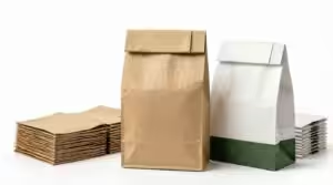
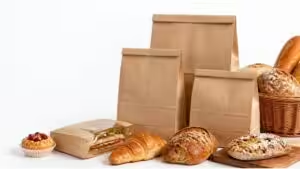
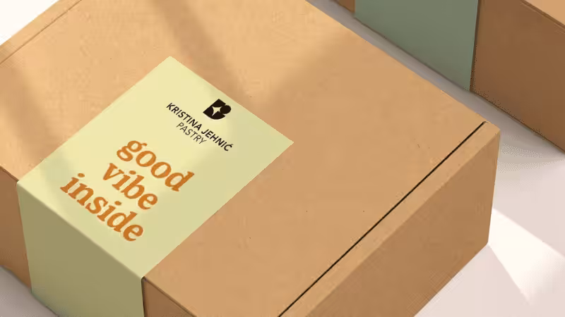
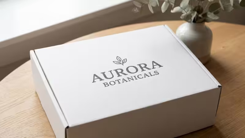
Kraft Paper: The Honest & Eco-Friendly Choice
Kraft paper is the backbone of eco-minimalism. Its natural brown color instantly communicates “organic” and “sustainable” without you needing to print those words. Printing in black or dark brown ink creates a stunning contrast.
Best for: Organic soaps, coffee beans, and eco-friendly apparel.
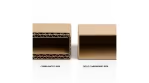
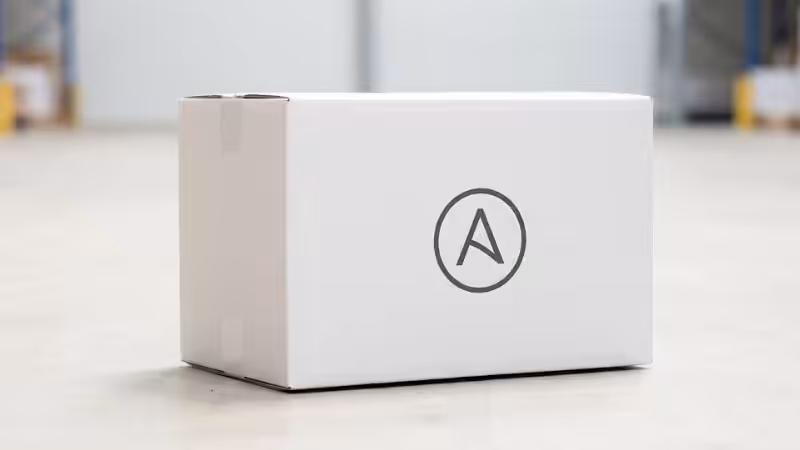
Corrugated Board: The Industrial Chic Protector
For shipping boxes and mailers, corrugated board is king. For a minimalist look, choose E-flute or F-flute board, which is thinner and smoother. Leave the raw cardboard texture exposed and print just your logo. It feels raw, industrial, and cool.
Best for: Subscription boxes, e-commerce deliveries, and heavy items.
Textured Paper: The Ultimate Tactile Luxury
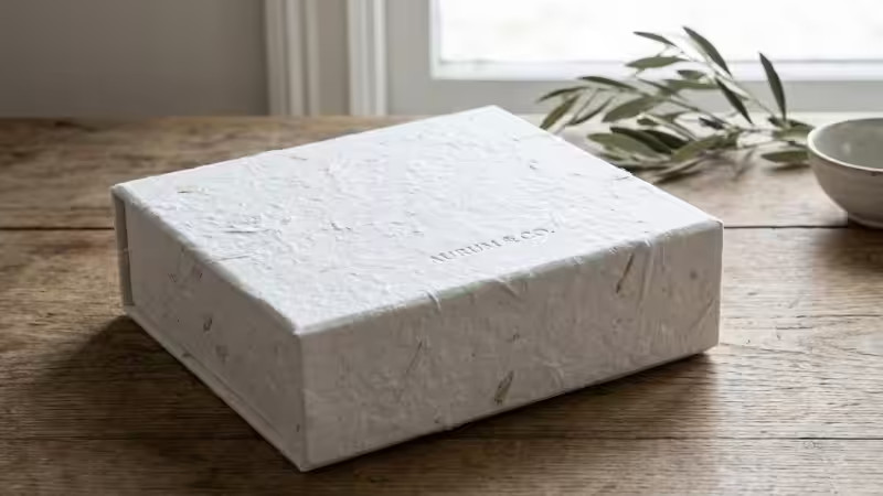
This is where luxury lives. Textured papers have built-in patterns like linen, eggshell, or felt. For a high-end feel, use embossing instead of ink on a heavily textured paper. The customer’s fingers will read the brand before their eyes do.
Best for: Jewelry, high-end cosmetics, and luxury gifts.
Part B: Actionable Techniques & Inspiration (The Ideas)
Product packaging provides a sensual experience, as it communicates a lot about your product without actually showing it. While looking at a shelf, every product is telling a story through its packaging design, like the use of material, font, colors, and negative space.
Here are some minimalist packaging design ideas you can implement into your product packaging design.
Blind Embossing: The No-Ink Luxury Touch
This technique presses a design into the paper without any ink. The logo or pattern is visible only through shadow and light. It invites customers to touch the packaging, creating a physical connection with your brand.
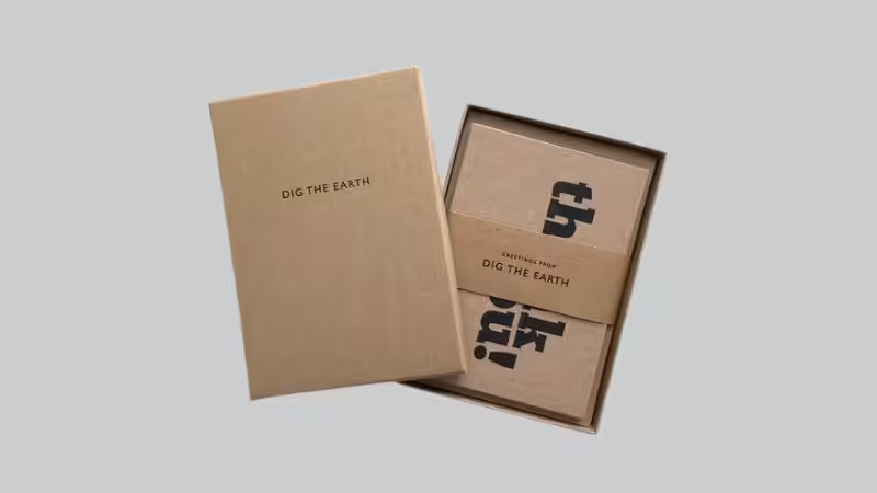
Typography as the Hero: Let Words Be Your Art
Who needs pictures when words can be beautiful? Use a unique, bold font for the product name or a short phrase. Make the text large and let it become the main graphic element.
Die-Cut Windows: A Truthful Glimpse Inside
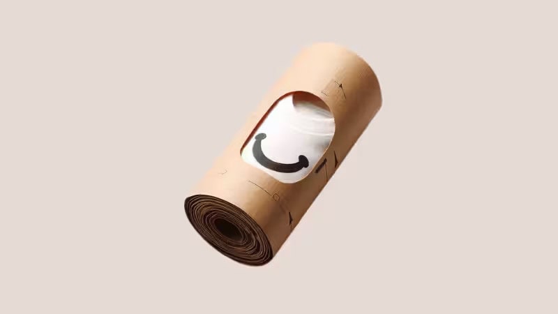
Minimalism is about honesty. What’s more honest than showing the actual product? Instead of printing a photo, cut a simple geometric shape (like a circle or square) out of the box. The product inside provides color and texture.
Inner Printing: The “Wow” Moment Unboxed
Keep the outside of the box completely plain—perhaps just raw cardboard with a small logo. When the customer opens it, surprise them with a flood of bright colors or a simple pattern inside. This creates a memorable unboxing experience.
The Power of Typography
Who needs pictures when you have words? Use a unique, bold font to write the product name or a catchy phrase. Make the text large and let it wrap around the corners of the box. The text itself becomes the graphic element.
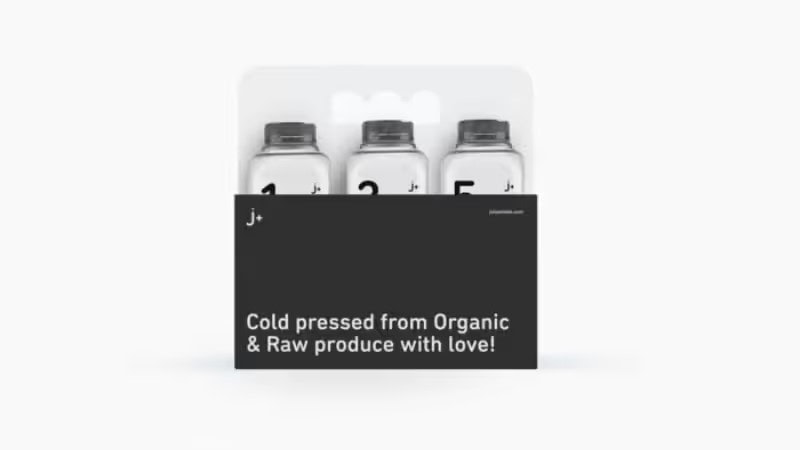
Monochromatic Palettes
Choose one color and stick to it. If your brand color is blue, use a light blue box with dark blue text. Or a matte black box with glossy black foil stamping. Tone-on-tone printing is incredibly sophisticated and subtle.
Asymmetry
You don’t always have to center everything. Place your logo in the bottom-left corner and leave the rest of the box empty. Asymmetry creates visual tension and interest, making the eye travel across the negative space. It feels modern and artistic.
The Power of Typography
Who needs pictures when you have words? Use a unique, bold font to write the product name or a catchy phrase. Make the text large and let it wrap around the corners of the box. The text itself becomes the graphic element.
Monochromatic Palettes
Choose one color and stick to it. If your brand color is blue, use a light blue box with dark blue text. Or a matte black box with glossy black foil stamping. Tone-on-tone printing is incredibly sophisticated and subtle.
Asymmetry
You don’t always have to center everything. Place your logo in the bottom-left corner and leave the rest of the box empty. Asymmetry creates visual tension and interest, making the eye travel across the negative space. It feels modern and artistic.
Cost-Effective Chic: The Sticker on a Plain Box
This is a great strategy for startups. Buy high-quality, plain boxes in bulk. Then, design a beautiful, minimal label or sticker to seal the package. It looks intentional and chic at a fraction of the cost of full custom printing.
Brands That Mastered Minimalism (Real-World Examples)
Apple: Apple is a master of minimalist packaging. Their clean white boxes, simple product photography, and perfectly organized interiors create an unboxing experience that feels like a ceremony. The packaging signals premium quality before you even touch the device.
Aesop: This skincare brand uses simple, amber-colored bottles and jars with text-heavy, typewriter-style labels. The design feels like a vintage apothecary formula. It communicates honesty, quality ingredients, and scientific precision without any flashy graphics.
When to Be Cautious: Is Minimalism Always the Answer?
Minimalism is powerful, but it’s not a universal solution. It may not be the best fit if:
- Your product category is loud and energetic. For children’s toys or discount snacks, bright colors and mascots often perform better.
- Your product requires extensive information on the box. For complex electronics or items with detailed instructions, a minimalist design might not provide enough space for essential text.
- Your brand identity is intentionally vibrant and complex. If your brand is known for being bold and maximalist, a sudden switch to minimalism could confuse your audience.
Frequently Asked Questions About Minimal Packaging Design
Q1:How do you keep minimalist packaging from looking cheap?
The key is focusing on material quality and finishing details. Opt for a substantial, textured paper stock over thin, flimsy material to convey value. Subtle techniques like blind embossing, foil stamping, or a high-quality label add a premium feel without visual clutter. Thoughtful design, with precise typography and ample negative space, signals intention and quality, not a low budget.
Q2: Is minimalist packaging strong enough to protect products during shipping?
Absolutely. Minimalism is a visual design style, not a structural weakness. The protective integrity of your package comes from the material choice, like sturdy corrugated board, and the use of custom-fit inserts to prevent items from shifting. A clean, minimalist exterior can house a highly engineered interior that keeps your products perfectly safe.
Q3:Can minimalist design be used for food packaging?
Yes, it is highly effective for food, particularly for artisanal, organic, or health-focused brands. The design often uses unbleached paper and clear windows to emphasize the natural quality of the product inside. The most important factor is ensuring all materials, including inks and adhesives, are certified food-safe and comply with local health regulations.
Q4:How can a small business afford custom minimalist packaging?
Start with cost-effective strategies, like applying a beautifully designed sticker to a high-quality stock box or printing your design in just one or two colors. The best approach is to partner with a supplier that offers low minimum order quantities (MOQs). This allows you to get a professional, custom-printed box without a large upfront investment, making premium packaging accessible.
Conclusion
Minimalist packaging design proves that less truly is more when every element is intentional. By reducing visual noise, choosing high-quality materials, and embracing negative space, brands can create packaging that feels confident, sustainable, and undeniably luxurious.
As 2026 trends move toward calm colors, tactile materials, and eco-conscious design, minimalist packaging is a strategic investment that enhances brand perception, reduces costs, and aligns with modern consumer values.
Design Your Minimalist Packaging with Packoi Today!
Are you scaling your business and in need of a reliable custom packaging and printing service provider? You are in the right place! Packoi is a one-stop shop for all custom packaging and printing solutions.
We will be there for you on every step of getting your package service, from designing to testing samples to getting your order shipped to your door. Our highly skilled and experienced production team knows exactly what you want, and they get to work right away. Which in turn provides you with a fast turnaround time.
If you don’t have a design for your minimalist packaging yet, we’ve got you! Packoi also provides design services. Our designers will work with you to make your dream packaging design a reality.
For additional information and personalized quotes, contact us now!