Are you stuck in choosing a packaging color? Discover how to select a color scheme for your product packaging design with our guide. Also, appreciate the different cases of successful and unsuccessful color choices in packaging design.
A consumer’s first physical interaction with a brand usually happens through its packaging, not the product itself. That makes it essential for packaging to be visually appealing and able to catch attention quickly. Since people often judge product quality based on packaging design, it’s a key part of making a strong first impression.
Studies show over 70% of people judge product quality by its packaging, and color plays a key role in catching attention, conveying brand personality, and influencing buying decisions.
This article will guide you step by step on choosing the right color scheme, with practical tools and real-world examples to create packaging that looks great and drives sales.
The Psychology of Color: How It Shapes Brand Perception
The significance of color is considerable, especially in branding, where some amount of science is involved in picking the ideal hue. Colors influence customers’ perceptions of the product.

For this reason, some brands spend a lot of money and time picking the right color palette for branding, but others choose randomly based on their preferences.
1. What is Color Psychology?
Color psychology refers to how some colors influence human behavior and emotions. The influence of these colors on human psychology is involuntary. Therefore, packaging color psychology refers to the scientific selection of brand colors to trigger specific consumer behaviors toward selecting products.
Because the main objective when designing packaging is to attract consumers, color psychology is very important in choosing the right hue. At the same time, it is an important component of color theory. If you’re interested in color theory, you can read about it.
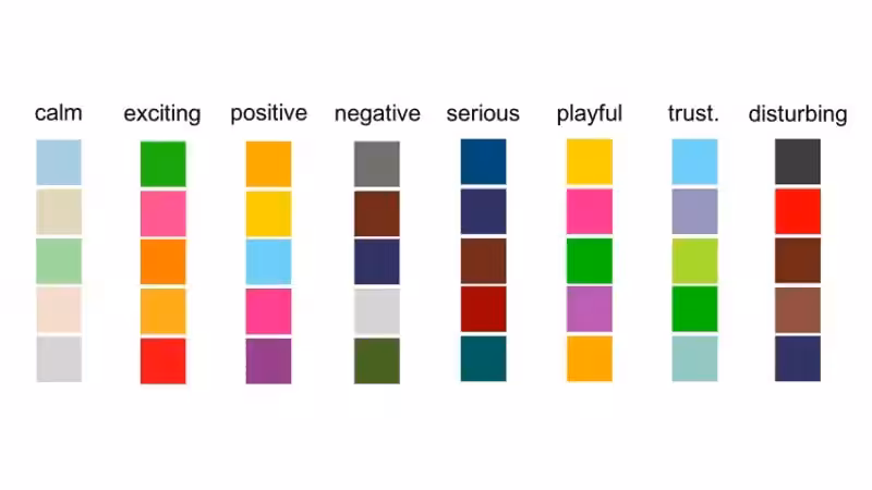
Your packaging colors affect consumers’ perceived product quality and brand personality. But how these colors invoke perceptions varies from one person to another based on factors like age, gender, and cultural preferences. Some color associations are known to be universal, as well as their perception.
- The color red is often associated with love and anger.
- Blue and green packaging are commonly linked to peace and calmness.
These examples show how color psychology shapes human perception of different color associations.
2. How Color Can Influence Brand Perception
Color is a visual representation that speaks a lot about the brand and its values. It is not coincidental that major brands like Coca-Cola and Lego use the color red, while Twitter, Facebook, and IBM use blue as their superior brand color.

Well, these brands use a well-calculated marketing strategy in choosing color combinations to improve their effectiveness in persuading potential customers through advertising.
The different color palettes these companies use help enhance their brand identity and product positioning. This is especially important to make your brand design stand out from competitors with a unique identity.
Consumers perceive different brands differently based on the color palette they use in packaging. Brand identity is a depiction of the company’s values. How a company interacts with customers and their impression of customers to perceive things differently clearly depicts brand personality.
Therefore, choosing specific colors is increasingly important as it influences brand identity. Brands use certain colors that make logos and packaging easily recognizable. Based on different color psychology among individuals, here are some of the common perceptions of different colors:
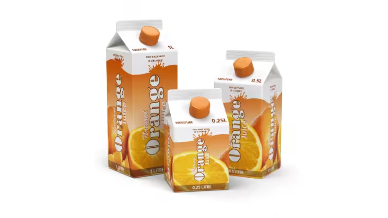
- Food and beverages: The commonly used food packaging color is red. Green is used for natural foods and is a depiction of eco-friendly products. Healthy and filling foods like oats use an orange color palette, while blue packaging is used for fun foods.
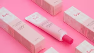
- Cosmetics: Bright colors like pink are associated with femininity and are common with cosmetics packaging targeting female customers, whereas blue packaging is used for male cosmetics.
- Electronic products: white, grey, and black packaging colors are common in electronic packaging.
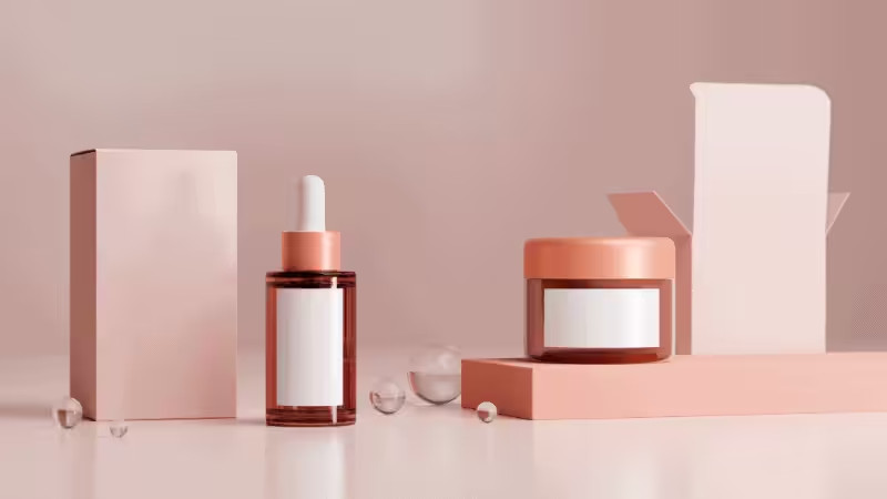
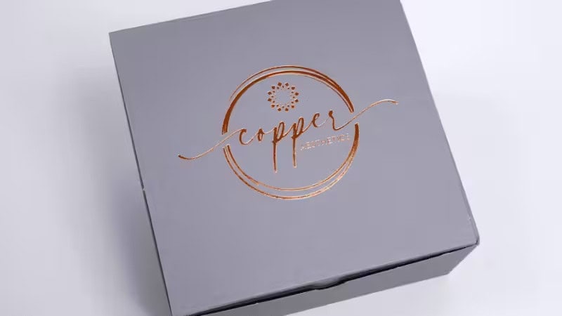
- Luxurious items: expensive items may use white or purple packaging with some darker shades that give a premium appearance. On the other hand, lighter shades are used for packaging lively, energetic, and inexpensive products. Darker purple packaging is the opposite.
These are just some consumers’ universal perceptions of brands based on their branding color choice. With consumer preferences being the core driver of decision-making in every company, the right packaging color palette can significantly reinforce your brand’s image.
How to Choose a Color Scheme: A Step-by-step Guide
Building a brand that is recognizable in the market is not easy. It requires a lot of consideration and tools for it to succeed. Choosing colors for your packaging is one of the key considerations. Here are the steps to help you choose the right colors for your packaging and create a reliable brand identity among customers.
1. Define Your Brand Identity

Brand identity represents the values you stand for. It is important to know how you want to engage with your customers. The right colors for your product have a huge role in influencing your customer’s purchasing decisions. It is through packaging that brands can communicate their brand voice.
Defining your business values and your brand’s specific goals can help you choose your core brand colors.
2. Understand Your Target Audience
Your target market comprises different characteristics that may affect your business. The target audience, defined by age group, gender, literacy, and economic stability, can help you know the right colors for your product. Also, various colors have different cultural meanings attached to them.

So, it is wise to know the cultural preferences of your target audience before choosing packaging colors. The color you choose for package design must align with the consumer’s requirements and preferences.
3. Analyze Your Competitors
A good branding company, through a branding strategy, will analyze its competitors and unique branding colors to stand out from the competition rather than blend with them.
Start by observing the actual retail environment. Gather images of competing products and arrange them side by side. Pay attention to the dominant tones used in your specific market category. For example, if every organic snack brand relies on the same earthy greens or dull browns, a bright yellow custom box will immediately catch the consumer’s eye.
However, remember that differentiation has logical limits. Your chosen colors still need to signal what is inside the package. You want to break the visual mold without confusing the buyer about your actual product.
Always test your ideas before spending money. Print a physical mock-up of your custom packaging. Place it directly next to rival products on a real store shelf. Step back and look at the line-up. If your design fades into the background, adjust your shades before heading into mass production.
4. Consider Product and Industry Trends
The packaging design should speak volumes about the quality of the product. We are now familiar with how packaging color depicts the quality of the items and its power to influence consumers’ psychology in purchasing decisions.
It is quite important for the packaging color to give a slight idea about the product. For instance, a shampoo bottle with green packaging indicates its natural components. This will evoke the attention of customers looking for organic cosmetic products to make a purchase.
Market trends are also crucial in making brand decisions, especially on certain colors that are used differently, and can greatly impact customer purchasing patterns.
5. Testing Color Schemes
Knowing what colors symbolize is not enough. Incorporating a sense of harmony in packaging colors is especially important. Testing different color schemes to determine which can work for your branding is important. You can test color schemes by:
- Know what you want to present to consumers: The mood or attribute that your consumers should receive from the packaging colors. e.g., for passion and energy, use the color red or yellow packaging, whereas for peace and calmness, use blue or green shades, and more.
- Color context: how you want consumers to perceive the packaging color.
- Refer to the color wheel: select different color schemes to see what stands out. Here, the aim is to choose the right colors for creating packaging.
- Draft multiple designs: Drafting several designs on your website will help you know which color palette stands out.
Cost Reality Check: Will complex gradients or multi-color printing double my costs?
When testing your color schemes, the ultimate business question usually pops up: If I choose a stunning gradient or a complex multi-color design, is my packaging cost going to skyrocket?
The honest answer: No, it won’t “double,” but it does make a difference.
If you want maximum cost-effectiveness, a minimalist 1-color or 2-color design (for example, printing a single dark green on raw kraft paper) is your best friend. It saves money on printing plates and ink while offering a highly premium, eco-friendly look.
On the other hand, complex colors and trendy gradients require a standard CMYK full-color printing process. While modern printing technology has made full-color printing very affordable, it is naturally slightly more expensive than a simple one-color job.
Pro Tip for your testing phase: Ask your packaging supplier to provide quotes for both your full-color gradient version and a simplified two-color minimalist version. Compare the physical proofs alongside the price tags to make the smartest business decision.
Tools and Resources for Choosing a Color Scheme
Crafting the right color combination for your packaging is crucial, as it has a greater impact on brand recognition and consumers’ purchasing patterns. You can use various tools to find the right color scheme for packaging design.
While the color wheel plays a significant role in finding the best combination, digital tools are useful for selecting high-contrast color schemes that make design elements instantly noticeable. These digital tools include:

- Adobe Color CC
- Colors
- Designspiration
- Khroma
- Material Color Tool
- Paletton
- Color Explorer, etc.
How design professionals can assist in the process
Selecting colors for your packaging is sometimes challenging, especially when starting out. Design professionals usually have expert information on the best colors for various packaging materials.
Collaborating with an expert will give you rich information regarding color schemes based on the kind of product and customers you are dealing with.
Real-World Case Studies: Packaging Color Wins, Fails, and Lessons
The visual elements or color scheme of your packaging design can either enhance your product package or fail to offer the desired elegance. Here are some real-life examples of successful and unsuccessful color implementation:
1. Successful Packaging Design
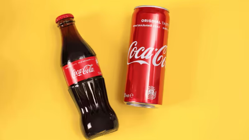
Coca-Cola: Red color scheme
With its iconic red color palette, the company has built a huge brand identity globally. They apply the red color scheme not only to their packaging but also to their advertising, merchandise, and trucks. This has been a successful branding that most companies are struggling to match.
2. Unsuccessful Packaging Design
Sephora: black and white scheme
Sephora is one of the leading cosmetic brands. The company opted for black and white instead of using colors associated with beauty, like pink and blue. The designs were received with mixed reactions by consumers. This is because black and white are colors associated with quite different things.
3. Lessons Learned from These Case Studies
- Being consistent with your color palette is vital to your brand recognition. Coca-Cola has consistently used Red as its main branding color for many years.
- Sephora’s choice to use black and white packaging does not meet consumer needs, and in most cultures, black packaging is associated with mourning. This does not depict what the brand sells to its customers.

FAQs
Q1: I’m not a designer. How do I pair colors without making my packaging look messy?
A: Don’t panic! Just rely on basic color theory rules. Want a design that pops? Use complementary colors (like blue and orange). Going for a premium, soothing vibe? Stick to analogous or monochromatic colors (like dark green with light green). These simple rules keep your design harmonious and professional.
Q2: I’m stuck. Are there any ready-to-use color schemes I can just copy?
A: Absolutely! You don’t have to start from scratch. There are endless pre-made color palettes and templates available online (like Canva’s color combinations). Think of them as pre-matched outfits for your brand—just pick a style that fits your vibe and apply it directly to your packaging.
Q3: Why does a color look vibrant on my screen but dull and totally different when printed on the box?
A: Welcome to the most common packaging disaster! Screens emit light and use the RGB color model, while printers use physical ink, which is CMYK. To avoid dull, muddy boxes, always set your design files to CMYK before printing. For dead-on accuracy, ask your manufacturer to use a specific Pantone color.
Q4: Will my favorite color look the same on glossy cardboard vs. porous kraft paper?
A: Not at all! Materials drastically change how colors appear. A bright, vivid yellow will pop beautifully on glossy, coated paper. But print that exact same yellow on rough, absorbent kraft paper, and it will look muted and grayish. Always choose your colors with your specific packaging material in mind!
Conclusion: Bring Your Brand Colors to Life
Selecting the perfect color scheme for your packaging might feel like a high-stakes decision, but you don’t have to get it perfectly right on your first try.
By understanding basic color psychology and keeping your target audience in mind, you’ve already done the hard work. Remember, your colors don’t just need to look good on a screen; they need to tell your brand’s unique story and stand out on the physical shelf.
Before committing to a massive production run, the safest and most effective move is to test your colors in the real world. You need to see how your chosen palette interacts with actual printing inks (CMYK) and your specific packaging materials.
- Need more inspiration? Check out our packaging designs and printing services to see how different textures affect color output.
- Ready to test your ideas? You don’t need to be a design expert. Our pre-press specialists at Packoi are here to double-check your color values and provide physical proofs so you know exactly what you’re paying for.
Take the guesswork out of your packaging design. Let’s turn your digital color palette into a stunning reality.