Fortunately, with a basic understanding of some key color theory concepts, you can instantly give your product a professional look that will help attract customers and encourage them to reach for yours over the competition every time.
Do yourself a favor, explore different color palettes and color theory concepts now and get ahead when creating great packaging for your products!
What is Color Theory?
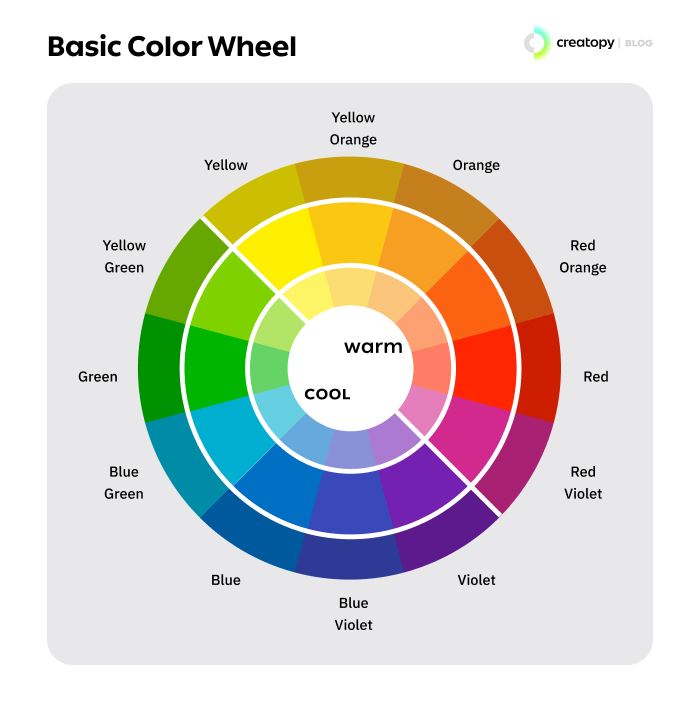
Color theory is essential for designers to create aesthetically pleasing designs and color schemes in visual interfaces. Designers utilize a color wheel that helps them to select colors that either contrast or complement each other while also taking into account various factors such as human optical ability, psychology, and culture so that the certain colors chosen are not just attractive but have meaning behind them too.
Why is Color Theory Concepts Important in Packaging Design
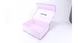
Color is an essential element in packaging design, and understanding the basic principles of color theory makes it easier for the graphic designer to create a design that appeals to the target audience.
Color theoretical concepts such as hue, saturation, intensity, and value are essential in creating successful packaging designs. They can produce eye-catching visuals while also communicating meaning to different markets. For example, a brand looking to have a natural feel to its product might choose dark greens and dark blues, while a food brand might opt for warm colors that stimulate appetite.
The following are the main important reasons why color theory concepts are essential in packaging design:
Color is the First Thing that Everyone Notice When Looking at Something
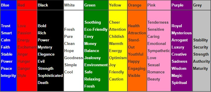
Colors remarkably impact us all, whether we realize it or not. Color harmony can evoke emotions that range from joy and happiness to sadness and anger. It’s no wonder color is often the first thing we notice when we look at something, it can make an immediate impression, giving us insight into the mood of an artwork, the energy of an environment, and more.
Colors Can Evoke Different Emotions and Feelings
No two colors evoke the same feeling. How different monochromatic colors make us feel can vary significantly based on personal experiences and cultural influences.
For some, light blues evoke serenity and security, while others might associate yellow-orange with happiness or optimism. Even something like gray, which typically has a connotation of gloom, can bring warmth and comfort to some.
Colors Can be Used to Attract Attention or Create a Certain Mood
Colors can be powerful tools for setting the mood and grabbing attention. You can influence how someone feels in a subtle but impactful way with a few simple splashes. The use of color, both in design and fashion, is constantly changing – with certain colors staying popular for years while others come and go.
You can easily create the perfect atmosphere through careful selection, whether trying to evoke excitement for an event or bring about calmness in your product.
Different Colors are Associated with Different Brands
When you see a particular color, what comes to mind? Chances are that it is connected to some brand or product. It happens because companies use colors strategically to make an impact and create psychological associations in the minds of their customers.
For example, a red hue can indicate excitement, green symbolizes nature, and yellow-orange often exudes energy. Brands use color to make themselves stand out in a crowded market and tie vivid imagery to their products.
Use of Color in Packaging Design is Important for Attracting Attention and Communicating the Brand’s Message
Color is an essential aspect of packaging design and can create colors that instantly draw the eye and powerfully convey a message. It can evoke emotion and encourage customers to take action faster than other design elements.
Color can also represent a brand’s values, enabling companies to establish their identity at a glance. Whether bright or subtle, a pop of cool colors is one of the most effective ways for a product or company to stand out from the competition and promote loyalty and recognition for returning customers. It is an indispensable tool in the world of marketing!
Choosing the right colors in packaging design is a remarkable way to grab someone’s eye and make an impactful statement regarding a brand.
It can evoke emotions related to the product, such as happiness when seeing bright blues, and it can also give customers an idea of the values a particular brand holds.
How to Use The Three Primary Colors in Your Packaging Design
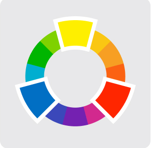
The three primary colors, red, blue, and yellow, are a great way to ensure your design stands out without overwhelming your customers. This triadic color scheme adds vibrancy and life, allowing you to draw attention to all the right places on your packaging.
Consider how the contrast between different shades and tints of the primary colors can be used for an enhanced effect. Bright yellow against dark blue or red-violet with a pale base can give off a bold impression that will captivate consumers at retail outlets.
The accent color shades typically complement with primary color hues, so you can use them too. Lighter shades on a dark background also work.
When creating a packaging design, you can use the three secondary colors, orange, green, and purple, to draw attention to your product. These color combinations have unique properties that can work together to create a visually pleasing and eye-catching design scheme.
For instance, orange is often associated with feelings of excitement and enthusiasm. Yellow-green evokes tranquility and peace, while lighter purples are often linked with luxury and sophistication.
How To Choose The Right Colors For Your Product’s Packaging
Here are some other tips while choosing colors for a package web design project:
Keep it Simple
Making sure your product packaging is eye-catching and captivating is essential to the success of any business. To ensure a successful outcome, try simplifying the design by selecting two or three complementary colors opposite each other on the color wheel.
People find simplicity attractive, making any package easier to understand. While you could use a monochromatic color scheme, it’s important to remember that each color has its meaning and can drastically contribute to or detract from your message if misused.
By selecting a complementary color scheme, you will create a stunning and captivating design that customers won’t be able to resist!
Additionally, when crafting your package design, include more details and facts than usual, as well as a language of higher semantic richness that will make your product stand out from the competition. You can use a combination of primary and secondary colors.
Try to Use Contrast
To make elements on a package stand out, color contrast is essential. Contrary to popular belief, having two colors that appear completely different doesn’t always guarantee color contrast; if the tones of each color are the same, there will be no difference visible to the viewer.
You can contrast between analogous color schemes, tertiary colors, and accent colors to make an impact in your color printing.
Color contrast also plays an important role in bringing balance to a design by allowing certain key components to pop while others take more of a receding role.
When properly applied, sharp contrast can help create a visual hierarchy, making it easier for viewers to recognize the main elements quickly and aesthetically.
Test Different Color Schemes
Testing different color options for a package before launch is an important step in the process. To get an accurate result, it is necessary to create mock-ups and test them with target audiences. Additionally, a full category analysis should be conducted to gain further insight into the context of the product.
At-shelf shopper research and eye tracking are essential indicators that can help optimize the package before it hits shelves. By conducting research and eye-tracking studies, businesses can understand how customers interact with their packaging, which ultimately helps them make more informed decisions about the purest form of a particular shade they choose for their products.
Keep in Mind Your Target Market
It’s essential to consider one’s target market and the associations that different colors can evoke. Color preference is a complex topic, with gender and cultural perception strongly impacting choices. Generally speaking, blue-green tends to be liked by both genders, whereas there is less agreement when it comes to dark purples.
Men usually prefer darker colors with black added, while women are more inclined towards tints of colors with white added.
Additionally, color selection can also depend on cultural context, as specific colors may have different meanings in different cultures. For example, red-orange is a dominant color that often symbolizes joy in western countries, whereas, in eastern countries, it could be associated with mourning and death.
Similarly, green may signify renewal or fertility in other cultures beyond the western meaning of nature and environment.
Ultimately, it’s essential to consider one’s target audience when selecting colors, as they will help shape the image of a company or product and influence how customers view it.
Conclusion
As you can aggregate from your exploration of color theoretical concepts for package design, color is a powerful marketing tool. Considering how colors send messages about a brand, it’s essential to choose the right color combination that communicates the mood and message of your product.
The overall design should be visually appealing, with colors selected and combined with engaging consumers in an instant.
Use this as a reference guide for each project to ensure that your package design accurately conveys desired emotions and thoughts. With careful selections and experimentation, you can create beautiful designs that captivate audiences at first glance!
Want to Take Your Packaging Design Project to the Next Level? Contact us!
Do you have a product that needs great packaging designs? Look no further than Packoi Printing! Our team of creative designers will help elevate your product’s visual aesthetic to the next level. We use cutting-edge technology to create color schemes that are unique and eye-catching.
And because of our excellent customer service, you’ll always be sure of timely deliveries and first-class assistance. Contact us today for reliable graphic design solutions tailored to fit your business needs!