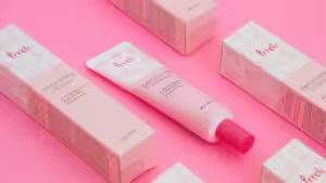
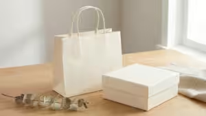
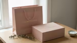
In this article, you’ll find out how to create the best design for your cosmetic product packaging so you can make your target market buy it.
About Cosmetic Products
To create the best design for the packaging of your cosmetic products, it’s important to understand the contents first. So let’s talk about the product that you’ll be designing packaging for.
Cosmetics are products that appeal to the lifestyle preferences of a customer. And it’ll be an understatement to say that the lifestyle industry is popular right now.
It’s booming. People want to invest in things that’ll make them look and feel good. And it’s not just the women. Even men are starting to embrace cosmetic products because they see how they can be useful to their health and overall wellness.
Over the years, the cosmetics industry has grown to become more than just makeup and beauty products. It expanded to include products for personal care and hygiene.
The products in the cosmetics category include skin care, cleansing products, hair care, nail care, oral care, baby care, lipsticks, antiperspirants, perfumes, and body sprays.
What does this have to do with packaging?
As mentioned, the packaging is the first thing that your target market will see. You have to make sure the packaging will attract them enough to want to take a closer look at the product.
It’s not just about making it look visually appealing. It has to represent the product within. It has to tell the story of your brand. It has to put the product in the right position.
The design of the cosmetics packaging should do all of that. And more.
This is why choosing the right design for the packaging of your cosmetics product is important. If done correctly, it can help sell the product effortlessly so your business can increase its sales and profitability.
The 7-Step Process of Designing Your Cosmetic Packaging
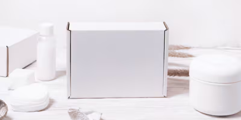
Since the packaging of the cosmetics product is the first thing that the target audience will see, you have to choose the right design. It’s not a complicated task. But you have to follow the right process so you can be sure that you’ve chosen the right design.
To do that, you have to consider a lot of factors that’ll influence how the cosmetic packaging design will look.
Identify Your Ideal Client
Your first concern is your customer. What do they want to see?
This is why you have to get a clear picture of who your target market is. You want to attract the right people through the design of your packaging.
Who are they and what is their age profile? Gender? Social status?
Find out what lifestyle aspiration they want to achieve by getting your product. That should be reflected in your packaging. Is it comfort? Self-care? Luxury?
These will give you clues on what design will resonate with your target market. If you can achieve this connection, it’ll be easy to get them to come near your product to get a closer look.
It’ll give your product the chance to appeal to the customer and in effect, sell itself.
Decide on Your Brand’s Positioning
Once you’re sure that you know who your market is, it’s time to consider your brand positioning next.
This is all about setting your brand apart. It’s not just about standing out. It should tell your customers that it’s your product. They should immediately know that it’s your brand.
This will take some research because you’re not just considering what your brand represents. You have to do it in comparison to your competitors.
If you sell skin care products, what makes you the best? Why should your customers choose you over the other skin care products in the market?
You can build a reputation for your brand that highlights the advocacies you support – like sustainability. Or all organic. Or a focus on DIY spa treatments.
These are brand positions that you can consider in the skin care category.
Think about that because this will influence the customers who will consider buying your product.
And your packaging should reflect the position that you want your brand to take in the market.
Define Your Brand Personality
After your brand position, it’s time to align it with your brand personality. Your position is more of an external thing. Your brand personality is internal.
You have to define the traits that you want your customers to know you for. These are specific words that you want your market to associate with your brand.
Organic. Feminine. Healthy. Fitness. Natural. Luxurious.
There are so many words that you can choose from. These words will influence your packaging design. Make sure that these words will resonate with your ideal clients.
So if your clients are simple folks, they probably won’t react well to luxury as a brand attribute. Or if they’re strong advocates of organic materials, they might not like it having glitters in your cosmetic packaging.
Collate Your Ideas
With your ideal market, brand position, and brand personality defined, you should have some ideas on what your packaging should look like.
Based on the data that you’re holding, you can decide what material, shape, colors, fonts, illustrations, and elements to put in the cosmetics packaging.
Put all these ideas together and create an idea or mood board. It’ll help you visualize what the packaging will look like.
So if your target market is women in their 30s and 40s and your brand positioning is organic skin care products, what packaging will be perfect for that? Then you look at the brand personality, how can you put those in your packaging?
Your mood board should collate all these ideas.
Gather photos that represent these ideas and put them all together. This mood board will give direction to your creative thoughts so you can come up with a great cosmetics packaging design.
Finalize the Dimensions
With all the ideas on the board, you should be able to determine the overall look of your cosmetics packaging.
There are many shapes and sizes to choose from. With everything that you know at this point, it should be easier to visualize the best shape or size to use.
Of course, you have to consider the product that the packaging will contain. If it’s fragile, then you need to choose a box that can protect it.
But that’s not the only consideration. You should also think about the cost of the packaging design.
If you choose expensive packaging, that will look good. But is it worth decreasing your profit margin?
Remember, you’re not just doing this to impress your customers and make them buy the product. You’re also using cosmetic packaging to help you profit.
Choose Your Visual Elements
Up next are the visual elements of the product packaging. This includes the brand logo, color, font, and all the things that the customer will see.
You have to strike a balance between what your customers want to see and how you want your brand and product to be represented.
But if you created your cosmetic products with your target market in mind, then everything should be aligned. The packaging design will come out in such a way that’ll attract your market effortlessly.
Even for your cosmetics brand, if you’re targeting the right people, having your brand on the packaging will resonate with them anyway.
You just have to tie everything together.
Put Everything Together
The last step is to lay out everything so you can create a mock-up of the product packaging.
You can do this yourself if you can, or a professional designer can do it for you. If you decide to hire someone else to do it, make sure that you give them all the details. From the information to the color palette to the illustrations and layout – all these should be clear.
Give them specific instructions for what the front part and all the sides will look like. The more details you provide, the more likely they can create the packaging design that you had in mind.
While it’s easy to get lost in all the design elements, make sure your cosmetic packaging has all the important information about your product. Like what it’s for, the ingredients you used, how to use it – all the details that your customers will need to use it properly and safely.
3 Layers of Your Cosmetic Product Packaging
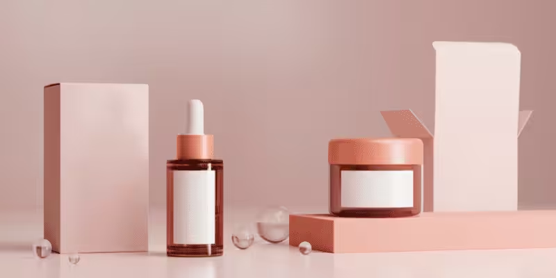
Your cosmetic packaging isn’t just one box. It’s a combination of 3 important layers. It’s important to go through the design of each layer so you can make sure that they’re aligned.
Remember, each of these layers contributes to the overall experience of the customer when they use your cosmetic products. You want each layer to represent your cosmetic brand well. It has to tell your story and have it resonate with the values, beliefs, and lifestyle aspirations of your target market.
Let’s take a look at what these layers are so you can decide on their design elements.
Outer Packaging
This is what people will see first. Not unless the cosmetic store displays the product out of the packaging.
But in most cases, it will be the first thing to be seen. That means the outer packaging should make a great first impression on your target market.
Make sure it piques their curiosity so they will take it from the shelf or display area and open it.
While the visual design of this layer should be on point, this also has another job.
It has to protect your cosmetic product. So if you have a fragile product like perfume or anything in a glass bottle, make sure the outer layer can protect it well.
Inner Packaging
The next layer in your cosmetics packaging is the inner one. The inner packaging is the one that’s between the outer and the actual product.
It could be anything. It can be as simple as a thin plastic sheet. Or it could be a bubble wrapper. It could be an inner box – which is great for fragile cosmetic products.
This is oftentimes necessary to add an extra layer of protection for the product.
But apart from that, you should also think of this as a part of the unboxing experience of your customers. The more layers they peel off, the more excited they’ll feel until they reach the last layer of the cosmetics packaging.
In truth, some cosmetic products don’t need this inner packaging. So if your budget can’t accommodate it, you don’t have to worry about scraping this off your overall packaging design.
Product Container
This is the final layer of your cosmetics packaging design. This is the one that contains your product.
A glass bottle for perfume. A lipstick tube. A jar for a facial cream.
There’s usually a specific container that’s ideal for the type of product you want to sell. What’s important is that this container is functional enough for your product. Not only that, but this should also make it easy for the customer to use.
As for the design, this should have the same one as your outer package. It should also contain some information about the product – specifically how it should be used and handled.
Make sure it’s enough information so that even if the customer loses the outer layer, they’ll know how to use the product properly.
How to Choose the Right Container for Your Cosmetics
Although the outer layer of the product packaging is the one that’ll give the important first impression, it’s not what you’ll work on first.
It’s the container of the product that should be finalized first before you can design the other parts of the packaging. Apart from the branding and target market, your container will also determine what type of materials you’ll use, and the size and shape of your overall product packaging type.
Of course, this container will be determined by the product that you want to sell.
While you can be very creative with your choices, you have to consider the functionality of the container. It has to suit the cosmetic product that you’re selling.
You can’t put perfume in the same container as lipstick. You also can’t put a facial cream in the same container as soap. Hair products like shampoo and conditioner have to come in a squeezable tube or bottle.
Think about that as you design the product container.
Once that’s finalized, then you can think about the outer package design. It has to fit the product container. So the size and shape will depend on that.
But that doesn’t mean the shape should follow the container. As long as it fits and the outer layer can protect what’s inside, it shouldn’t be a problem.
Some products will require the inner layer of packaging. Like some require foil wrapping to protect them. Others just need the outer box and it should be enough.
Another consideration is where you plan to sell your cosmetic product. It’ll help you decide how to make your product stand out. But if you plan to sell online, you have to consider how to protect your product while it’s beings shipped.
3 Elements of a Cosmetic Packaging Design
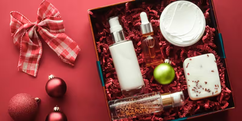
When you design packaging for your cosmetic brand, visual appeal is your utmost concern. Remember, this is what the customers will see first. You have to make sure the packaging design is pleasing to the eye.
The question is, how can you create packaging that can attract your ideal customers? How can you design it so they’ll stop and look at your product despite the presence of other cosmetics around it?
It might seem like a hard task, but there are 3 things that you should focus on – color, font, and illustrations.
Let’s go through them one by one.
Colors
When it comes to packaging design, colors are one of the most important design elements. It’s not just about the visual appeal. There’s a psychology behind colors that you have to understand.
This is why when you do your market research, dig deeper into color psychology. It plays an important role in enticing your ideal customers so they’ll end up buying your product.
You have to choose a color scheme that’ll make your product rise above the rest while showcasing your brand identity.
For instance, black is eye-catching but if your brand is feminine, it might not be the best option for your packaging design. Pink or light purple may be the better option because it promotes love, beauty, romance, and luxury.
Make sure that the colors you’ll choose will resonate with the emotions of your target customers.
Font
After colors, font is the next thing that you have to consider. Cosmetic products should come with an explanation of how they should be used. Some products require a list of ingredients.
But this isn’t the only information you can place. You can also put your brand story – if there’s enough space in the packaging.
Because of this, you have to choose the right font to put all this information in. Like colors, fonts represent something about your brand.
Cursive is feminine. Bold and thick fonts make a statement. Choose the one that represents your product well.
There are many fonts to choose from. Take your time in choosing the one that fits your branding well.
Illustrations
The final design element is the illustration. This refers to all the graphics, patterns, artwork, and images on the packaging design.
Now the illustrations on the packaging can take cues from the product. If you’re selling something that has a floral scent, you can use a floral design.
Or you can opt to use it as a brand strategy by putting your company logo there.
There’s no one rule to do this. Whether you design it with modern art, natural elements, abstract, or geometric patterns, what’s important is to make it unique and true to your brand and product.
Common Designs for Cosmetic Products
There are many design possibilities for your brand’s cosmetic packaging. These aren’t necessarily new trends. On the contrary, these packaging designs are the ones that wouldn’t go out of style no matter what.
So if you want to choose timeless designs, consider the following as your options.
Florals
You can’t go wrong with florals – especially if your market is entirely feminine. And the great thing about this is it can be versatile.
You can make it vintage so it’s nostalgic and romantic. Or you can make it cartoonish so it looks fun. You can even use photographic floral designs.
Whether you decide to use lush flowers or minimalist floral designs, don’t forget to align them with the actual product and your target market.
If it’s for a masculine market, this may not be a great option for your packaging design.
Custom Fonts
Playing with typography has risen in popularity over the years. What makes it a great design is the fact that it’s gender-neutral – at least if you use the right font.
But even if you use cursive, which is feminine, it can still pass as something that men can associate with.
Using custom fonts can be applied to perfumes, skincare, beauty products, etc. You just have to play with the colors and the layout of the font. Use different fonts in different sizes to make the design look creative.
This can be used to express your brand, too. Print your brand name all over the packaging repeatedly. That can help with brand recognition.
You can even have someone write legibly and use that as the typography design. It’ll make your design incredibly unique.
Black and White
Using black and white for packaging designs will never go out of style. It’s one of the cosmetics packaging trends that you’ll always see.
The best use of this design is for luxurious products. If you combine it with foil stamping, you can grab people’s attention. You can capture the interest of customers who like luxurious products.
While this is perfect for embodying luxury and elegance, it can be used for something else.
You can use this design technique as a brand strategy to make a bold statement. Even with just the color and plain text on the surface, that’s already a powerful design – as long as you choose the right materials and layout, it can be a powerful representation of your cosmetic company.
Pastels
There’s something about pastel packaging designs that fit cosmetic products very well. It can be very appealing to customers who like softness and subtlety.
Cosmetic companies targeting the female market would do well to use pastel colors for their packaging design. But how can you apply this design to attract your ideal customer?
You can have the packaging in pastel colors with clean text to keep it from looking too plain. Or choose a pastel graphic design. Playing with color mists can also be an option.
If you like minimalism, using pastel colors can still make it look lively for your customers.
Bold Patterns
Here’s another way to make a bold statement. Use eye-catching patterns.
Go wild with stripes, geometric shapes, and other designs that’ll surely make your cosmetic packaging pop.
Don’t stick to a boring and predictable pattern. Irregular patterns can be artistic when done the right way. It’ll give your packaging design an edge that’ll surely impress your customers.
And if you think that this is just for young cosmetic brands, it’s not. It can be for any cosmetics brand. So go and have fun with this packaging design so you can leave a lasting impression on your market.
Let’s Start Designing Your Cosmetics Packaging. Packoi Printing is Willing to Help.
Having the right cosmetic packaging can be a powerful brand strategy – but only if you do it correctly. It can help you attract people to look closer at your product so they’ll be enticed to buy it.
The design process of unique cosmetics packaging can be fun and educational – if you partner with the right company. Packoi Printing can help you put together the right packaging that’ll give you an edge. It’ll make your product stick out so you can profit more.
Give us the details of your design. We’ll send you a fair quote as soon as possible.


