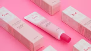
Color is powerful. Up to 90% of snap judgments about a product are based on color alone.Inconsistent colors across packaging, business cards, and marketing materials can erode customer trust and make your brand look unprofessional. Up to 90% of a customer’s first impression is based on color alone—you can’t afford to get it wrong.
The secret to solving this once and for all lies in understanding the critical difference between Pantone vs. CMYK. CMYK is a process that creates colors by mixing four inks, making it ideal for full-color images, photographs, and complex designs. Pantone (PMS), on the other hand, uses pre-mixed spot colors, ensuring exact color consistency across all materials.
This guide will empower you to choose the right color system for every project, ensuring your brand’s colors are always precise, consistent, and powerful.
What are CMYK Colors?
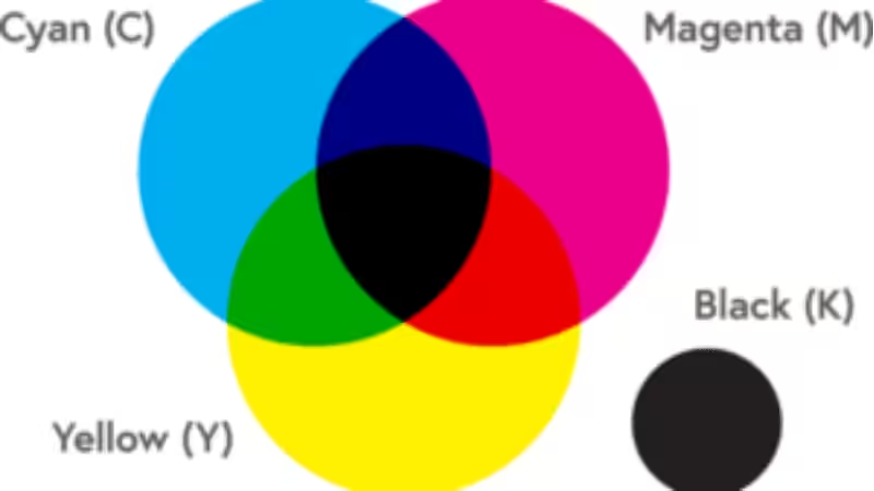
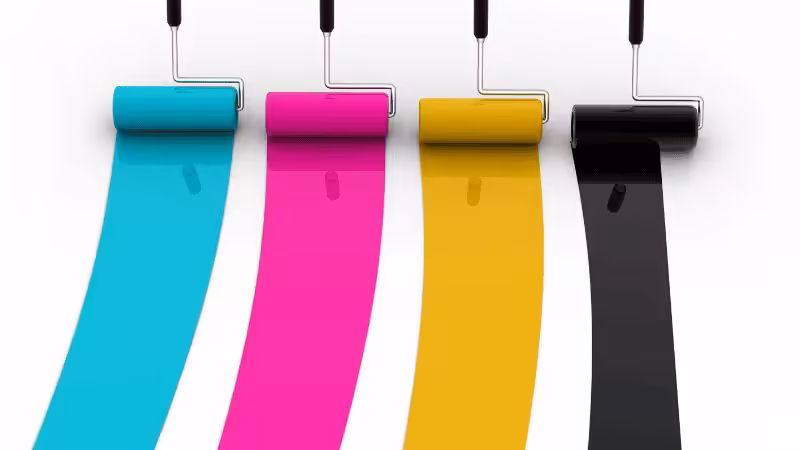
The CMYK color scheme is a subtractive color model used in four-color process printing, relying on cyan, magenta, yellow, and black (key) inks to create a full spectrum of colors. This model works by layering and blending colored inks on paper, subtracting different wavelengths of light to produce the desired hues.
Unlike digital displays that use RGB (red, green, blue) to emit light, CMYK absorbs light, making it the standard for commercial printing.
How the CMYK Model Works
The CMYK color model uses four ink plates to create an image, each corresponding to one of the primary process colors:
- Cyan (C): Absorbs red light and enhances blue-green tones.
- Magenta (M): Absorbs green light and contributes to red-purple hues.
- Yellow (Y): Absorbs blue light and produces warm, golden tones.
- Black (K – “Key”): Enhances contrast and provides deeper black tones, ensuring crisp, high-quality prints.
By layering these inks in varying percentages, CMYK printing can produce a wide range of colors. However, since the inks are mixed during the printing process, slight color variations may occur depending on paper type, ink quality, and printer calibration.
What are Pantone Colors?
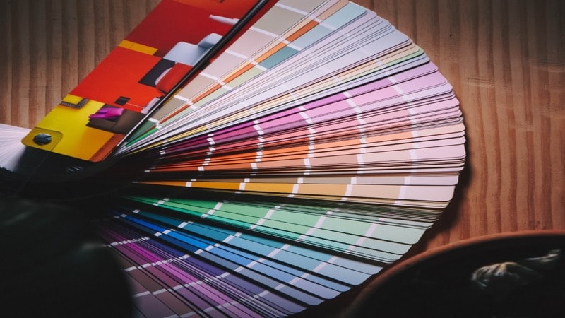
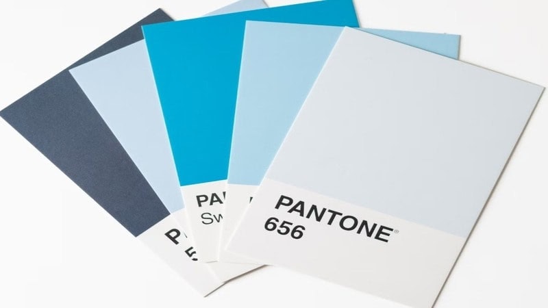
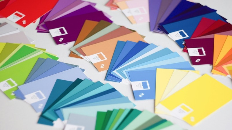
Pantone colors are standardized spot colors designed for precise and consistent color printing. This color model uses pre-mixed physical ink to achieve uniform shades across different materials and printing methods. This consistency is crucial for brands, as studies show that consistent brand colors can increase brand recognition by 80%.
The Pantone Matching System (PMS) consists of 1,867 solid colors, each assigned a unique three- or four-digit identification number. These colors are formulated from 13 base pigments, which are carefully mixed before printing to ensure uniformity.
Each Pantone color code includes a suffix indicating the type of paper stock it is printed on:
- U (Uncoated) – For rough, porous paper surfaces
- C (Coated) – For glossy, smooth paper finishes
- M (Matte) – For soft, non-glossy paper
Since some colors appear different depending on the paper type, the Pantone process ensures color consistency across all three paper stocks. For industries using colored plastics, the Pantone Plastic Color Referencing System is applied. This system uses the letters:
- Q – Opaque plastic
- T – Transparent plastic
This method can also produce deeper black tones, vibrant hues like Radiant Orchid, Tangerine Tango, and Blue Iris, and specialty finishes such as metallics and fluorescents.
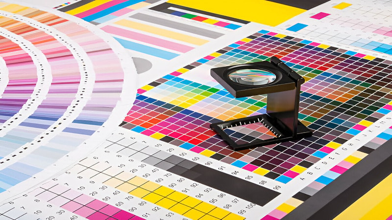
Pantone vs. CMYK: The Key Differences at a Glance
Have you ever noticed that a brand’s logo looks slightly different on a business card than it does on a billboard? This happens because not all printing processes handle color the same way. Here you can see how Pantone is different from the CMYK color model:
| Feature | Pantone Colors | CMYK Colors |
|---|---|---|
| Color Model | Spot color system (pre-mixed inks) | Process color system (cyan, magenta, yellow, black) |
| Color Mixing | Mixed before printing | Mixed during printing using four ink plates |
| Color Accuracy | Highly precise and consistent | Can vary due to paper type, printer calibration, and ink application |
| Best For | Branding, logos, packaging, and solid colors | Full-color images, photographs, and high-volume printing |
| Number of Colors | 1,867 solid colors | Virtually unlimited shades but may not match exactly |
| Printing Cost | More expensive, especially for multiple colors | More cost-effective for large-scale printing |
| Paper Stock Variations | Uses suffix codes (C, U, M) for coated, uncoated, and matte papers | Colors may shift based on paper type and ink absorption |
Color Model & Mixing: Spot Color vs. Process Color
The biggest difference is how the colors are created.
Think of Pantone as buying a specific can of paint from the store—for example, “Tiffany Blue.” The color is pre-mixed in a factory to an exact formula. This is called a “spot color.” Each of the 1,867+ solid colors has a unique identification number.
The CMYK color scheme, on the other hand, is like being an artist with only four paint tubes: Cyan, Magenta, Yellow, and Black (Key). To get a specific shade of green, the printer must mix dots of cyan and yellow ink directly on the paper. This is called “process color.”
Color Accuracy & Consistency: The Gold Standard for Branding
This is where Pantone shines. Because Pantone colors are pre-mixed, the color is incredibly consistent. A logo printed in Pantone 286 C will look the same on a business card in New York as it does on a package in London. This consistency is vital, as studies show that consistent brand colors can increase brand recognition by 80%.
CMYK colors can have slight variations. The final color depends on the printer, the paper, and the ink quality. While professional printers can get very close, achieving a 100% perfect match for precise brand colors with CMYK can be a challenge.
Color Range & Vibrancy (The “Color Gamut” Explained)
A “color gamut” is simply the range of colors a system can produce.
The Pantone system has a wider gamut. It can create colors that the CMYK process cannot, such as bright oranges, vibrant blues (like Blue Iris), deep purples, and specialty finishes like metallics and fluorescents.
The CMYK gamut is smaller. While it can produce millions of shades, it struggles to reproduce those ultra-vibrant colors. This is why a bright logo on your screen can look a little duller when printed in CMYK.
Cost Implications: Which is More Budget-Friendly?
The answer depends on your design.
- CMYK is generally more cost-effective for designs with many colors, like photographs. The printer uses the same four inks for every job.
- Pantone cost depends on the number of colors. If your design uses only one or two specific colors, printing with Pantone inks can sometimes be cheaper than a full four-color CMYK run. However, the price increases for every additional Pantone color you add.
Pantone vs. CMYK: Pros & Cons
The CMYK Model: Pros & Cons
Pros:
- Good for Budgets: More affordable for large print jobs like magazines or brochures.
- Great for Photos: Perfect for printing images with many colors and smooth gradients.
- Standard & Efficient: It’s the industry standard, making most print jobs straightforward and fast.
Cons:
- Inconsistent Color: The final color can change slightly between different printers or paper types.
- Limited Special Colors: Cannot produce bright neons, shiny metallics, or very specific brand colors.
- Faded Blacks: The black ink can sometimes look more like a dark gray than a true, deep black.
Pantone Colors: Pros & Cons
Pros:
- Perfect Accuracy: You get the exact same color every single time, which is vital for branding.
- Specialty Colors: Easily produces metallic, neon, and other unique shades that CMYK cannot.
- Consistent on Any Material: The color stays true whether printed on paper, plastic, or fabric.
Cons:
- Higher Cost: Custom-mixed inks and special printing processes make it more expensive.
- Not for Photos: Unsuitable for printing photorealistic images with complex color transitions.
- Longer Production: Mixing custom inks can add time to the printing schedule.
When to Use Pantone vs. CMYK: Real-World Scenarios
So, how do you decide? Let’s look at some common situations.
Choose Pantone For: Absolute Brand Consistency & Specialty Colors
Use Pantone when color accuracy is your top priority. It’s the best choice for:
- Logos and brand elements that must be the exact same shade every time.
- Designs with 1-3 solid colors, where brand identity is central.
- Projects requiring specialty colors like metallics, neons, or pastels.
- Maintaining color across different materials (e.g., paper, plastic, fabric).
Choose CMYK For: Photographic Images & Cost-Effective Projects
CMYK is the workhorse of the printing world. It’s ideal for:
- Full-color printing with photographs, detailed illustrations, or gradients.
- High-volume marketing materials like magazines, flyers, and brochures.
- Projects where budget is a primary concern and minor color variations are acceptable.
The Hybrid Approach: Using Both for Optimal Results
You don’t always have to choose just one. A common and effective strategy is to use both. For example, you can print a brochure using CMYK for the photos and text, but add a fifth, separate Pantone ink plate just for your logo. This ensures perfect brand color while keeping costs manageable—a smart way of reducing our packaging price without compromising identity.
From Screen to Print: Why Your Colors Don’t Match
The most common frustration in printing is when the final product doesn’t match what you saw on your computer. Here’s why.
The Digital Dilemma: RGB vs. CMYK and Pantone
Your computer screen, phone, and digital camera all use the RGB (Red, Green, Blue) color model. They create colors by mixing light. The more light you add, the brighter the color, until you get white.
Printers use CMYK, a subtractive model. They create colors by putting ink on paper, which absorbs light. The more ink you add, the darker the color, until you get black.
Because these two systems work in opposite ways, a bright, glowing RGB color on screen can’t be perfectly replicated with CMYK ink on paper. Designs must be converted from RGB to CMYK for printing, and this conversion is where color shifts happen.
How to Convert Pantone to its Closest CMYK Match
Sometimes, you have a Pantone brand color but need to print it using the more affordable CMYK process. You can convert it, but it’s a compromise.
Design software like Adobe Illustrator has tools to find the official CMYK equivalent for a Pantone color. However, the result will be an approximation, not a perfect match. The best practice is to consult a physical Pantone Color Bridge swatch book. This book shows a Pantone color directly next to its closest CMYK simulation, so you can see the difference before you print.
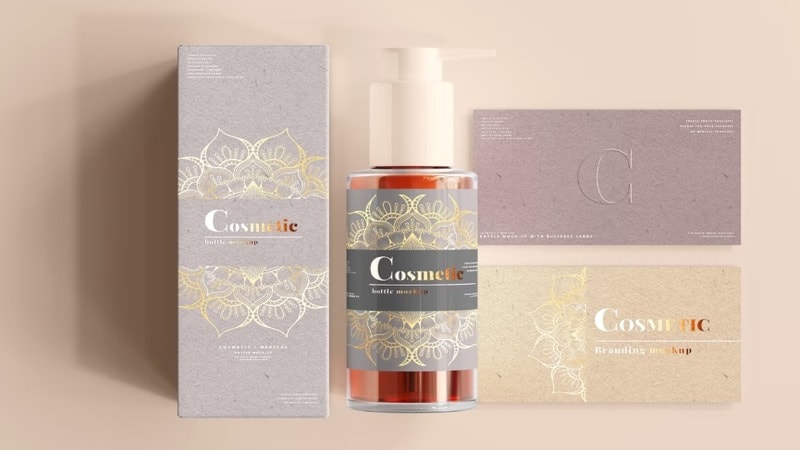
Applying Colors to Packaging: A Practical Guide for Brands
For packaging, color choice has a direct impact on how customers perceive your product on the shelf.
Choosing the Right Color System for Your Packaging Design
- For packaging with complex artwork or photos, CMYK is the practical choice. It allows for rich, detailed imagery across the box.
- For a strong brand identity, use a Pantone color for your logo and key brand elements. This ensures your signature color is consistent across all your packaging, from mailer boxes to retail cartons.
The Impact of Material: How Paper Stock (Coated, Uncoated, Kraft) Affects Color
The material you print on dramatically changes how a color looks.Pantone recognizes this with suffixes on its color codes:
- C (Coated): For glossy, smooth paper. Colors appear sharp and vibrant.
- U (Uncoated): For rough, porous paper (like standard cardboard). Ink soaks in more, making colors appear darker and less saturated.
- M (Matte): For soft, non-glossy paper.
The same Pantone ink will look different on coated vs. uncoated stock. It’s essential to choose your color based on the material you will be using.
Pro Tip: Using a white ink base on kraft paper
Printing on brown kraft paper can make colors look muddy. To make your colors pop, printers can first lay down a layer of opaque white ink and then print your CMYK or Pantone colors on top of it. This acts as a primer and keeps your brand colors bright and true.
Frequently Asked Questions About Pantone & CMYK
Q1:How do I convert a Pantone color to CMYK?
Yes, you can convert Pantone colors to CMYK using software like Adobe Illustrator or Photoshop, which provides official Pantone color libraries. However, the result is an approximation, not a perfect match, as the CMYK color gamut is smaller. Always expect some color shift, especially with very bright or vibrant Pantone shades.
Q2:Can I just use a CMYK equivalent for my Pantone logo?
While you can find the closest CMYK match for a Pantone color, it comes with the risk of inconsistency. The color of your logo may look slightly different each time it’s printed on different materials or by different vendors. Using the official Pantone color is the only way to guarantee absolute color accuracy and protect your brand identity.
Q3:Why do designers and printers still use physical Pantone color books?
Digital screens are not color-accurate and vary widely from one device to another. A physical Pantone guide acts as the universal, objective standard, ensuring that the designer, client, and printer are all referencing the exact same physical color swatch. This eliminates guesswork and guarantees the final printed color meets expectations.
Q4:Can I print both Pantone and CMYK on the same packaging box?
Absolutely, this is a common technique for high-end packaging and is often called a “5-color” or “6-color” print job. This process uses the standard four CMYK inks for photographic images and adds one or more separate Pantone inks for logos or brand colors. It offers the best of both worlds but requires a specialized printing setup to ensure perfect alignment and quality.
Conclusion: Making the Right Choice for Your Brand
Both CMYK and Pantone are excellent color systems. The right choice depends entirely on your project’s goals, design, and budget.
- CMYK is the versatile, cost-effective standard for photographic and multi-color printing.
- Pantone is the unbeatable choice for color accuracy, consistency, and brand integrity.
For the best results, many brands use both systems together—CMYK for detailed artwork and a spot Pantone color for critical branding elements. By understanding these differences, you can make informed decisions and ensure your brand’s colors are always perfect.
Get the Best Printing Service from Us
Are you looking for a design agency that can improve your brand’s relationship with customers using effective and personalized marketing solutions? Packoi Printing is one of the many design agencies that provide both CMYK and Pantone printing as a marketing solution.
The agency can help with retail packaging, designing promotional material, and developing distinctive logos. Talk to us now and order your custom packaging.