
Pantone color swatches emerged from the need to standardize the printing of promotional and branding materials. This was vital in ensuring that there is consistency in the branding of different elements in your company.
Always have a Pantone color book to ensure that you have top-notch production runs in your projects. Moreover, liaise with your printer to get the right color for your brand in all printed materials. Another important aspect is to ensure that you have Pantone spot colors shared with your printer, especially when you are operating in different locations. This is an important strategy to ensure consistency in your screen and paper appearance.
Designing Branding Materials
When it comes to designing and printing with colors, you always need something that is consistent and gives you amazing results. Artists, designers, and other creatives use Pantone colors to print and design. You must understand that printing with Pantone matching system PMS and CMYK colors is very different.
Therefore, when it comes to choosing the colors to print your packaging in, it is basically confusing and many people do not know what to settle with. Color consistency is vital when it comes to designing and printing packages, marketing materials, or any other type of art. With color consistency, you guarantee brand recognition and identity.
In this guide, we provide details on how to choose the right Pantone colors or swatches for your design. Pantone colors are among the most popular color spaces used in the design.
Do you have any questions about what color spaces are? Color spaces refer to systems that arrange or organize color when printing or designing. With chosen color spaces, it ensures that everyone remains on the same page and has a standardized system of color, which is vital in avoiding printing errors.
Before we dive into details on how to choose Pantone matching system colors, let us discuss what are Pantone colors.
What is Pantone and Why Should You Use It for Your Print Designs?
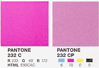
Pantone is vital because it provides consistency in printing. The color mixes ink and creates a consistent or precise color match whenever someone is designing. The color system is usually known as Pantone Matching System (PMS). It comes in more than 1000 colors.
Just like when you are selecting color shades for your kitchen, the Pantone colors link to specific swatch samples and numbers. Through the standardization of the color matching system, designers in any location of the world ensure that their colors match even though they cannot be compared physically.
So, you should use Pantone colors because they provide exact color matches no matter the printer or location. It is perfect for individuals looking for colorful, consistent, and high-quality branding. In designing companies, Pantone Matching System is used for quality control.
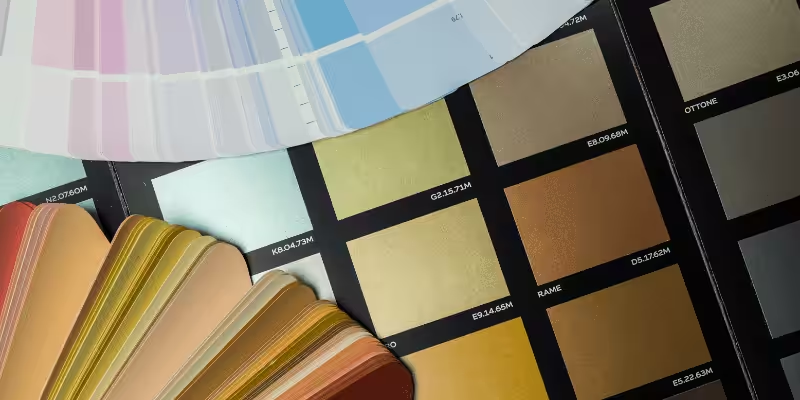
Difference Between Pantone Color and CMYK Colors
The major difference between CMYK and Pantone Colors is based on the accuracy level of the final outcome. With the Pantone system, you will always get specific colors whenever you are printing or designing. On the other hand, CMYK gives significant color differences on each print.
Designers believe that CMYK colors have certain limitations and can never produce colors with similar vibrancy compared to Pantone. CMYK printing is usually inconsistent compared to Pantone Swatches. Designers typically notice a tonal variation between what they see on screen and what is written on paper.
These limitations are usually addressed by the Pantone swatches. It is regarded that the color system offers the best quality in printing and designing. However, it is more expensive compared to CMYK because it consumes much time and uses the single-print method. With the Pantone method, each color is usually printed one at a time and is never mixed together unlike what happens in CMYK printing.
In this regard, if you have more colors on designs, you will need more spots, making you pay more for projects with multiple colors. Therefore, the Pantone system is usually ideal for designs that are simple and straightforward.
If you are a printing perfectionist, using Pantone Color Systems is the perfect choice for you. On the other hand, for print jobs where quantity and detail color choices are important, it is always effective to go with CMYK.
Can You Convert Pantone Colors to CMYK?
If you design using apps like Adobe Illustrator, you will definitely use CMYK color pigment in your designs. Most designers are wondering whether it is possible to convert CMYK color swatches to Pantone Color Swatches. First, we must admit that the process of converting these colors is usually tricky, especially for individuals who prefer a particular color space over another. Therefore, it is important to put in mind what your brand colors are and the exact color match you need.
However, it is possible to change from Pantone Color to CMYK swatch before printing, and vice versa. This ensures that you are printing colors as accurately as possible. It avoids challenges with an appearance on the final print, whether you are using adobe illustrator or other designing applications.
When you want to convert colors from one space to another, it is always vital to understand the different color codes for the two systems. There are many online tools that can help you convert CMYK to Pantone, so you need to know the values of the specific color you would like to convert.
Another advantage of applications like adobe illustrator and photoshop is that they can switch between these color modes within the system.
How Do You Choose the Correct Pantone Swatch When Creating Print Designs?
There are several processes involved in choosing Pantone colors. Here is a comprehensive process you can follow in choosing the right Pantone color Swatches for your design projects.
If you are designing a brand identity package for your business, you should first look through the Pantone Formula Guide and choose the colors you like.
After choosing the colors you like and noting down the specific codes for all components. When the design is over, the coated or uncoated Pantone swatches codes should be recorded and sent to the printer.
The press operator or printer should use the exact printing process in order to produce exact colors on the final product. This provides consistent color outcomes on the printed materials, whether they are packages, marketing materials, or inserts for your shipping boxes. Always settle for a Pantone color that rightly represents your brand.
Converting CMYK Color Into Spot Colors
If you design your projects in CMYK, you might need to convert them into spot colors in order to provide perfect results. This is an easy process that every self-confessed print geek can accomplish. However, you might need the assistance of a professional designer to get the right Pantone Color Swatches for your brand.
During the conversion process, it is important to have your Pantone color guide on your hands. This is important to produce quality results and ensure that you are effective in your branding.
Conclusion
Pantone color swatches are popular in commercial printing projects. They were used to standardize printing styles and ensure that branding provided specific color pigments for customers. The Pantone color swatches provide consistency in printing and ensure that optimal results are achieved.
Always aim for the exact match in your colors. Talk to your graphic designer and have specific CMYK values or Pantone codes to ensure you have the same color across your branding. This is important to establish brand identity across different places.
Get Your Pantone Designs Today?
Are you looking for the perfect branding materials for your business? Talk to us and get the best services you will get nowhere else. At Packoi Printing, we are committed to offering customers amazing designs aligned with their brand needs. We are always committed to what you desire. Get in touch with our design team for perfect results on your project. We design custom booklets, catalogs, brochures, and other marketing materials.