Up to 90% of snap judgments about a product are based on color alone. Pantone and CMYK are two distinct color systems used in printing, each with its own strengths and applications.
CMYK is a process that creates colors by mixing four inks, making it ideal for full-color images, photographs, and complex designs.
Pantone (PMS), on the other hand, uses pre-mixed spot colors, ensuring exact color consistency across all materials.
In this article, we’ll explore the key differences between Pantone vs. CMYK color model and help you decide which one best suits your needs.
What are CMYK Colors?
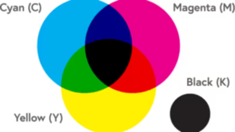
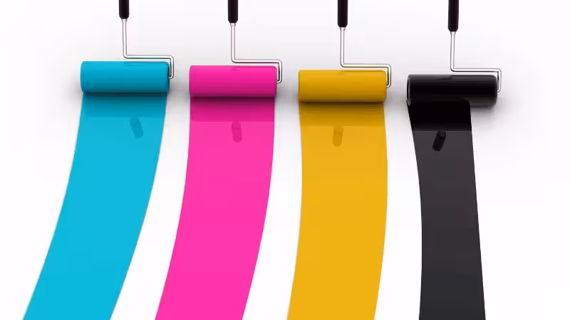
The CMYK color scheme is a subtractive color model used in four-color process printing, relying on cyan, magenta, yellow, and black (key) inks to create a full spectrum of colors. This model works by layering and blending colored inks on paper, subtracting different wavelengths of light to produce the desired hues.
Unlike digital displays that use RGB (red, green, blue) to emit light, CMYK absorbs light, making it the standard for commercial printing.
How the CMYK Model Works
The CMYK color model uses four ink plates to create an image, each corresponding to one of the primary process colors:
- Cyan (C): Absorbs red light and enhances blue-green tones.
- Magenta (M): Absorbs green light and contributes to red-purple hues.
- Yellow (Y): Absorbs blue light and produces warm, golden tones.
- Black (K – “Key”): Enhances contrast and provides deeper black tones, ensuring crisp, high-quality prints.
By layering these inks in varying percentages, CMYK printing can produce a wide range of colors. However, since the inks are mixed during the printing process, slight color variations may occur depending on paper type, ink quality, and printer calibration.
What are Pantone Colors?
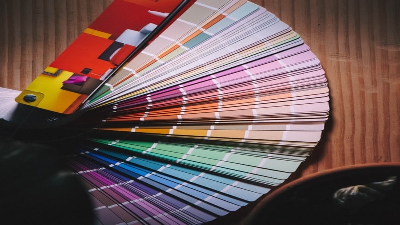
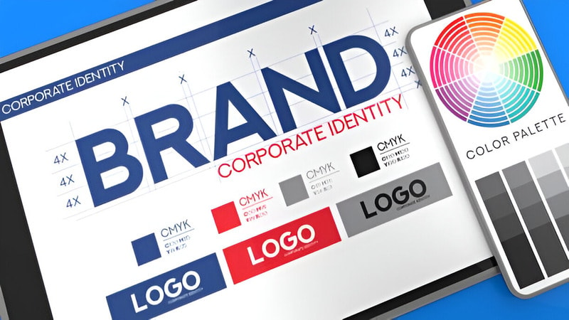
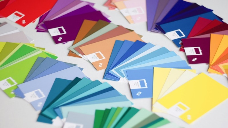
Pantone colors are standardized spot colors designed for precise and consistent color printing. This color model uses pre-mixed physical ink to achieve uniform shades across different materials and printing methods. This consistency is crucial for brands, as studies show that consistent brand colors can increase brand recognition by 80%.
The Pantone Matching System (PMS) consists of 1,867 solid colors, each assigned a unique three- or four-digit identification number. These colors are formulated from 13 base pigments, which are carefully mixed before printing to ensure uniformity.
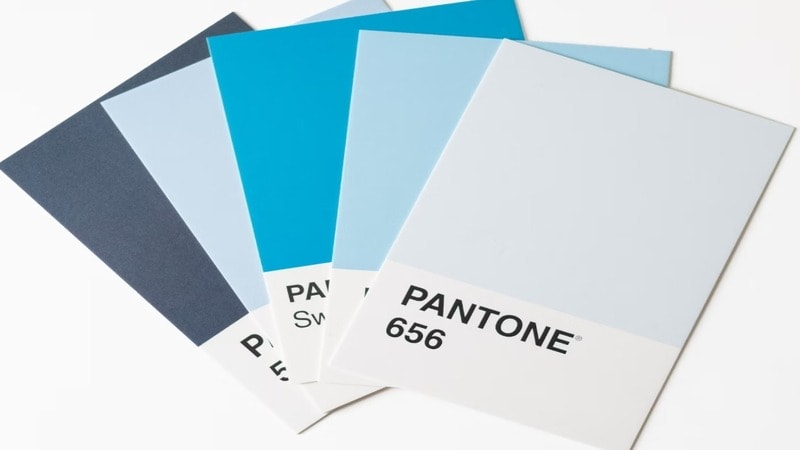
Each Pantone color code includes a suffix indicating the type of paper stock it is printed on:
- U (Uncoated) – For rough, porous paper surfaces
- C (Coated) – For glossy, smooth paper finishes
- M (Matte) – For soft, non-glossy paper
Since some colors appear different depending on the paper type, the Pantone process ensures color consistency across all three paper stocks. For industries using colored plastics, the Pantone Plastic Color Referencing System is applied. This system uses the letters:
- Q – Opaque plastic
- T – Transparent plastic
This method can also produce deeper black tones, vibrant hues like Radiant Orchid, Tangerine Tango, and Blue Iris, and specialty finishes such as metallics and fluorescents.
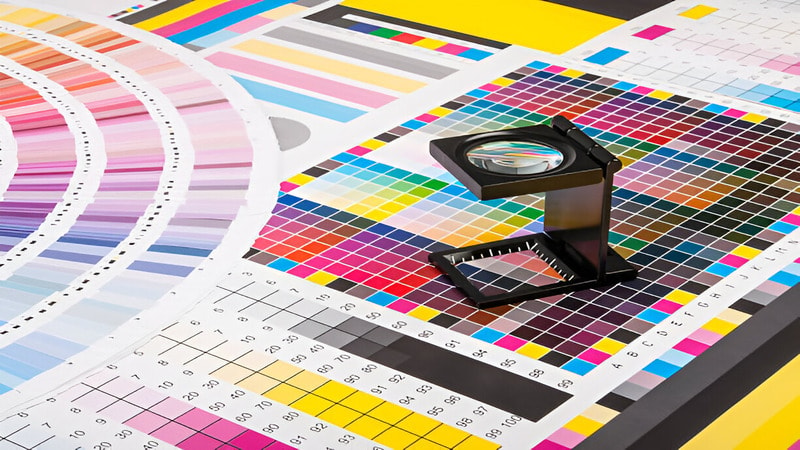
What’s the Difference Between Pantone and CMYK?
Have you ever noticed that a brand’s logo looks slightly different on a business card than it does on a billboard? This happens because not all printing processes handle color the same way. Here you can see how Pantone is different from the CMYK color model:
| Feature | Pantone Colors | CMYK Colors |
|---|---|---|
| Color Model | Spot color system (pre-mixed inks) | Process color system (cyan, magenta, yellow, black) |
| Color Mixing | Mixed before printing | Mixed during printing using four ink plates |
| Color Accuracy | Highly precise and consistent | Can vary due to paper type, printer calibration, and ink application |
| Best For | Branding, logos, packaging, and solid colors | Full-color images, photographs, and high-volume printing |
| Number of Colors | 1,867 solid colors | Virtually unlimited shades but may not match exactly |
| Printing Cost | More expensive, especially for multiple colors | More cost-effective for large-scale printing |
| Paper Stock Variations | Uses suffix codes (C, U, M) for coated, uncoated, and matte papers | Colors may shift based on paper type and ink absorption |
Pros and Cons of CMYK Model
Pros of the CMYK Model
- Cost-Effective for High-Volume Printing: The CMYK color model is widely used in commercial printing due to its affordability. It relies on four standard colored inks which makes it more cost-effective than custom-mixed Pantone colors. This is why CMYK is always a preferred choice for marketing materials like magazines, brochures, newspapers, and flyers.
- Wide Color Range for Full-Color Prints: By layering different amounts of cyan, magenta, yellow, and black, the CMYK model works to produce millions of color variations. This makes it ideal for photographs, gradients, and detailed images that require smooth color transitions.
- Efficient for Process Printing: Since CMYK printing is the industry standard for process color printing, it ensures reliable and consistent results across large-scale production runs. Many printing presses are optimized for CMYK, making it a practical choice for most print materials.
Cons of the CMYK Model
- Inconsistent Color Accuracy: Unlike Pantone colors, which are pre-mixed, CMYK colors are created by combining ink during printing. This means the final color can vary depending on factors like printer calibration, paper type, and ink quality. As a result, achieving precise brand colors can be challenging.
- Limited Vibrancy and Special Colors: The CMYK model struggles to reproduce fluorescent, metallic, and certain deep shades, such as radiant blues or rich purples. This limitation makes it less suitable for projects requiring bold, highly specific colors.
- Black Tones May Appear Faded: In CMYK printing, black is created using the K (black) ink plate, but it may not always appear deep or rich. Instead, it can sometimes look dark gray, requiring additional ink layers to produce deeper black tones. This can increase ink usage and printing costs.
Pros and Cons of Pantone Colors
Pros of Pantone Colors
- Unmatched Color Accuracy: Pantone colors provide precise color matching, ensuring that the final print looks exactly as intended. They are pre-mixed and identified by a unique number, eliminating color separation issues and maintaining color consistency across different materials.
- Ideal for Branding and Spot Colors: For companies that require consistent brand identity, Pantone is the preferred choice. The Pantone Color Institute develops color trends and ensures accurate color reproduction, making it the industry standard for logos, corporate materials, and packaging.
- Ability to Produce Specialty Colors: Pantone offers shades that the CMYK printing process cannot achieve. This includes fluorescent, metallic, pastel, and deep hues. Additionally, Pantone colors can produce deeper black tones, ensuring rich and bold blacks that don’t appear washed out.
- Consistent Results Across Different Materials: Pantone colors remain the same across different surfaces, including paper, fabric, plastic, and packaging materials. This is due to the physical ink formulation used in the Pantone Matching System (PMS).
Cons of Pantone Colors
- Higher Printing Costs: Since Pantone colors are pre-mixed, they require custom ink mixing and additional printing steps. This increases printing costs, especially for large-volume prints.
- Limited for Full-Color Images: While Pantone excels in spot colors, it is unsuitable for photorealistic images requiring gradients, color transitions, and shading.
- Not Always Compatible with CMYK and RGB: Although you can convert some Pantone colors into the CMYK color model, the results may differ. Certain shades, such as radiant orchid, tangerine tango, and blue iris, may not appear the same in CMYK or RGB colors due to differences in how such a model works. This can create challenges when using both RGB and Pantone in mixed-media designs.
- Longer Production Time: Because Pantone inks are mixed before printing, printing can take longer. This may not be ideal for tight deadlines or projects requiring quick turnaround times.
When to Use CMYK vs. Pantone Colors?
Use CMYK for Full-Color Printing and Cost-Effective Projects
The CMYK color model is ideal for printing process applications where cost and efficiency are top priorities. Since CMYK printing relies on three colors —cyan, magenta, yellow, and one key color black (K)—it works well for brochures, magazines, flyers, posters, and any print materials with gradients or photographic images.
The subtractive color model blends these colored inks to create a wide range of shades, making it suitable for detailed images and complex color schemes.
If your design requires mass production or involves varying color tones, for example, orange and pink, then this is the perfect option. However, since CMYK color accuracy can fluctuate based on the printing process, ink type, and paper stock, it may not be the best choice for precise brand colors.
Use Pantone for Precise Brand Colors and Specialty Printing
If you need consistent brand identity, Pantone colors offer unparalleled color accuracy. A Pantone Matching System (PMS) assigns a unique identification number to each shade, ensuring that the same color appears consistently across different materials. This is essential for logos, corporate branding, product packaging, and business stationery.
Pantone is also the go-to choice when using spot colors. For instance, shades like radiant orchid, green leaves, and blue iris may appear washed out in CMYK, while Pantone ensures their vibrancy and richness remain intact.
However, Pantone printing is best suited for small-scale projects or brand-centric designs since it requires custom-mixed inks, which can increase costs.
Combining CMYK and Pantone for the Best Results
In some cases, industry experts use both RGB and Pantone, or Pantone and CMYK, to balance cost efficiency and color precision. For example, a company might print a Pantone-matched logo on a CMYK-printed brochure to maintain brand integrity while keeping production costs low.
Ultimately, the decision between CMYK vs. Pantone depends on your project’s requirements, budget, and desired level of color consistency.
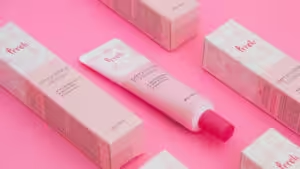
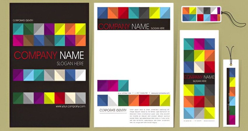
How Do You Make Use of CMYK or Pantone Colors in Packaging Design?
CMYK colors are ideal for retail packaging because they allow for design flexibility rather than strict color matching. By adjusting (CMYK) values, industry experts can create unique shades and tones for different product lines. This method is cost-effective and perfect for high-volume printing where minor color variations are acceptable.
For strong brand identity, Pantone colors (PMS) offer consistent, accurate shades across different print materials. Unlike CMYK printing, PMS colors are pre-mixed and applied as spot colors, ensuring identical hues in each print run.
This makes Pantone ideal for logos, stock boxes, custom packaging, and branding materials where color accuracy is critical.
Moreover, A hybrid approach can be beneficial. We all love reducing our packaging price. And using CMYK for detailed artwork and Pantone for brand logos or key elements ensures both cost-efficiency and consistent branding.
Additionally, brands can leverage the Pantone color spectrum for subtle design enhancements, making packaging stand out while maintaining a recognizable identity.
Conclusion
Both CMYK and Pantone color systems are widely used in printing, design, and manufacturing. Choosing the right one depends on your needs. CMYK is the industry standard because it’s cost-effective, versatile, and efficient.
However, it has a limited color range and can lead to slight variations in color reproduction. While Pantone offers precise, vibrant colors with consistent results, making it ideal for branding.
However, it is more expensive for complex designs. For the best results, many businesses use both systems together—CMYK for detailed artwork and Pantone for branding elements.
Get the Best Printing Service from Us
Are you looking for a design agency that can improve your brand’s relationship with customers using effective and personalized marketing solutions? Packoi Printing is one of the many design agencies that provide both CMYK and Pantone printing as a marketing solution.
The agency can help with retail packaging, designing promotional material, and developing distinctive logos. Contact us quickly!