When it comes to printing, maintaining color consistency and color accuracy is crucial for effective branding and marketing. Inconsistent colors can weaken a brand’s identity and confuse customers. This is where color matching comes into action. It helps to ensure your brand colors remain consistent across all materials.
In this blog, we’ll discuss what color matching is and how it’s done. We’ll also talk about the importance of color matching in the printing and design process, and some common challenges that designers face in color matching.
Let’s start!
What is Color Matching in Printing?
Color matching refers to the process of ensuring color consistency between the printed version and the original design, displaying accurate colors across different mediums. This color consistency in printing helps build consumer familiarity with the brand.
Though the concept may seem simple, color printing is not always straightforward. Replicating digital colors can be challenging due to several factors, such as differences in color models, ink limitations, and paper types. The shift from on-screen design to print can lead to discrepancies, making it difficult to reproduce accurate colors.
What are Color Models in Printing?
Color models are systems used to represent and describe colors in a consistent manner. These color models provide a standardized way to mix and reproduce colors, which allows the representation of many different colors using some specific colors. The purpose of using color models is to ensure color matching in the printing process.
Now, we’re going to discuss three popular color models, their applications, and their limitations.
1. RGB Model

The RGB (Red, Green, Blue) model creates colors by combining red, green, and blue lights at varying intensities. This model operates through an additive process, meaning that colors are formed by adding light. For instance, adding red, green, and blue at full intensities produces white light, while the absence of all three results in black.
This model is incredibly diverse and capable of displaying over 16.7 million colors. With so many colors, RGBl allows vibrant and realistic visualizations, making it an ideal choice for design work. All digital devices are optimized for RGB, which is why it is considered the universal standard for screen-based applications.
While RGB is ideal for digital displays, it is unsuitable for printing with physical inks. Printing relies on a subtractive process, where colors are produced by absorbing and reflecting light rather than adding it. Furthermore, physical inks cannot reproduce all the colors the RGB model can achieve.
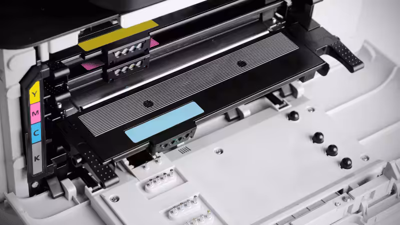
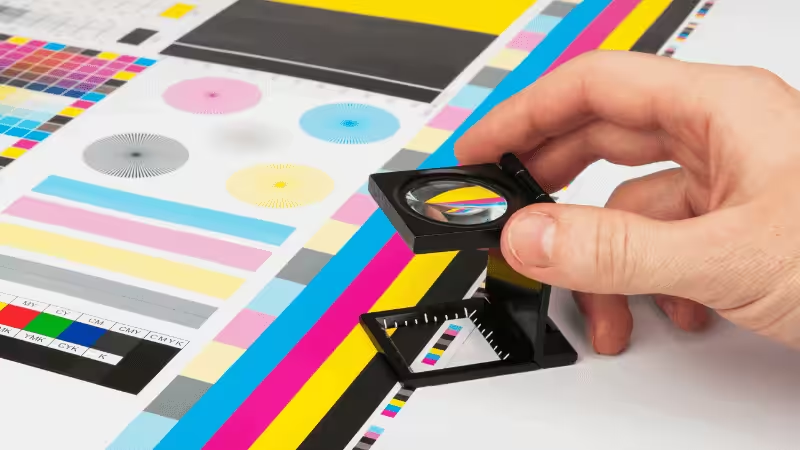
2. CMYK Model
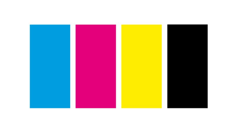
CMYK stands for Cyan, Magenta, Yellow, and Black. By mixing these basic colors, a wide spectrum of printable hues is created. The CMYK printing process follows a subtractive process, meaning that colors are formed by absorbing certain wavelengths of light and by reflecting others.
The table below shows the absorbed and reflected lights for the primary colors in CMYK.
| Color | Absorbed Light | Reflected Light |
|---|---|---|
| Cyan | Red | Green and blue |
| Magenta | Green | Red and blue |
| Yellow | Blue | Red and Green |
| Black | None (Used for adding depth and improving shadows) | None (Used for adding depth and improving shadows) |
Table 1) Color Absorption and Reflection in CMYK
The CMYK color gamut is narrower than that of RGB, as it cannot reproduce some vibrant hues like neons or metallics. One key advantage of using the CMYK color model is its cost-effectiveness, as it uses standard inks that are readily available, and custom color matching or pre-mixing is generally not required.
3. Pantone Matching System (PMS)

The Pantone Matching System (PMS) is a standardized color-matching system widely used in printing and design applications to achieve high color accuracy, providing an exact match. Unlike CMYK, PMS uses pre-mixed inks (spot colors) to achieve specific colors. Each spot color is assigned a unique Pantone color code.
This system offers a broad color gamut, including solids, metallics, and neons, providing exceptional quality and color consistency. Businesses prefer the Pantone color matching system due to its unmatched color consistency across various mediums, making it an ideal choice for brand logos, packaging design, and other printing applications.
However, despite the outstanding color accuracy and exact color match, one major drawback of using the Pantone system is its cost. Spot colors can be more expensive than traditional CMYK printing, as the process needs pre-mixed inks and specialized printers.
The following table compares the three color models based on their purpose, uses, color gamut, cost, and limitations.
| Characteristics | RGB | CMYK | Pantone |
|---|---|---|---|
| Purpose | Standardized colors for consistency | Colors for screens | Colors for printed materials |
| Primary Uses | Websites, apps, digital media, etc. | Packaging, posters, magazines, etc. | Branding, logos, packaging etc. |
| Color Range | Widest color range | Most limited range | Limited but highly-specific |
| Cost | No additional cost | Cost-effective | Expensive |
| Limitation | Cannot be printed directly | Limited color range | Expensive due to spot color inks |
Table 2) Side-by-side comparison of RGB, CMYK, and Pantone
Step-by-Step Guide to Color Matching in Printing
Now that you are familiar with color models, let’s understand the color-matching process for printing.
1. Monitor Calibration
Since digital color displays, like monitors, often do not display the exact colors that will be printed, it’s crucial that you calibrate your monitor properly before starting your design work. Monitor calibration can be done in two ways.
Hardware Calibration Tool
Use a colorimeter or spectrometer, which compares the light emitted from your monitor with known color standards. These tools often come with color management software, such as X-Rite i1Profiler or Datacolor SpyderX, which automatically adjust your monitor’s color settings.
Adjusting Display Settings
Alternatively, you can manually adjust your monitor’s display settings. Set the screen brightness to around 120-140 cd/m², and keep the contrast range at 70-80% of the monitor’s maximum. The monitor’s typical white point (or color temperature) should be 6500K (daylight settings). Windows also offers a built-in screen calibration tool to guide you through the process.
2. Choosing the Right Color Profile
The next step in the color-matching process is selecting the correct color modes based on the intended output. If you are designing for digital use, opt for RGB, which is supported by most monitors and devices and offers a wide color gamut. RGB colors can also be converted to CMYK colors for printing, but remember that the color matching may not be as accurate after conversion.
If you want precise color matching in both physical and digital printing, choose Pantone Matching System. It offers standardized color formulations, ensuring colors are faithfully reproduced, making it ideal for projects where color accuracy and consistency are critical. It is particularly valuable for logos and branding, providing an accurate and consistent color reproduction.
3. Convert RGB to CMYK Before Printing
Once the design phase is complete, convert the RGB colors to CMYK. You can use software like Adobe Photoshop or Adobe Illustrator to convert between the color profiles. Alternatively, you can use online converters for quick conversion, but they may be inaccurate.
Without this conversion, your print may not be a perfect match with the design, or it may appear dull because printer inks cannot reproduce all the colors in RGB. If you are using Pantone colors, this step may not be necessary.
4. Proofing
Proofing allows you to check how colors appear in print before the final run. It can be done by digital (soft) or physical (hard) proofs. For soft proofing, you simulate the print colors on a calibrated monitor and confirm that the display matches the expected outcome.
For hard proofing, you can print a physical sample on actual paper using the same printer and print materials as in the final product run. Finally, to adjust any discrepancies in the proofs, you can use tools like Adobe Photoshop and Illustrator to make the necessary changes.
5. Communicate with Printers
Communicate with your printer using RIP (Raster Image Processor) software to manage printer settings and ensure optimal print quality. RIP helps you control various factors like resolution, color handling, and ink distribution.
Finally, share detailed color specifications and confirm the color models, paper type, finishing options, and print run details. You can also set other preferences, such as coatings and gloss levels.
Why is Color Matching so Important?
Color matching techniques play a vital role in various aspects of design and branding. Here are some points highlighting the significance of this process.
1. Brand’s Color Consistency
Colors are often the first thing consumers notice and associate with a brand. Precise color matching enables brands to have consistent colors across all marketing materials, which in turn helps build trust and recognition.
2. Professional Appearance
Color matching is important for presenting a professional and polished image. Mismatched colors can make designs appear unrefined, affecting how a brand is perceived.
3. Cost-Efficiency
Correct color matching reduces the risks of reprints and costly mistakes, ultimately saving on material waste and production costs. It also confirms that the final product meets expectations the first time around.
4. Uniformity Across Multiple Platforms
Colors can look different across devices and printing surfaces. Proper color matching ensures that the designs appear consistent and accurate in both print and digital formats.
5. Psychological Impact
Colors can evoke specific emotions. For example, blue conveys trust, while red is associated with excitement or urgency. Consistent use of colors helps in communicating the intended psychological message.
6. Regulatory Compliance in Specific Industries
In pharmaceuticals and food packaging industries, maintaining color accuracy is often subjected to strict regulations. Inaccurate colors could imply misbranding or compromise on quality or safety.
Common Challenges in Achieving Consistent Color Matching
Color matching can be tricky due to factors like variations in perception, lighting conditions, and print materials. Some common challenges are listed below:
1. Color Perception Variability
Different people perceive colors differently due to factors like age and vision differences. What looks like a vibrant red to one person could be dull or orangish to another. A mismatch in perception leads to dissatisfaction among clients.
2. Lighting Conditions
Metamerism refers to the phenomenon where colors appear differently under varying lighting conditions. Due to metamerism, two colors that seem to match under one type of light may look noticeably different when viewed under a different lighting source. This makes consistent color matching challenging, especially for designs intended to be viewed in diverse environments.
3. Material Differences
The different materials used for printing, such as differences in paper type, paper weight, or finish, can highly impact the appearance of the printed colors. For instance, glossy surfaces often make colors look brighter, while matte finishes can dull them a bit.
Additionally, printing on transparent surfaces, like acrylic, can differ depending on the side to which the ink is applied. If the ink is applied to the top surface (first surface), the colors will appear more vibrant, but if applied to the back surface (second surface), the colors can appear slightly softer.
4. Conversion Between Color Spaces
Converting from RGB to CMYK for printing can often result in color discrepancies due to CMYK’s limited gamut compared to RGB. Vibrant colors like neon greens or blues may appear dull when printed. This can be improved by creating some physical samples and adjusting the design before the final print output.
5. Printer Limitations
Printers often have some technical constraints, such as a limited number of ink cartridges, restricted print resolution, or a reduced color range. Other factors like nozzle precision, ink drying speed, and alignment accuracy can also cause inconsistent print results. Overcoming these challenges requires specialized technical knowledge.
5 Tips for Achieving Accurate Color Matching
Getting consistent and accurate color reproduction in printing can be challenging for various reasons. Here are five tips to help you master the art of color matching and ensure that your printed look is an accurate representation of the colors that align with your design.
1. Calibrate Your Monitor Regularly
Monitors can shift their color representation due to temperature fluctuations and changes in ambient light. Because of this, you should perform regular calibration on your monitor, especially if the final output color accuracy and precision are critical.
2. Choose the Right Color Profile
Select the right color profile based on your requirements. Use RGB for digital designs and CMYK for print projects. Use Pantone spot colors for precise color matching, especially for logos and branding.
3. Use a Standard Light Source for Viewing Proofs
Review the test prints under a standardized light source like D50 (5000 Kelvin) or D65 (6500 Kelvin) to simulate how colors appear under typical lighting conditions. This reduces metamerism and ensures that your test prints’ proofs match the intended design.
4. Choose Materials That Align With Your Design Goals
The choice of paper stock and finish can significantly influence the color accuracy in printing. Glossing finishes can make colors appear more saturated, while matte finishes can make them more subdued. Additionally, textured papers, such as linen or felt, can scatter light and cause color deviations.
5. Invest in Professional Printers for Complex Projects
Research the best options for professional printers and check out their features. Generally, high-quality digital printers will have Color Management Systems (CMS), proofing options, and support various file formats. Furthermore, printers with G7 Master Certification guarantee industry-standard color calibration.
FAQs
Why do colors look different on screen vs. print?
Digital displays use RGB (Red, Green, Blue), an additive color model where light is emitted to create colors. In comparison, printers use CMYK (Cyan, Magenta, Yellow, Black), a subtractive model where colors are produced by absorption and reflection of light.
What is the best color space for printing?
CMYK (Cyan, Magenta, Yellow, Black) is the best color space for printing. Printers use CMYK inks to reproduce the colors because this model is specifically designed for subtractive color mixing, which is suitable for printing.
How can I make sure my printer produces accurate colors?
To ensure accurate results in printing, it is important that you choose the right color profile, calibrate the monitor, and adjust the printer’s settings to suit your requirements best.
Is color matching necessary for every print project?
No, color matching is not necessary for every print project however, it is important for projects where color consistency and precision are of concern.
Final Thoughts
In this guide, we discussed the concept of color matching in printing, some important color models, and the steps for color matching in printing. We also highlighted the importance of color matching, major challenges, and some tips for accurate color matching.
Whether you are a graphic designer, marketing professional, or a print enthusiast, understanding what color matching is and how it works can make a significant difference in achieving the desired result.
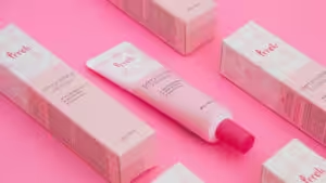
Get Perfect Color Matching with Packoi’s Custom Packaging Solutions
With over 25 years of experience, Packoi specializes in custom packaging solutions that promise precise color matching and innovative designs. Trusted by businesses across various industries, our packaging protects your products and reflects your brand’s true colors.
With professional licensing and certification, Packoi offers a wide range of custom boxes, bags, and marketing materials meticulously designed to meet your color expectations while adding a touch of luxury to your customer’s experience.
To find the best packaging for your business, contact us now!