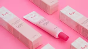
Pantone 11-4201, or Cloud Dancer, is currently taking the center stage as the defining color of 2026. It shows a move away from bright and loud branding toward quieter choices. Unlike the harsh whites used back in the 2010s, the soft and milky hues of Cloud Dancer give a premium and sustainable feel.
Below is all about using this trendy off-white color in packaging designs to build a better brand identity.
Why “Cloud Dancer” is Taking Over Sustainable Packaging Designs in 2026 – Color’s Key Features

Cloud dancer speaks directly to modern generations. A well-thought-out use of this color makes it ideal for all sorts of packaging designs. It appeals to consumers who want brands to feel honest, sustainable, and calm without being overly loud.
Under color psychology, this milky off-white represents clarity and freshness. It feels reassuring without being overwhelming. This is why it resonates with many beauty, lifestyle, and wellness brands. This is the perfect color for brands to represent their ideology of self-care, simplicity, and balance.
Cloud Dancer also reflects the growing minimalistic and no-makeup approach in branding. This makes it ideal for consumers who prefer realistic and natural skin over minimal filters. Any brand that uses this shade can attract people who are drawn to clean and unforced ideologies.
Cloud Dancer also suggests purity, authenticity, and innocence. This foreshadows a brand’s use of unbleached and non-toxic materials, as well as close-to-nature, organic ingredients.
Exuding environmental responsibility, this color has an edge over sharp whites, which often signal chemical treatments. Using Cloud Dancer in custom packaging gives the impression of a brand that reduces processing with thoughtfulness.
3 Minimalist Color Palettes for Packaging in 2026

If you are still confused about which color palettes Cloud Dancer merges with perfectly, below are three of the best ideas for you. All of these palettes are ideal for modern, premium, and environmentally responsible packaging.
These combinations are not only simple but also versatile. This versatility makes these palettes ideal for future-focused branding needs.
Eco-Luxe palette
Cloud Dancer + Deep Moss Green + Kraft Brown
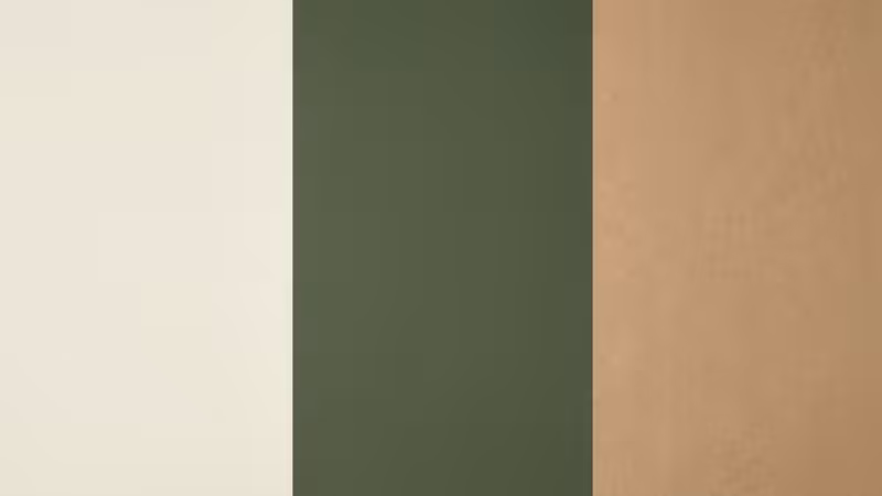
Anyone who wants a grounded and organic feel for their brand can confidently go for this luxurious and sustainable palette. The Cloud Dancer color keeps the overall look light and clean. On the other hand, the moss green and kraft brown add an earthy and organic touch to the packaging.
This palette is ideal for organic makeup, wellness, sustainability-focused, and food brands. It is also perfect for brands that want to convey a premium feel without appearing overprocessed. This combination helps customers associate the brand with luxury that does not rely on heavy processing.
Modern Minimalist Palette
Cloud Dancer + Stretch Limo (Black) + Matte Silver Foil

If you want your brand to have a sharp, clean, and architectural look that feels bold without being overwhelming, this palette is ideal. It is a perfect blend of cleanliness and sharpness.
While Cloud Dancer softens the strong contrast of black, Stretch Limo Black adds authority and boldness, adding confidence to your brand’s voice. The use of matte silver foil enhances the overall palette with luxury that does not feel overpowering. This palette is perfect for tech products, jewellery, and other high-end accessories.
Soft Pop Palette – Cloud Dancer, Muted Coral, and Lavender
Cloud Dancer + Muted Coral + Lavender
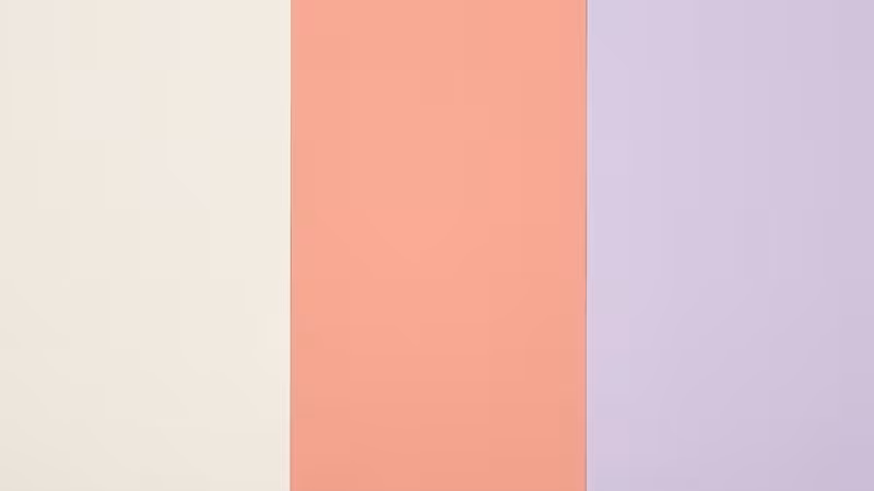
This one is for brands that want their packaging to convey a gentle yet playful vibe. It adds personality without overpowering the soft and warm off-white base of Cloud Dancer. This palette is ideal for cosmetics, skincare, and other Gen Z-focused brands that want to highlight their unique style.
It is also well-suited for brands with a largely youthful customer base that appreciates a sense of playfulness in design.
| Palette Name | Color Combination | Best For | Overall Feel |
|---|---|---|---|
| Eco-Luxe | Cloud Dancer + Deep Moss Green + Kraft Brown | Organic food, wellness, sustainable brands | Natural, grounded, premium |
| Modern Minimalist | Cloud Dancer + Stretch Limo (Black) + Matte Silver Foil | Tech, jewelry, luxury accessories | Clean, architectural, high-end |
| Soft Pop | Cloud Dancer + Muted Coral + Lavender | Cosmetics, skincare, Gen Z brands | Soft, playful, modern |
Brand Identity & Design Inspiration: Applying Cloud Dancer by Box Type
With proper usage of paper and inks, Cloud Dancer looks great across multiple packaging designs and types. Take a look below:
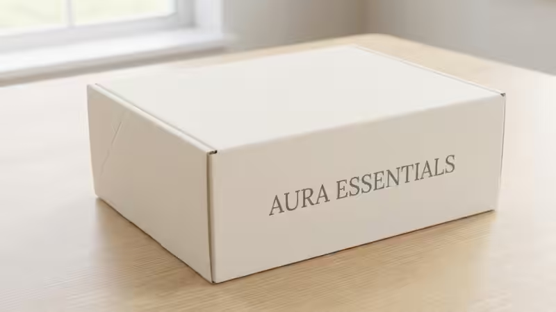
1. Custom Mailer Boxes
Using cloud dancer as a canvas for custom mailer boxes gives them an elevated and fresh look. It effectively communicates luxury and sets the mailer box apart from those typical brown ones.
Design Tip: It is best to use Cloud Dancer as the base color or the main canvas of the overall design. Ensure minimalist ink usage. Pair the design with a functionally luxurious tear strip for ease of opening. This can give your e-commerce packaging an elevated and customer-oriented feel.
2. Rigid Gift Boxes
Luxury brands can use Cloud dancer in their rigid gift boxes to commit to their expensive brand identity. This color looks heavy, expensive, and architectural on rigid packaging designs. It’s like copying “Apple’s” box aesthetics but keeping things warmer and with low environmental impact.
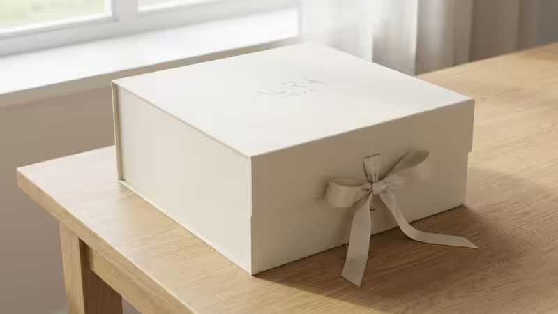
Design Tip: It is best to stay true to the texture over print. Use a textured paper like linen or felt and wrap it around the greyboard. This can make the entire box feel great to touch, giving it a tactile, fabric-like feel. Such a box can surely evoke excitement in the target audience.
3. The Unboxing Details
Nicely done product packaging designs can surely deliver your brand message loud and clear. However, it is always best to take things up a notch by inculcating the same colors in the unboxing elements. Using this color in tissues and box inserts gives your customers an airy and translucent experience. This color can cover the main product with a thin veil, adding mystery and softness.
Design Tip: Don’t go overboard with simplicity and only use plain white tissues; rather, use a customized printed cloud dancer tissue with printed elements on it. You can use a tone-on-tone pattern for printing.
4. Folding Product Cartons
If you want your brand to be remembered for smart packaging design, you must create packaging that reflects your brand identity well. This is where cloud dancer colored sustainable packaging with cardboard can help.
For the folding cartons, using this color can add a clinical and clean feel. It can signal that the item inside the packaging is pure, organic, and close to nature. Such folding cartons show the brand’s commitment to a reduced carbon footprint with a shift away from heavily processed products.
Designing packaging like this can be ideal for cosmetics and beauty brands. In case you want more color, go for earthy tones and soft hues over a white background.
Design Tip: We suggest ditching the dark background and textures and instead going for soft-touch or velvet laminations in the foreground. When you use Pantone 11-4201 in a matte-ish manner, the products stand out on their own.
Avoid glossy and shimmery finishes that can ruin the entire vibe of this creamy white. Moreover, create packagings with minimal negative space and less clutter to draw attention.
5. Sliding Drawer Boxes
This is the most eye-catching packaging design you can go for to deliver a strong brand message. Sliding drawer boxes in Pantone 11-4201 are an experiment that cannot ever go wrong. Opening such a package feels like making a ritualistic reveal. It builds an impression at first glance.
Ensure smooth and easy sliding motion that, when combined with this creamy white colour, will leave a lasting impression. Such a packaging design is ideal for small business owners in the jewelry and accessories niche to give a precious feel to their products.
Design Tip: Going for a Two-Tone Strategy, use Cloud Dancer for the outer side and mix it with earthy tones of terracotta or forest green in the inside.
6. Cylinder Tube Packaging
Eco-friendly products can look aesthetic and organic in cylindrical, creamy-white boxes. The curves will reflect light differently, which will add more emphasis to the softness of the cloud dancer.
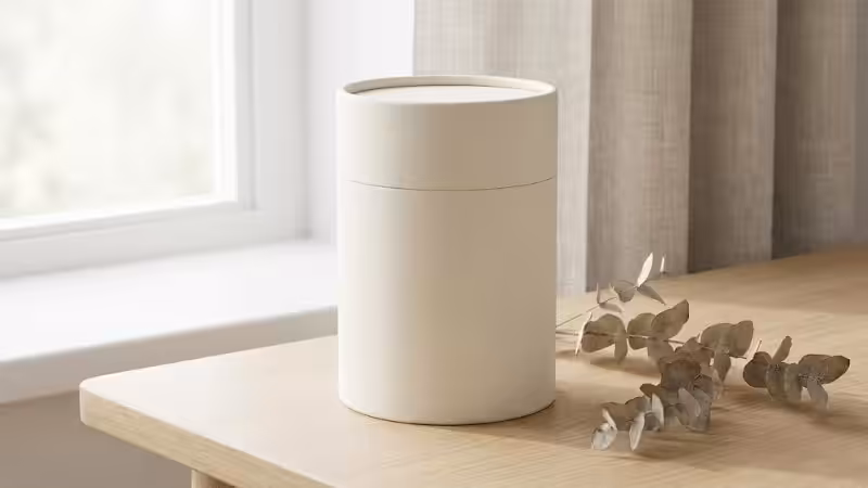
Design Tip: We suggest going for Hot Foil Stamping to print the logo. Since a cylinder doesn’t have sharp edges, a Rose Gold or Copper foil stamped logo curved around the tube will look great.
Common Mistakes to Avoid with Cloud Dancer Color Packaging
It is common for even the most experienced designers to stumble when working with such a unique shade of white. Mistakes with using this colour are common because of its subtle and nuanced nature.
Such errors, while not always apparent on the surface, can ruin the premium feel of a design and make it look cheaper or poorly executed. Below are the key mistakes that you must avoid at all costs when using Cloud Dancer, AKA Pantone 11-4201, in packaging:
The Dirty Effect
This is one of the most common mistakes made when working with soft and unique pastel hues. Pairing warm Cloud Dancer with cool-toned fabric or paper ruins its overall feel. This undertone clash can make the packaging look dull, off, and visually inconsistent.
Using cool-toned materials to print a Cloud Dancer design can turn the color greyish and dark instead of soft and creamy. It is best to always compare the paper and ink side by side.
Low Opacity Problems
Printing white or off-white ink on brown or low-quality kraft boxes is a mistake. It often results in muddy and uneven packaging that loses its elegance and ruins the essence of Cloud Dancer. The solution is to choose a paper base that already matches the warmth of Cloud Dancer.
Overloading the Design
The Cloud Dancer color demands white space and simplicity. Its beauty thrives on clean layouts and breathing room. Overloading packaging with busy patterns, heavy typography, and multiple colors is a mistake. It ruins the quiet confidence and luxury appeal of the box. It is best to let the off-white shine as the main color.
Other common mistakes include ignoring the packaging’s finish and texture and skipping proper sampling. These often lead to poor-quality packaging being produced in bulk.
FAQs
Q1: What is the specific Pantone code for Cloud Dancer?
The specific code for cloud dancer is Pantone 11-4201.
Q2: Can I print Cloud Dancer (off-white) ink on brown Kraft boxes?
You shouldn’t do that. The Kraft base often overpowers the warm-whitish ink, making everything look muddy.
Q3: Is using a Pantone color like Cloud Dancer more expensive than standard printing?
It can be a bit more expensive if combined with premium paper and finish options. However, the premium end results justify the extra money spent.
Q4: Is Cloud Dancer’s packaging eco-friendly?
Yes. Softer whites often represent less processing compared to the harsh and loud whites.
Q5: Which packaging finish looks best with Cloud Dancer?
There are many. The best are those with matte, soft-touch, or a textured feel. These include linen, felt, or cotton-based papers.
Conclusion
Cloud Dancer is not just a color trend. It is a statement of quality, luxury, and sustainability that can elevate your packaging designs in 2026. The key to acing this shade in your packaging is understanding the patterns and papers for printing that work the best with it. Always choose the right packaging manufacturers who understand your requirements and can bring out the best in this color.
Get Custom Cloud Dancer Packaging Design From Packoi
Worried if you will get the right Cloud Dancer shade on a paper that elevates its look? Connect with Packoi today for our paper library and sample kits. We let you see and touch, and compare premium paper options designed to match the printing needs of Pantone 11-4201. Explore textures, finishes, and subtle tone differences before committing to bulk production.
Already have a design in mind and want to get it printed? Reach out to us today for a free quote and further consultations.