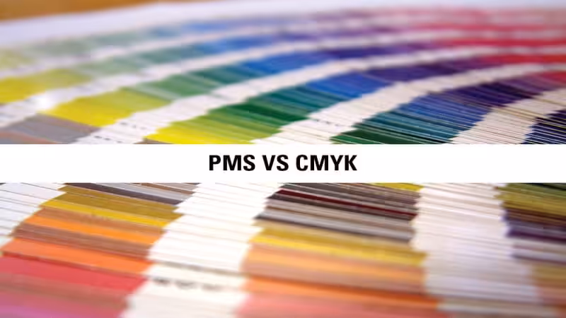
The choice between Spot Color vs. CMYK printing is the hidden factor that determines brand consistency, visual impact, and ultimately, your budget. Making the wrong call can lead to costly reprints and a brand image that looks unprofessional.
This definitive guide will demystify the two processes completely. By the end, you’ll know exactly when to use each method to achieve perfect color accuracy every time, while also making the most cost-effective choice for your project.
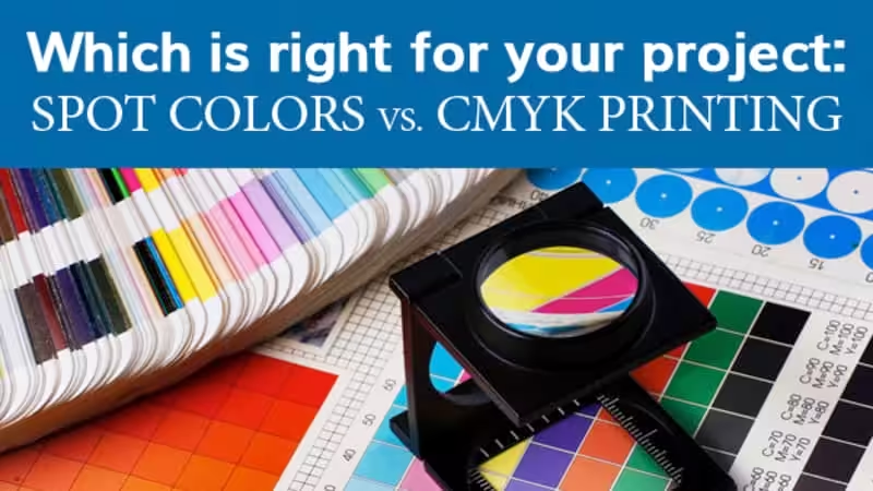
Spot Color vs. CMYK: The Quick Answer
If you need a fast answer, use this table to make a quick decision.
Feature | Spot Color Printing | CMYK Printing |
Best For | Brand logos, 1-3 color designs, text, brand-specific colors. | Full-color photographs, complex graphics, designs with many colors. |
Color Accuracy | Highest. Pre-mixed ink ensures 100% color consistency every time. | Good. Colors are mixed on the press and can have minor variations. |
Cost Structure | Cost-effective for a few colors. Price increases with each new color. | Cost-effective for designs with many colors. One setup costs full color. |
Special Effects | Yes. The only way to print true metallics, neons, and pastels. | No. Cannot produce specialty inks. |
Bottom Line | Choose when color accuracy is your #1 priority. | Choose when printing photorealistic images or complex designs. |
What Is Spot Color Printing and When Is It Used?
Spot color printing is a specialized printing process that uses pre-mixed inks to achieve an exact color match for a specific design element. Think of it like buying a can of paint mixed to a precise formula—you get a pure, solid color that remains perfectly consistent from the first print to the last.
This method ensures the highest level of color accuracy. Because each spot color is a single ink, it requires its own dedicated printing plate, guaranteeing a crisp and vibrant result.
This method is the industry standard for brand-focused projects, especially for custom packaging and corporate identity. If your logo has a specific shade of blue, spot printing ensures that color is identical across all materials. It’s also the perfect excellent option for producing sharp edges on text and vector graphics.
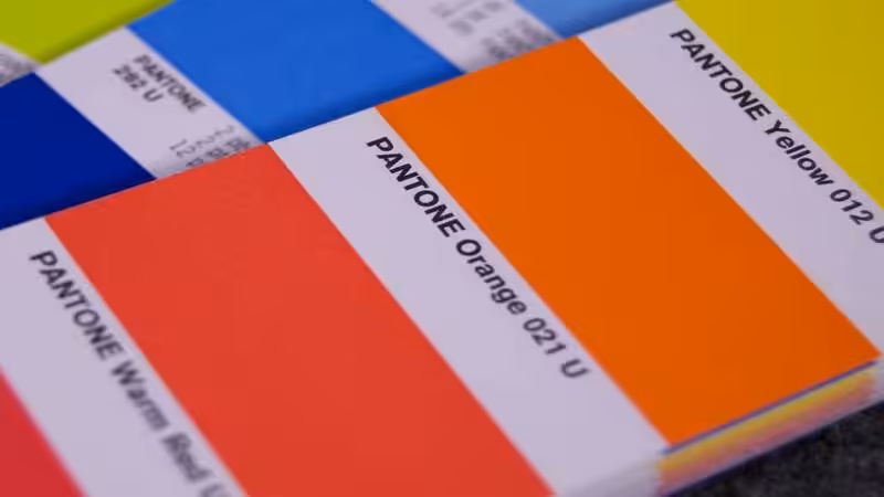
The Pantone Matching System (PMS) for Perfect Color Matching
When discussing spot colors, we are typically referring to the Pantone Matching System (PMS). Pantone is a standardized library of Pantone colors used globally by designers and printers for precise color matching. Each of the PMS colors has a unique code (e.g., PANTONE 185 C). Providing this code ensures the printer uses the exact ink formula, achieving consistent color across every print job.
What Is CMYK Color Printing and How Does It Work?
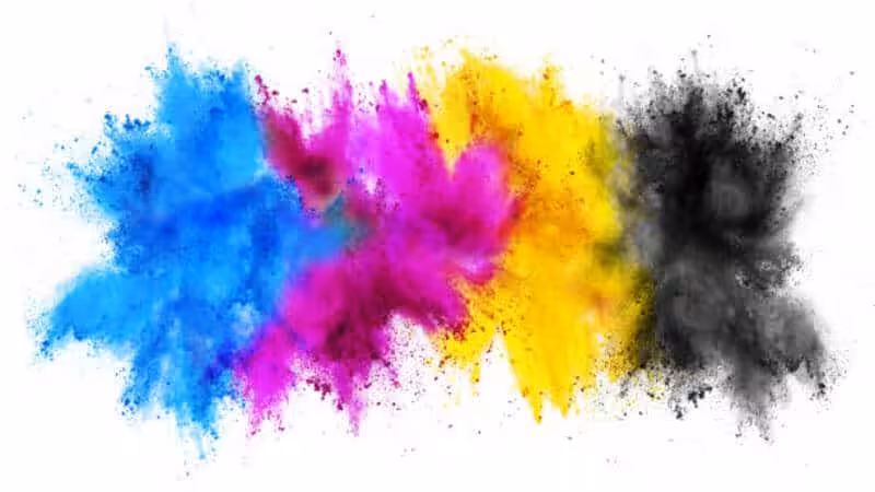
CMYK color printing, also known as the four-color process or process color printing, creates a vast spectrum of hues by combining just four colors of ink.
These standard inks are Cyan(blue), Magenta(red), Yellow, and Key (black), often abbreviated as CMYK.
During the printing press operation, these four inks are applied as thousands of individual tiny color dots that overlap. Your eyes blend these dots together to perceive a full-color image.
This is the standard method for reproducing photographs and other high-quality images with complex color gradients. Instead of one solid color, you get an illusion of color built from four base inks, making it ideal for designs with many colors.
The Core Difference: Color Accuracy and Consistency
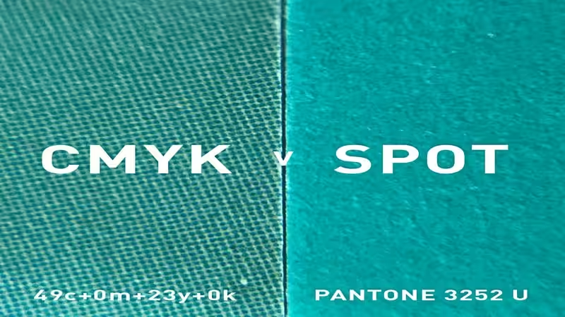
Color Gamut Explained: Why CMYK Can’t Match Every Spot Color
The range of colors a system can produce is called its “color gamut.” The spot color gamut is huge and includes vibrant colors like bright oranges, deep blues, and special inks. The CMYK gamut is smaller. It cannot mix inks to create certain intense colors.
This is why trying to print a bright Pantone orange using CMYK often results in a muddier, less vibrant orange. Your screen (which uses an even wider RGB gamut) can display these bright colors, leading to the common problem of “what I see on screen isn’t what I get in print.”
Advantages of Spot Color for Branding
- Perfect Consistency: The main benefit is absolute color accuracy. Your brand color will be the same today, tomorrow, and a year from now.
- Vibrant Colors: It produces cleaner, brighter, and more vivid colors that CMYK cannot replicate.
- Clean Edges: Solid ink creates exceptionally sharp lines, perfect for logos and text.
Disadvantages of Spot Color for Complex Images
- Not for Photos: This technique is not effective when you need to print photographic-style designs.
- Limited Colors: Each color adds significant cost, making it impractical for designs with more than a few colors.
Spot Color vs. CMYK: Which Is More Budget-Friendly?
The most common question is about cost. The answer depends entirely on your design.
- Use Spot Colors to save money if: Your design uses only one, two, or maybe three distinct colors.
- Use CMYK to save money if: Your design has many colors, gradients, or a photograph.
A Quick Cost Comparison Scenario
Let’s imagine you’re printing 5,000 small boxes:
Project | Best Choice | Why? |
A simple 2-color logo on a white box. | Spot Color | You only pay for two printing plates and two ink setups. Cheaper and better color. |
A full-color photo of your product. | CMYK | You only pay for four printing plates to create millions of colors. Spot color would be impossible. |
Advantages of CMYK for Multi-Color Designs
- Cost-Effective for Full Color: It’s the most affordable way to print images and complex designs.
- Efficiency: One press run with four plates can produce nearly any image, simplifying the process.
Disadvantages of CMYK in Color Variation
- Potential for Variation: Since colors are mixed on the press, slight variations can occur between print runs due to machine calibration, paper type, and other factors.
- Less Vibrant: As mentioned, it cannot hit the brightest notes in the color spectrum.
Beyond the Basics: Combining Methods and Using Special Inks
Sometimes, neither process alone is the perfect solution.
Can You Mix Spot Colors and CMYK in One Print Job?
Yes! This is called 5-color or 6-color printing. It’s a premium option used for high-end packaging. The process prints the full-color image using CMYK and then adds one or two spot colors in a separate pass for the brand logo or key text. This gives you the best of both worlds: beautiful photos and perfectly accurate brand colors.
Using Spot Colors for Metallic or Fluorescent Colors
If your packaging design requires a true metallic silver, a vibrant neon green, or other fluorescent colors, you must use a spot color. These special effects are created with unique ink formulas. The CMYK simulated process of using dots simply cannot replicate this shimmer or glow, making spot color essential for standout packaging.
How to Choose the Best Color Mode for Your Project?
Use this simple checklist to make the right call.
Your Final Decision Checklist
- Is the exact brand color matching your #1 priority?
- → Choose Spot Color.
- Does your design have 1-3 distinct colors?
- → Spot Color is likely more cost-effective.
- Does your design include a full-color photograph or complex gradients?
- → Choose CMYK.
- Are you printing a multi-color design on a tight budget?
- → CMYK is your answer.
- Do you need a metallic, neon, or pastel color?
- → You must use a Spot Color.
- Do you need both a photo AND a perfect brand logo?
- → Ask your printer about CMYK + Spot Color (5-color) printing.
Practical Tips: Preparing and Converting Your Artwork Files
Correct file setup is critical for achieving accurate colors. While your designer handles the details, understanding the basics helps you make an informed decision.
How to Set Up Files for Spot Color Printing
When using spot colors, your artwork must be created in vector graphics programs like Adobe Illustrator. Your designer will assign a specific Pantone swatch (e.g., from the Pantone Solid Coated library) to the design elements. This embeds the exact color process information into the final file, telling the printer precisely which ink to use.
Correctly Converting Color Modes to CMYK
For CMYK printing, all elements in your file must be converted to the CMYK color mode before submission. This is a crucial step typically done in programs like Adobe Photoshop or Illustrator. Never send an RGB file directly to a commercial printer. The automatic conversion can lead to unpredictable and disappointing color shifts. By converting to CMYK yourself, you can preview the color changes and make adjustments to get as close as possible to your desired look.
Frequently Asked Questions About Spot Color and CMYK
Q1:Does paper type affect spot color and CMYK printing?
Yes, paper has a significant impact, especially on CMYK. Spot inks are opaque and solid, so they look consistent even on colored or textured paper. CMYK inks are translucent, meaning the paper’s brightness and coating will show through and affect the final perceived colors. For this reason, getting a printed proof on your actual chosen stock is crucial for color-critical projects.
Q2:Can you convert a CMYK color to an exact Pantone match?
Not always perfectly, because the CMYK color gamut is smaller than the Pantone library. While some Pantone colors can be closely simulated, vibrant oranges, blues, and greens often appear duller when converted to CMYK. Design software and Pantone’s Color Bridge guide can show you the closest possible CMYK match, but it will rarely be a 100% exact replication.
Q3:What does it mean to add a ‘5th color’ to a CMYK print job?
A ‘5th color’ refers to an additional ink run added after the standard four-color (CMYK) process. This extra ink is almost always a spot color, used for elements that CMYK cannot accurately reproduce. Common uses include printing a precise brand logo, adding a metallic or neon ink for accents, or applying a clear varnish for texture.
Q4:For custom stickers or labels, is spot color or CMYK better?
It depends entirely on your sticker’s design. For logos or graphics with 1-3 specific brand colors, spot color provides superior vibrancy, sharpness, and consistency. For stickers featuring photographs or complex, multi-color illustrations, CMYK is the more cost-effective and practical solution. The best way to decide is to have your artwork reviewed by a packaging expert who can recommend the ideal process.
Spot Color vs. CMYK: Making the Final Informed Decision
The difference between spot color vs. CMYK ultimately comes down to a trade-off between precision and complexity.
Choose spot color printing when absolute color accuracy and brand consistency are non-negotiable, especially for projects with one to three distinct colors like logos and branded packaging. It’s also the only way to achieve special effects like metallic or fluorescent colors.
Choose CMYK color printing for its cost-effectiveness when dealing with many colors, complex graphics, or photographs. It’s the industry standard for commercial printing like magazines, brochures, and detailed promotional materials.
By understanding the strengths of each printing process, you can confidently select the right method for your next print job, ensuring your final product is both visually stunning and budget-friendly.
Discover the Perfect Printing Solution for Your Business with Packoi
Choosing the right color process is a big step. If you’re looking for a reliable packaging partner who understands the importance of perfect color, you’re in the right place. At Packoi, we help businesses create outstanding packaging, stickers, and promotional materials.
Contact us today. Our experts can review your design for free and recommend the best, most cost-effective printing solution for your needs.
Get Instant Quote & Free Samples Now!