Catalogs are a powerful way to market products and encourage higher sales. It’s also quite effective in launching new collections and highlighting products that require an extra push to sell.
This is why fashion brands that operate online and offline use these catalogs extensively.
In this article, you’ll learn more about catalogs – specifically how you can design them to push your fashion brand forward. You’ll get simple yet very effective catalog design tips so you can create this printed marketing material for your brand.
What Is a Fashion Catalog?
The catalogs used in the fashion industry aren’t that different. It’s the same as what you’d expect from a furniture, food, or toy catalog.
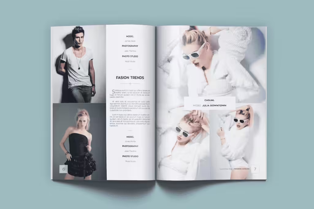
Fashion catalogs display the clothing offered by the fashion brand so people will be enticed to buy them. These aren’t just photos of the items. Catalog designs should include product descriptions, details, styles, sizes, materials, colors, prices, and other information that’ll help the customer make a buying decision.
How Is It Different From a Fashion Lookbook?
In the world of fashion, it’s easy to confuse catalogs with lookbooks. In essence, both of these are used to encourage your target market to buy your clothing line. But apart from that, these are two different printed collaterals.
To create the right design for your catalog, let’s identify the difference between the two.
A catalog is a basic list of the items that you’re selling. Most of the time, the clothing line is arranged in a particular order. It could be by style like shirt, dresses, pants, etc. It could be by collection or season like summer, fall, winter, or spring. Catalogs also provide complete details about the product.

A lookbook is focused on the visual display. It has more photos than a catalog because it doesn’t need all the details like the sizing or measurements. Usually, the products in a lookbook are grouped by theme or color. Some brands publish one lookbook per season (sometimes 2 seasons are in one lookbook). Products are also photographed as lifestyle aspirations. It gives customers an idea of what the product looks like while giving clues as to what other products can be worn together with it.
Important Fashion Catalog Design Elements
When you’re looking for catalog design tips, focus on one thing – the design elements. Catalogs generally require the same details to make it complete. The product images, content, layout, materials, and binding.
More careful consideration is needed for the first three because these will have a huge effect on the visual appeal of your catalog.
To help you with that, let’s discuss these design elements one at a time.
Image
A catalog is intended to be visually appealing. It might not be the same level as a lookbook, but it’ll still require high-resolution images. This means the images should at least be 300 dpi to ensure that the quality is superb.
By providing the right image quality, readers will have a clear vision of what the actual product looks like.
Of course, the quality isn’t the only thing that matters here.
The way you capture the clothing products should be well-thought-out. When the reader looks at it, they should be able to picture themselves wearing it. That means the shot shouldn’t just be photos of the clothing on a mannequin. It has to be on a model that the target market can associate themselves with.
Content
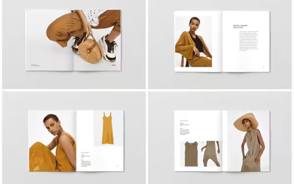
Another thing that you have to consider is the written content in the catalog. The product descriptions have to be complete. Or at least, it has to provide the information needed by the customers to make them decide to get the product.
The content would include the product name, description, colors, style, sizes, measurements, materials, prices, etc.
When listing the details, don’t just put them in bullet points. Make sure it’s presented in a way that’s clear and easy to read so the customer won’t feel bored to overloaded with information.
Layout
This refers to the actual design of the catalog. It involves the position of the images, content, font, and colors that’ll be used.
You’ll need to use your creative and artistic skills to do this. Will you use slab or serif font for the headings? How will you position the product details against the images so people will know how it relates to each other?
Not only that, but you should also consider the flow of the catalog. How will you get the customers from page one to the last? The images and content will have to be presented well so customers won’t skip a page.
As you answer these questions, keep your brand image in mind as well. Everything that you decide to put on the catalog should be aligned with your brand.
Materials
This part may not matter to your customers, but the materials that you’ll use will have an effect on the output of your catalog.
For instance, how thick will the paper be? Will you use coated or uncoated paper? If the paper is glossy and thick, it’ll create a more vivid image. But it’ll make your catalog too heavy – not to mention the fact that it might be too costly.
The material that you’ll choose can also help your brand image so choose higher-quality paper stock only. Not only that but if your fashion brand is positioning itself to be sustainable, using recycled paper may be a great way to reinforce this image.
Binding
There are 2 common ways to bind fashion catalogs.
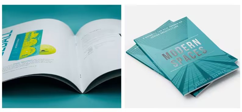
The first is a Saddle Stitch. The design is printed on both sides and arranged by page number. The paper is then folded in half so it can be stapled along the fold. This is ideal for catalogs that have 64 pages and below.
The second is the Perfect Bound. The design is printed on single sheets of paper and then arranged by page number so it becomes a book block. The spine edge and soft cover will then be attached to the block of pages using PUR glue. This is great for catalogs that are between 30 to 200 pages.
10 Fashion Catalog Design Tips to Follow
Now that you have an idea about the elements that you should consider, it’s time to gather catalog design tips so you can put it all together.
Here are powerful tips that can help you create an effective catalog for your fashion brand.
Appeal to a Specific Niche
The best way to start your catalog design is to think about your target audience. Be specific about the market that you want to target.
If you have a women’s clothing line, define what their demographics are. What are their ages and what do they do in life?
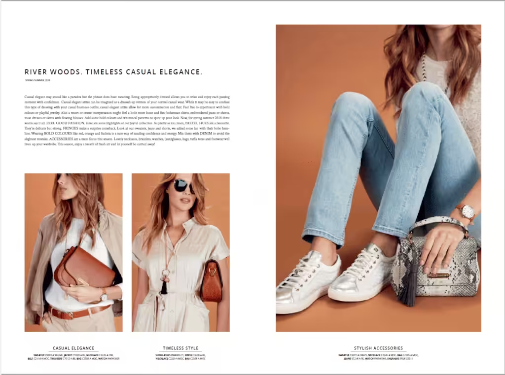
The more you know about your market, the more you can identify what design elements will appeal to them.
In case your brand targets a wide market, don’t create one product catalog for them. It’ll be better if they have a specific catalog for each segment.
Represent Your Market’s Life Aspirations
After you’ve identified the preferences of your target audience, get to know more about their life aspirations. Your catalog design should reflect that.
So if you’re targeting young adults who are building their careers, your catalog should have images that show power, success, and financial strength.
The purpose is to entice the readers to buy your products so they can reach what they aspire to have in life.
Keep the Product In Focus
A catalog is all about the product. Although the text also matters because it’s what buyers will use to make a decision, it’s still the products that matter the most.
This isn’t just about the new products. You also have to give space for the old ones and sale items.
Of course, the high-value products will be front and center in your catalog. They’ll have a bigger space. But you should also put the old product lines so people will know they’re still available.
Use Photos that Spark an Emotional Connection
This is one of the most important catalog design tips that you should consider.
It’s not enough that you provide high-resolution images. The images that you’ll put on the catalog should connect to the readers on an emotional level. This is one of the reasons why you should use your market’s life aspirations as your guide.
After all, most people use their emotions to make a buying decision. Of course, they’ll think about it. But if they know that your product can make them happy, they’ll make the decision to buy.
Align the Content with the Color and Design
When choosing the catalog design of your fashion brand, it’s important to make it look aligned with each other. To be specific, the color and layout of the catalog should reflect its content.
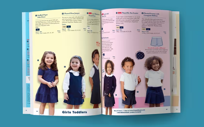
For instance, if you are creating a catalog for children’s clothing, make it look fun and colorful. If the catalog is for businessmen, opt for a simple and minimalistic layout with white, black, and grey elements.
This will ensure that the visual aesthetics of the catalog will appeal to the taste of your target market.
Opt for Consistency…
Aligning the content, color, and layout of the catalog design isn’t enough. The typefaces and design should also be consistent.
When it comes to the font, use only one or two families. Choose slab or serif font as your headline. Then use sans serif for the other details of the product.
Make sure the same typeface is used for the headlines and the product descriptions. This will create a sense of unity in your catalog.
It’ll also make it easier for people to spot important details.
For instance, you can always put the product name in Bold while the price is in Italics. If you do it consistently, the readers will spot both details easily as they browse the rest of the catalog.
…But Add a Surprise Page or Two
Although you want consistency in your catalog design, don’t make it too boring. Find the balance by adding a page or two that looks different.
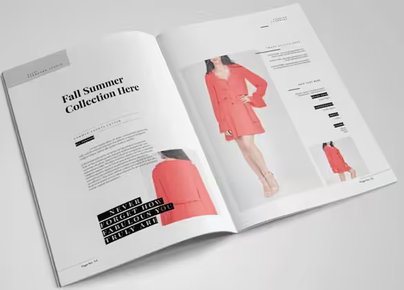
Maybe you can add a whole spread with just photos of the products. Make this unique page show a powerful life aspiration of your target audience.
Look at the page count and strategically plot these surprise pages throughout the catalog.
Be Smart with White Spaces
The layout of the catalog should also take the white space into consideration. White space refers to the blank spaces on the catalog page.
When done strategically, it allows you to put a lot of content on a page without making it look too cluttered. It also keeps products from looking like they’re competing for the customer’s attention.
The white space even provides rest for the eyes before it looks at the next product. This keeps the customers from feeling too tired or overwhelmed while browsing your catalog.
Make Product Descriptions Enticing
Most people will focus on the images in the catalog. But the truth is, both the images and content are important factors that’ll influence the buying decision of customers.
Pay attention to the product descriptions that you’re creating for the catalog. Read through it and make sure it flows naturally. Make the people want to complete reading it.
Provide enough information without giving the customer an overload of details. By the time they reach the end of the description, the customer should be enticed to make a purchase.
Choose the Right Cover
Finally, choose the right cover for your catalog design. This is the first thing that people will see. It’s most likely the reason why people would want to pick the catalog up and read through it.
If your cover is boring, people won’t mind it. But if you choose a photo of your best-selling product, it can make people interested enough to look at the rest of the catalog.
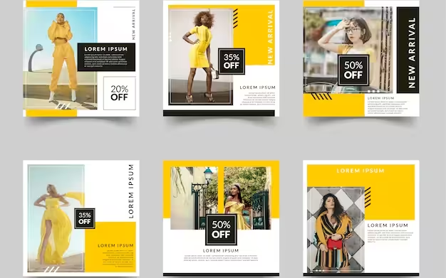
6 Steps to Create an Effective Catalog for Your Fashion Brand
By this time, you should have catalog design ideas starting to form in your mind. As you consider your options, it’s important to keep a firm grasp of two things.
First is your fashion brand and the other is your customers. Your catalog should reflect the image that you want for your brand and at the same time, it should resonate with your customers.
Once you have that in mind and you’ve selected the products to feature in the catalog, here are the 6 steps that you can follow.
Step 1: Choose the Look or Theme
Your catalog design should always start with a theme. Think about a toy catalog for a moment. The theme is usually something fun and energetic. That’s because it showcases products that bring happiness to children.
Think about your clothing line and retail products. Choose a theme that represents everything that’ll be included in the catalog. Use one or two families of font that best represent that.
This is the theme that’ll guide the rest of the elements in your catalog.
Step 2: Pick a Color Scheme
Your design ideas will be shaped by your color scheme. Once you have the overall look and theme in mind, you can choose the colors that are aligned with all that.
You can also consider your products and target market. They should all be aligned with each other.
Keep in mind that when printing a catalog, it’s best to use CMYK color profiles. This is ideal for printing materials than RGB. CMYK can print the colors more accurately on paper to match the actual product.
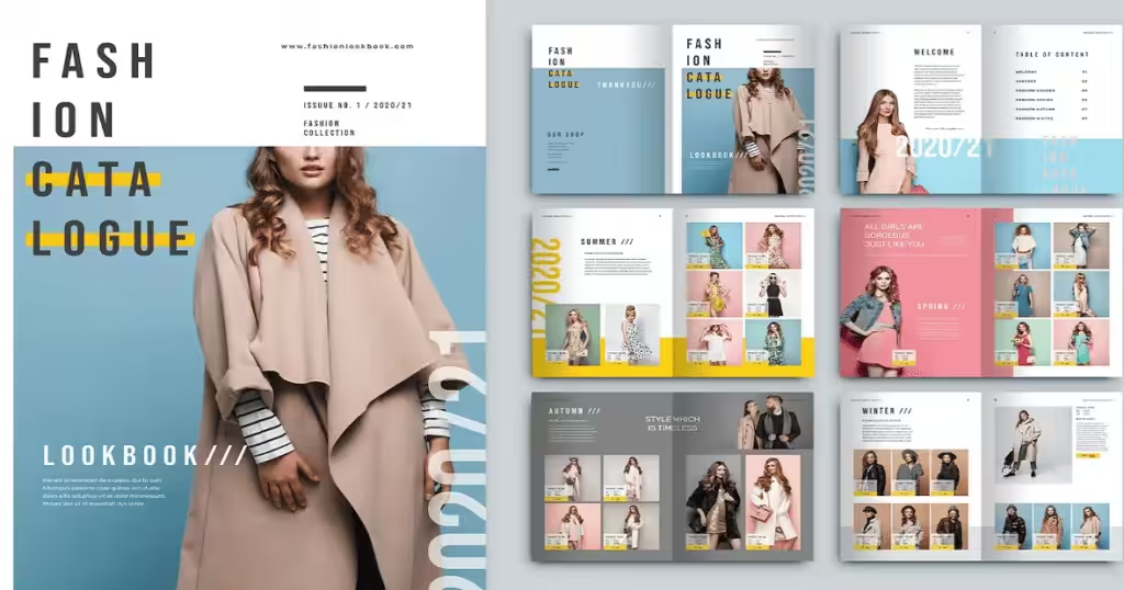
Step 3: Select High-Res Photos
If there’s one thing that you should invest in for your catalog design, it’s the images. Choose high-res photos to put on your catalog. If you have to pay a professional photographer to take photos of your products, do it.
If you have to hire models to pose and recreate the life aspirations of your target market – spend on it. The more enticing your photos are, the more effective your catalog would be in making people buy from you.
Step 4: Design the Layout
Once you have all the photos ready, add the content and see how you can position everything to match the theme that you’ve set during the first step.
Plot all the elements and choose the products and details that need to be highlighted. Pick the information that should be in bold or italics. Choose colors that can highlight special products.
Position the headings and group everything to give the products their own space to shine.
Step 5: Determine the Volume
The number of products that you’ll feature in the catalog will determine the page count. In the world of printing, it’s best to plan the pages in 8s.
So if the current page count is 14, adjust it so it becomes 16. Put page breakers or adjust the size of the images. You can also add a page with information about your brand.
Step 6: Pick a Printing Company
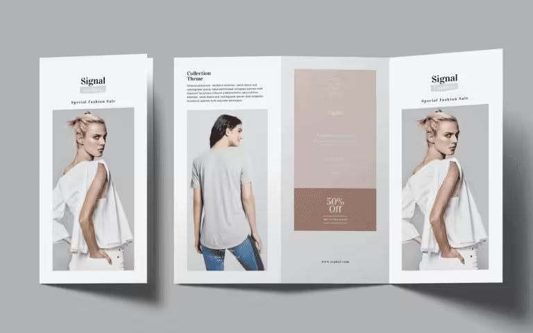
Once everything is decided on, it’s time to pick a printing company that can help you put everything together.
Choose a reputable company that can turn your vision for the catalog into reality. Inquire about the printing methods that they can do and provide the order quantity so you can get the best price for your catalogs.
Are You Ready to Create the Best-Looking Fashion Catalog? Packoi Printing Can Make That Happen.
Now that you have all the steps and catalog design tips in your hands, it’s time to get started on your catalog.
The right design will increase your sales and give your target market a better idea of what your brand is all about.
If you need help, Packoi Printing is here. We have extensive experience in printing catalogs.
Give us a call and we’ll get back to you with a fair quote immediately.


