So what is this first step? This is what this article will discuss. You’ll get the details of the first step to complete so you can create an excellent brochure for the business.
First Step: Answer These Questions
Before you decide on the brochure design that you’re creating, you need to ask yourself a couple of questions first.
These questions will guide you as you plan and design the brochure that can help increase your sales.
Here are the five questions that you should ask yourself.
Who Will Look at Your Brochure?
It’s always best to start with your target market. They are the readers of your brochure.
You have to realize that people will read your brochure for information. That means you have to know who’ll read your brochure so you can anticipate what they want to see.
Depending on who your target market is, you can decide if your brochure will be primarily images or text.
While the colors and font will depend on your brand, your customers will determine if the tone of your brochure will be friendly or formal.
How Will You Distribute Brochures?
This will help you determine the brochure type that you’ll choose.
For instance, if your customers are readers of newspapers, you want to ensure your brochure design is thin enough to become an insert.
That way, you can partner with print newspapers to distribute your brochures. The same is true if your customers love to read magazines.
Make sure your distribution plans will coincide with the habits of your target audience.
What is The Purpose Of The Brochure?
There are many reasons for the creation of brochure printing. Sometimes, it promotes a business or new products and services. Sometimes, it’s intended to provide further information about a brand.
Usually, the purpose of your brochure will depend on your marketing strategy. But it should also consider the potential customers who’ll consume its content.
Once you know what the purpose of the brochure is, then you can identify the contents that you’ll put in it. You can also determine the brochure type and layout that you’ll use.
What is Your Budget?
Another question to ask is your budget. Make sure your brochure design and plans fit the budget allocated for this printing project.
Your budget will help you negotiate the right price with the printers. Not only that, it’ll give you an idea of what to choose regarding the brochure paper, design, etc.
While you can adjust your budget, it still helps to have it available because it can guide your decisions as you create the brochure design.
How Will You Track Your Goals?
If you created your brochure for a purpose, how will you know if it was successful? You need to set up a tracking system to determine how many leads it helped your business acquire.
You can add a QR code or a link to the brochure design. Your potential customers can use this to connect to a website so they can purchase your product.
In turn, you can use that to track where your sales are coming from.
What Happens After These Questions…
Once you’ve answered all these questions, it’s time to start planning what brochure design you’ll print for your business.
Make sure you follow the process methodically so you don’t miss any essential element in your brochure.
Step 1: Choose The Type Of Brochure
When choosing the brochure type, you have to consider two things. First is the brochure’s content, and second is the people who browse it.

It would be best if you designed the brochure layout so your target audience can look at it from cover to cover. This means you need to get to know your customers well.
To help you do that, here are the common types of brochures you can choose from.
Bi-Fold
This is the simplest type of brochure that you’ll see. Think of a single sheet of paper that’s folded in half.
The bi-fold will give you four panels to put your content – with one side acting as the front and back cover while one side acts as the inner page.
Tri-Fold
This offers more layers compared to the previous one. You take a sheet of paper and fold it into three parts, with the sides overlapping.
This can be folded in two ways. The first is like a C, and the other is like a Z fold.
French Fold
This type of brochure will give you eight panels for your content.
To do a french fold, you must fold the paper twice, once vertically and then horizontally. Or the other way, horizontally first and then vertically.
While it will make your brochure look small, it’s a great brochure layout, especially if you have a lot of topics and you want each to have its panel. The reader will get different information in bite-sized portions when this unfolds entirely.
Gate Fold
This is like a tri-fold, but the side panels do not overlap. The ends will meet in the middle, opening like a gate. That means the middle panel is more significant than the two side panels.
This brochure layout is excellent if you have a massive piece of information you want to highlight. You can put it in the middle. Then the side panels will contain details about the company and the CTA.
Double Parallel Fold
This is like the French Fold, wherein you end up with eight panels. But all the folds will just be done vertically. You fold it in half, and then you fold it again.
This won’t make the brochure look small. But it’ll look narrow and long.
Step 2: Write The Copy
The content is one of the vital elements of your brochure design. This refers to the text – not the images.
When you’re working on designing a brochure and its copy, it’s essential to keep in mind that your ideal customers are after information. That means you must deliver a clear message and all the necessary data to help potential customers make a buying decision.
This isn’t just about the words you’ll use or sentence construction. It’s also about the fonts you’ll use and how you’ll highlight them in the brochure design.
Choose A Catchy Headline
No matter how beautifully you design a brochure, it won’t matter if you don’t catch your audience’s attention.
This is why you must ensure your brochure design has a catchy headline. It’s the first thing that your customers will see. Avoid cliches but choose a headline that’ll make them want to pick up the brochure to look closer.
Make It Skimmable
When you’re designing a brochure, it’s easy to get carried away. It’s tempting to put a lot of content in multiple places.
But it would be best if you remembered that the people looking at your brochure might be busy. That means the brochure design you’ll choose should be skimmable.
Highlight important information like the company details, website, and CTA. If you want to give them educational content, give the tips in bullet form. Ensure they can get the essential information even if they only skim through them.
Use Short Sentences
A brochure design that has too much text looks boring. So if you have to share information about your business and the company, keep it in short sentences.
Your ideal customer may not have the patience to read through very long sentences. They might end up not reading the whole thing.
Talk To Your Target Readers
Keep your target readers in mind when you’re designing a brochure. You have to remember that this will be one of your marketing materials.
The language and overall brochure design should resonate with your target market. This is one of the essential tips you should follow to create a great brochure that your customers can learn from.
Highlight The Benefits
Since you only have a limited space in the brochure design, highlight the benefits first. This is what you’ll use to capture the attention of your audience.
So if you’re designing a brochure to promote a new product, make that the highlight. Don’t put anything else that isn’t related to it.
Of course, you have to add the website and other contact details. But other than that, keep the content specific to the brochure’s purpose.
Consider The Overall Brochure Design
Consider the overall look as you complete the copy to create a perfect brochure. If the document doesn’t fit the brochure layout, you need to change it.
You can either rephrase or altogether remove it unless it’s vital information your audience must know. But if it won’t affect your business, remove it from the brochure design.
Proofread
Before you approve the copy – make sure you proofread it first. Not all printing companies include proofreading as part of their service, so make sure you do it for your brochure.
Check that the copy fits that Fold of the brochure. Make sure it contains all the essential information your business wants to share with the customers.
Step 3: Pick Out The Images
Unlike catalogs, you don’t need a lot of product images to complete your brochure design. However, you still need to add visual interest to it.
Since you only have limited space, choosing meaningful images is essential. That means using those that stay true to your brand image. Note that the photos may require using paper with a shiny coating. You need to talk to the printing company about their paper stock to help manage your costs.
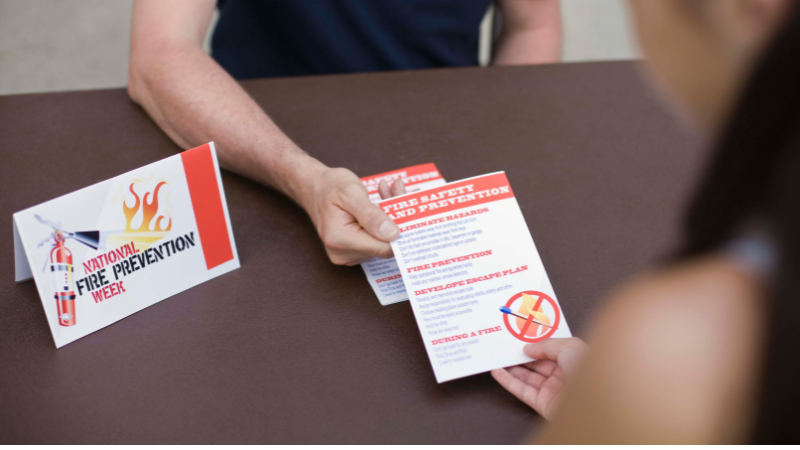
If the brochure promotes what you sell, use high-quality images of your products. You can use stock photos for this but choose vibrant imagery to bring life and color to your brochure.
As you pick out the images, here are some important reminders to adhere to.
A Feature Image For The Cover
The cover is the first thing people will see in your brochure design. Make sure the image that you’ll use will catch their attention.
You can use stock photos, but they must represent your business’s essential elements. Not only that, but it also has to describe what the brochure is all about.
One Image Per Product, Service, Or Offer
Whatever the brochure is about – whether it’s the product or service, try to put one image for each. That’ll help your readers know what the business is trying to offer.
Just make sure that when designing your brochure, you consider the space available to you. That way, you won’t make the brochure look too crowded.
Images For The About And Contact Details Area
Finally, don’t forget to choose images for the Contact details and About Us area. You can use stock photos here but make sure it fits the overall brochure design and your brand identity.
This is also where you can put QR codes or anything to help track the leads coming from the brochure. Include it in the layout of your brochure.
Step 4: Finalize The Brochure Design
At this point, you have most of the essential elements of your brochure design. It’s starting to look like what the reader will see as a final brochure.
So before you send it to the printer, here are other things you need to finalize for your business brochure.
Pick The Size
What is the size of the brochure? You need to answer this question because it’ll determine the type of paper you’ll use.
Most brochures follow the standard sizes like 8.5” x 11” (letter), 8.3” x 11.7” (A4), 8.5” x 14” (legal), 5.5” x 8.5” (memo), 11” x 17” (tabloid), 9” x 12”, and 11” x 25.5”.
When determining the size, you must consider the Fold you’ll use. Will it be a gatefold? Or a z-fold? Consider the overall brochure design to ensure you’re choosing the correct size.
Stay True To The Brand
A good brochure stays true to the brand. Your brochure design should use the brand logo, fonts, and images.
You don’t have to put the logo on every panel to make it a fantastic brochure. But make sure your target market can easily recognize that it’s yours.
Select The Right Font
The fonts that you’ll use also matter. It’s one of the essential elements to consider in your brochure design.
If you’re unsure what to use, go for your brand’s fonts. Choose two types so you have something to use to differentiate the copy you want to highlight.
Keep The Design Clean
Remember, the brochure design is just tiny. So if you want to have a good brochure, keep it clean.
Make sure the images and the copy go well together. It has to be cohesive and transparent in delivering the messages.
Use straight lines and colors that won’t take away from the copy of your brochure.
Emphasize The CTA
Your brochure design should have a clear CTA. The call to action will tell your customers where to go so they can make a purchase.
This CTA should be clear and straightforward to follow. It should lead them to your business website. Whether you’re using a z-fold or any other fold for your brochure, put this on the last page or panel.
Step 5: Coordinate With The Brochure Printing Company
Your brochure design is finally taking shape, so it’s time to get tips to coordinate with the company that’ll print it.
There are two things that you should discuss with them.
Ask For Unique Print Options (Design)
The first is the unique print options they have as part of their services.
For instance, can they do die-cut? Do they have unique elements or even paper to make your brochure design stand out?
Check if they have previous brochures that you can draw inspiration from. It’ll make the design and printing process more accessible if you have a template to follow.
Discuss The Price
If the printing company can’t offer anything unique, that’s okay. But it’s time to talk about the price for the brochure design that you’ve created.
Talk about the services included in their price so you can set the right expectations for your order.
The best way to do this is to talk to more than one printer. Then choose the one who can provide the best value.
Do You Need Help In Planning Your Brochure? Packoi Printing Is Ready To Help.
Going through all the steps to create a great brochure design may seem long – but it’s worth it. As long as you do the first step well, you should be fine as you go through the rest of the process.
If you need help designing your brochure, get in touch with Packoi Printing. We have services that help you create the perfect marketing tool for your company.
Give us the details of your brochure, and we’ll get back to you with a fair quote in no time.


